

In Insights Studio, use customizable charts and visualizations to turn report data into clear, interactive views of trends, comparisons, and performance. After selecting a data source, metrics, and dimensions, you can configure charts to:
-
Compare performance across campaigns, channels, or audiences
-
Visualize trends over time
-
Highlight relationships between dimensions and metrics, including flows across stages with Sankey charts
-
Monitor KPIs with flexible layouts and display options
-
Apply filters, sorting, and conditional formatting for clearer analysis
Before you build
Choose the Right Chart Type
|
Goal |
Recommended Chart |
|
Trend analysis |
Line |
|
Category comparison |
Column |
|
Multi-dimensional grouping |
Horizontal Bar or MultiSeries |
|
Composition analysis |
Pie / Donut |
|
KPI monitoring |
Big Text / Sparkline |
|
Mixed metrics |
Combo |
|
Flow and relationship analysis |
Sankey |
Creating a Chart
To create a visualization:
1. Open a Report or Dashboard.
2. Click Create New Chart within a report or Add New Widgets within a dashboard.
-20260803-153421.gif)
-20260803-153921.gif)
3. Select a chart type from the chart picker.
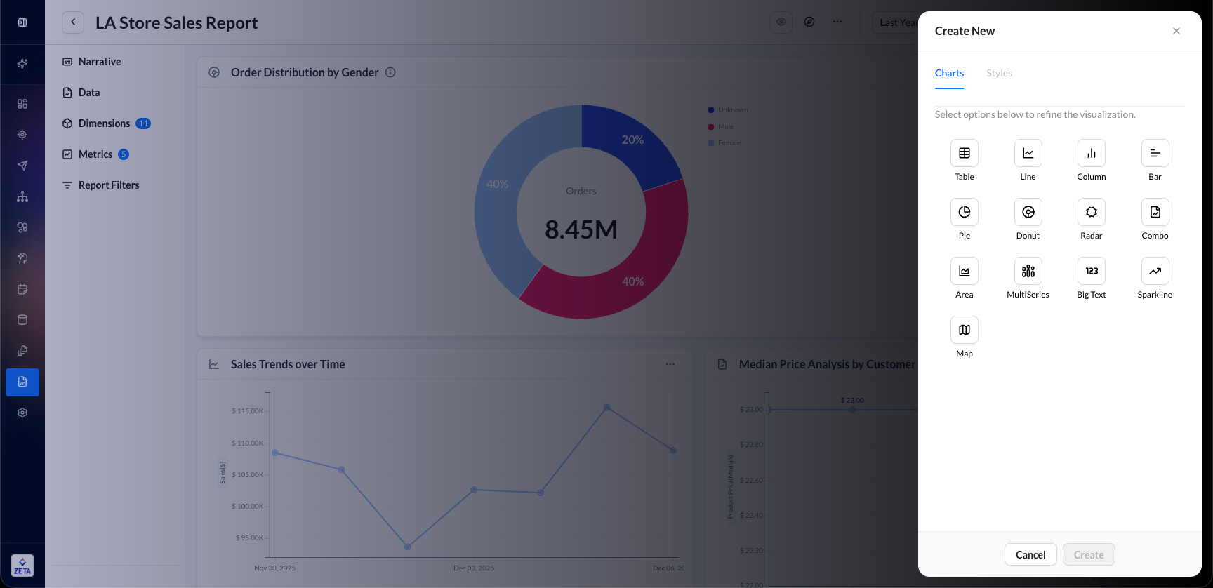
4. Configure metrics, dimensions, and styling options.
5. Save the widget.
You can edit an existing chart anytime from the widget’s three-dot menu.
Available Chart Types
The platform supports several visualization types depending on the analysis required.
|
Chart Type |
Dimensions Supported |
Multiple Metrics |
Dual Axis Support |
Color By Dimension |
|---|---|---|---|---|
|
Column |
1 |
Yes |
Yes |
Yes |
|
Line |
1 |
Yes |
Yes |
Yes |
|
Area |
1 |
Yes |
Yes |
Yes |
|
Horizontal Bar |
Up to 3 |
Yes |
Yes |
Yes |
|
MultiSeries |
Up to 3 |
Yes |
Yes |
Yes |
|
Combo |
1 |
Yes |
Yes |
No |
|
Pie / Donut |
1 |
No |
No |
No |
|
Radar |
1 |
No |
No |
No |
|
Sparkline / Big Text |
None |
No |
No |
No |
|
Map |
Geo fields only |
Limited |
No |
No |
|
Sankey |
Up to 5 (Summary) |
No |
No |
No |
Chart Type Details
Learn more about each of the chart types
Feature Support Matrix
|
Chart Type |
Secondary Metric |
Multiple Dimensions |
Color By Dimension |
|
Column |
Yes |
No |
Yes |
|
Line |
Yes |
No |
Yes |
|
Area |
Yes |
No |
Yes |
|
Horizontal Bar |
Yes |
Yes |
Yes |
|
MultiSeries |
Yes |
Yes |
Yes |
|
Combo |
Yes |
No |
Yes |
|
Pie / Donut |
No |
No |
Yes |
|
Radar |
No |
No |
Yes |
|
Sparkline / Big Text |
No |
No |
Yes |
|
Map |
Limited |
No |
Yes |
|
Sankey |
No |
Yes (Summary) |
No |
Metrics, Dimensions, and Axes
Learn More: Metrics & Dimensions Dictionary
Metrics
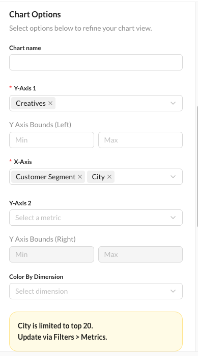
Primary Metric
The main measure that is visualized in the chart. Examples: Emails Sent, Opens, Revenue, Click Rate
Secondary Metric
Supported chart types: Column, Line, Area, Horizontal Bar, MultiSeries, Combo
Enabling a secondary metric disables Color By Dimension for supported chart types.
Dimensions
Dimensions define how data is grouped. Examples: Campaign Name, Send Date, Channel Name, Region
Single-Dimension Charts
Supported by: Column, Line, Area, Combo, Pie, Donut, Radar, Sparkline. Sankey Temporal uses one journey dimension.
Multi-Dimensional Charts
Supported by: Horizontal Bar, MultiSeries, and Sankey (Summary mode, up to 5 dimensions)
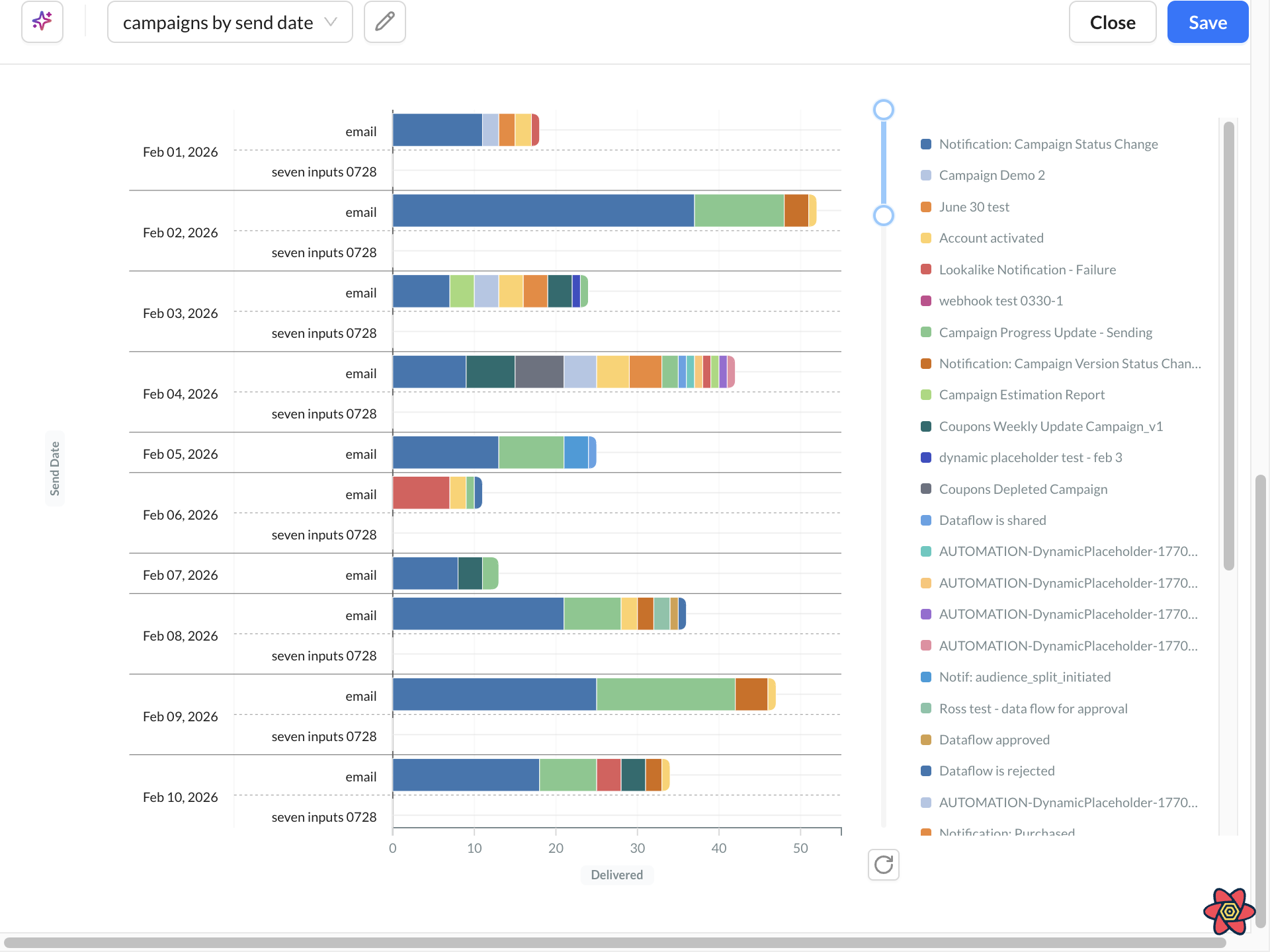
Dimension Limits
|
Configuration |
Max Dimensions |
|
Without Color By Dimension |
3 |
|
With Color By Dimension |
2 |
Each added dimension multiplies the number of rendered series. Example: 30 dates × 3 channels = 90 data rows
Use: Top N filters, Height: Large, Focused dimensions to improve readability.
Axes
The axis configuration changes depending on whether the chart is vertical or horizontal.
|
Configuration |
Vertical Charts |
Horizontal Bar |
|
Dimension Axis |
X-Axis |
Y-Axis |
|
Primary Metric Axis |
Y-Axis 1 |
X-Axis 1 |
|
Secondary Metric Axis |
Y-Axis 2 |
X-Axis 2 |
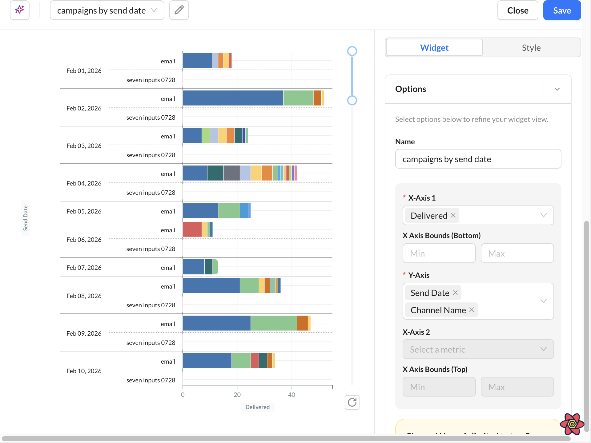
Color By Dimension
Color By Dimension controls which dimension determines the legend colors.
Supported chart types: Column, Line, Area, Horizontal Bar, MultiSeries
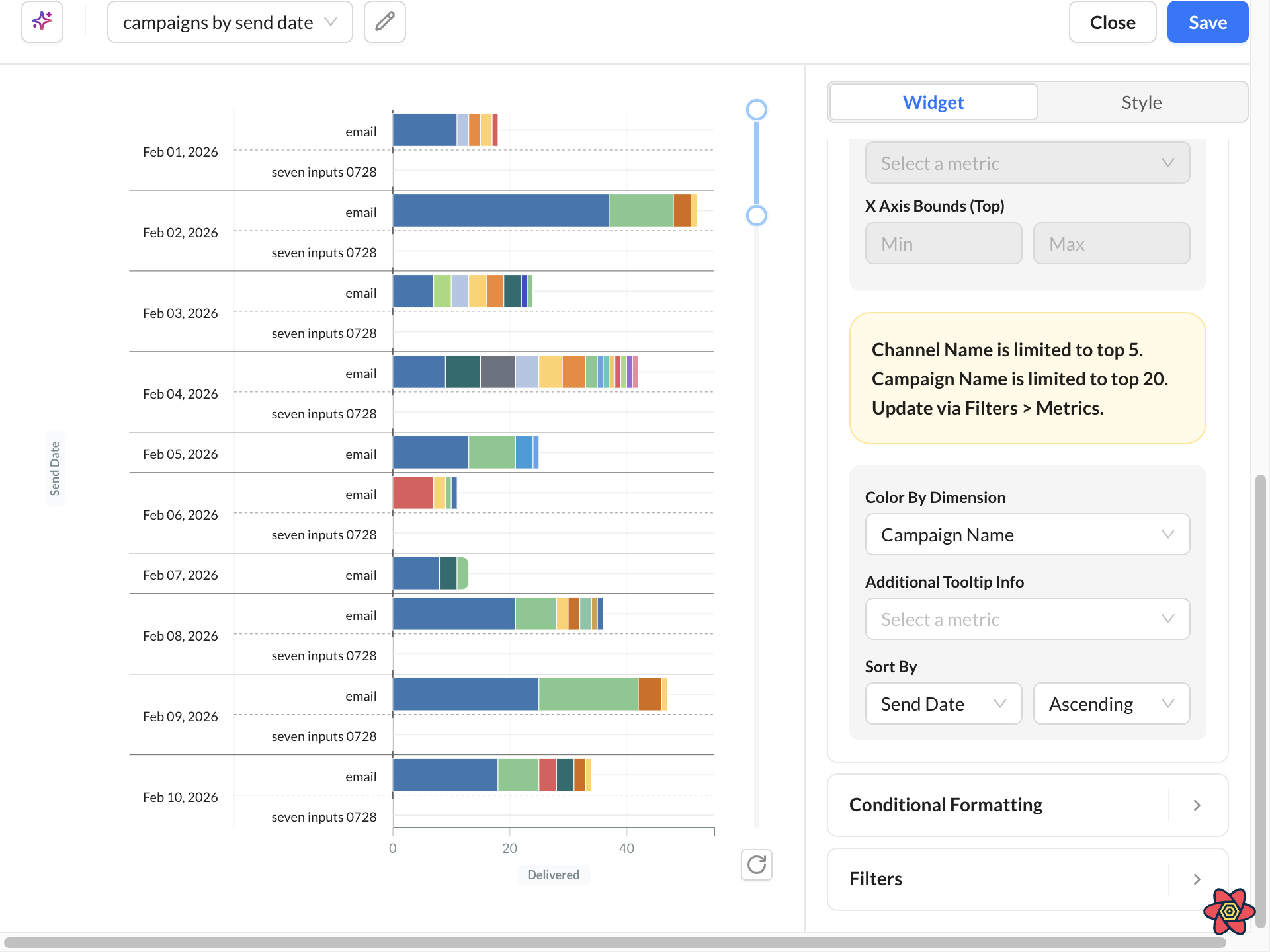
Color By Dimension is automatically disabled when:
-
Conditional Formatting is enabled
-
A secondary metric is configured
-
Horizontal Bar uses more than 2 dimensions
-
Horizontal Bar uses a secondary metric
-
MultiSeries dimension requirements are not met
Chart tooltips
Hover a chart to inspect values without changing the query. Tooltips are designed for faster reading on reports and dashboards:
-
Easier targeting: On bar and column charts, hover anywhere in the column — you do not need to hit the filled bar. On line charts, the tooltip snaps to the nearest x-axis value as you move the cursor.
-
Clearer comparison: Multi-series charts show values for the series at the selected point (up to 10 metrics). The hovered series stays emphasized; other series dim.
-
Consistent numbers: Tooltip values use the same formatting as the chart, including currency, percentages, and thousands separators. Missing values display as No data.
Style and Display Options
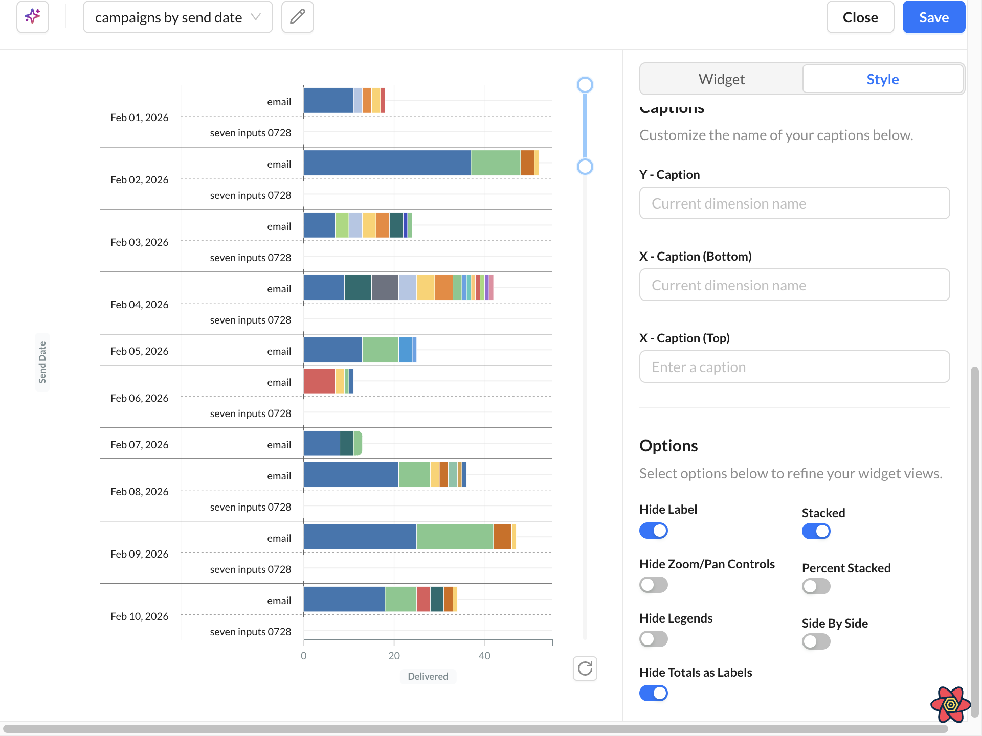
|
Caption |
Optional text displayed directly inside the chart area. |
|---|---|
|
Show Data Labels |
Displays numeric values directly on bars, points, or chart segments. |
|
Show Legend |
Displays the chart legend. When Color By Dimension is active, the legend reflects the selected color grouping. |
|
Stacked Charts |
Stacked charts combine values to show:
|
|
Percent Stacked |
Converts stacked values into percentages totaling 100%. Useful for: Share analysis, Ratio comparison, Distribution visualization Requires Stacked mode to be enabled. |
|
Side By Side |
Displays grouped bars next to each other for direct comparison. Side-by-side and Stacked modes are mutually exclusive. |
|
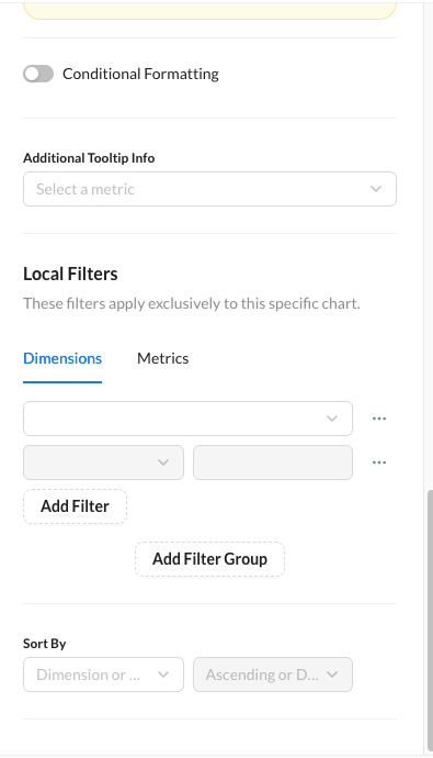
Additional Tooltip Info |
Additional metrics can appear in hover tooltips without being plotted directly. Supported by all chart types except: Big Text, Sparkline, Map, and Sankey |
|
Dimension Filters
|
Filter by dimension values such as: Campaigns, Channels, Regions, Date ranges Supports: Include/exclude logic, Multi-select filtering |
|
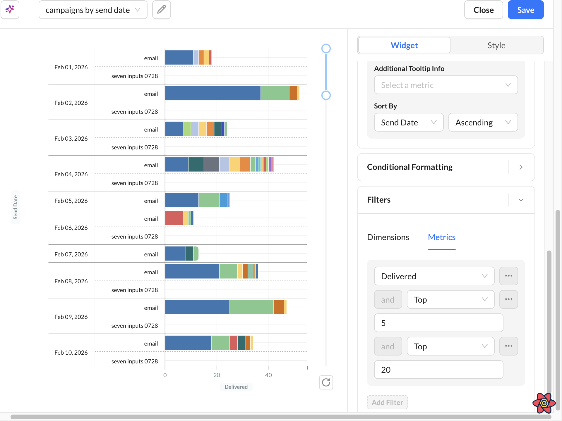
Metrics Filters (Top N / Top M)
|
Top filters limit how many dimension members appear in the chart. Top N Shows the top N values ranked by a metric. Example: Top 20 campaigns by Emails Sent Top M Limits secondary dimensions within each primary grouping. Example: Top 5 channels within each campaign Top filters are applied independently per dimension. Example:
These are not combined into a global Top 25. |
Width and Height Options
Width: Small, Medium, Large, Full
Height: Small, Medium, Large
Sorting Options
Charts can be sorted by:
-
Metric value (ascending or descending)
-
Dimension label (A–Z or Z–A)
-
Original data source order
Conditional Formatting
Learn More: Conditional Formatting
Best Practices
Keep Charts Readable
Avoid excessive dimensions and high-cardinality groupings. Recommended:
-
Use Top N filters
-
Limit unnecessary dimensions
-
Use Large height for dense charts
-
Use legends strategically