
Map Widgets help visualize geographic data directly within reports and dashboards. They allow you to display metrics across locations using interactive maps, making it easier to identify regional trends, compare performance, and analyze geographic distribution.
Map Widgets support two visualization styles:
-
Bubble Maps
-
Heat Maps
Creating a Map Widget
To create a Map Widget:
1. Open or create a report.
2. Add a new visualization or edit an existing widget.
3. Select Map from the chart types.
4. Choose your data source and date range.
5. Configure geographic dimensions and metrics.
-20260415-054249.gif)
Your dataset should include:
-
At least one metric
-
Geographic data such as:
-
Country
-
State/Region
-
City
-
DMA
-
Latitude/Longitude fields
-
Choosing a Map Type
Bubble Map
Bubble Maps display values as circles positioned on geographic locations.
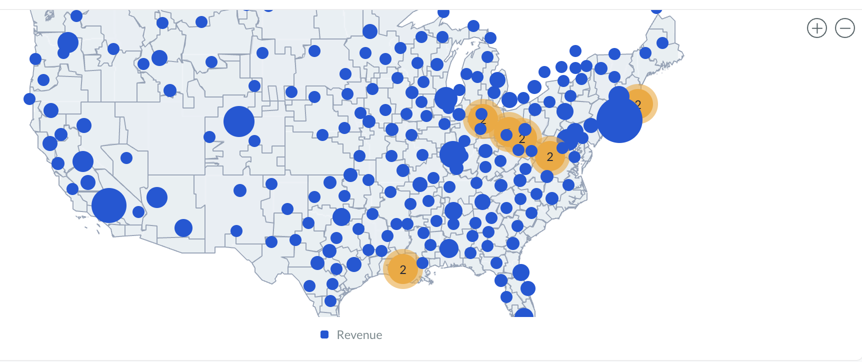
Bubble size reflects the metric value, helping compare performance across regions.
Best used for:
-
Comparing values by location
-
Highlighting high-volume areas
-
Visualizing point-based data
Heat Map
Heat Maps shade geographic regions based on metric intensity.
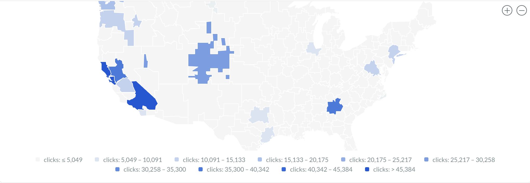
Darker or stronger colors represent higher values.
Best used for:
-
Regional performance analysis
-
Density visualization
-
Geographic trend comparisons
Geography Levels
Map Widgets support multiple geography levels depending on your data.
|
Geography Level |
Example Use |
|---|---|
|
Country |
Global reporting |
|
State / Region |
Regional analysis |
|
City |
City-level performance |
|
DMA |
Media market reporting |
|
Latitude |
North-South positioning for precise mapping |
|
Longitude |
East-West positioning for precise mapping |
Select the geography level that matches your dataset structure for the most accurate visualization.
Configuring Map Widgets
Map Widgets typically require:
|
Setting |
Description |
|---|---|
|
Chart Name |
Identifies the visualization |
|
Map Type |
Bubble or Heat Map |
|
Geography Level |
Defines map granularity |
|
Country / Region |
Defines the map area |
|
Metric |
Determines bubble size or color intensity |
You can also apply:
-
Local Filters
-
Filter Groups
-
Additional dimensions and metrics
Styling & Colors
Map Widgets support configurable color styling for visual clarity.
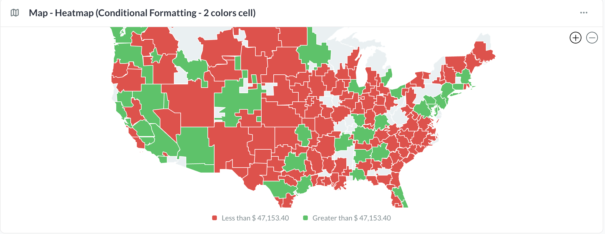
Heat Maps
Map color intensity is based on the selected metric values.
Bubble Maps
Bubble size reflects the selected metric and may also use color styling depending on configuration.
If enabled for your account, Conditional Formatting can be applied to Map Widgets. Learn More.
Viewing & Interacting
Users can interact with Map Widgets directly within reports and dashboards.
Supported interactions include:
-
Pan and zoom
-
Hover tooltips
-
Geographic exploration
-
Metric inspection
Hovering over a region or marker displays the associated metric values and tooltip information.
Best Practices
-
Use consistent geographic naming for accurate matching.
-
Match the geography level to the dataset granularity.
-
Use Bubble Maps for point comparisons.
-
Use Heat Maps for regional intensity analysis.
-
Keep metrics focused for clearer visualization.