
This article provides a comprehensive reference for all available chart types, including:
-
Supported dimensions, metrics, and axis configurations
-
Feature availability (dual-axis, Color By Dimension, stacked modes)
-
Recommended use cases and configuration examples
Use the summary table below for a quick comparison, or refer to the individual chart type sections for detailed configuration guidance.
Available Chart Types
The platform supports several visualization types depending on the analysis required.
|
Chart Type |
Dimensions Supported |
Multiple Metrics |
Dual Axis Support |
Color By Dimension |
|---|---|---|---|---|
|
Column |
1 |
Yes |
Yes |
Yes |
|
Line |
1 |
Yes |
Yes |
Yes |
|
Area |
1 |
Yes |
Yes |
Yes |
|
Horizontal Bar |
Up to 3 |
Yes |
Yes |
Yes |
|
MultiSeries |
Up to 3 |
Yes |
Yes |
Yes |
|
Combo |
1 |
Yes |
Yes |
No |
|
Pie / Donut |
1 |
No |
No |
No |
|
Radar |
1 |
No |
No |
No |
|
Sparkline / Big Text |
None |
No |
No |
No |
|
Map |
Geo fields only |
Limited |
No |
No |
Chart Type Details
Table Chart
Table Chart
Table charts display report data in a row-and-column format, making them useful for detailed review, validation, and side-by-side metric comparisons.
-20250829-140617.gif)
Supported Features
-
Row-and-column layout for metrics and dimensions
-
Dynamic Calculations in Chart Options for % of Total and % Change
Dynamic Calculations
On a table widget, use Chart Options → Dynamic Calculations to add % of total or % change columns without changing the dataset or writing SQL. This is available on table visualizations only, not on charts such as column or line.
You need at least one metric selected. Turning the toggle on creates a first rule with a metric, Calculation % of Total, and Compute Using Table Down.
1. Open a table widget and select at least one metric.
2. In Chart Options, turn on Dynamic Calculations.
3. For each rule, choose the metric, the calculation, and how to compute it.
|
Setting |
Options |
Use when |
|---|---|---|
|
Calculation |
% of Total or % Change |
% of Total shows share of a row or column. % Change compares a cell to another cell. |
|
Compute Using |
Table Down or Table Across |
Table Down uses the column (for example, Sent as % of column total). Table Across uses the row. |
|
Relative To |
Previous, Next, First, or Last |
Appears only for % Change. Previous or Next compare adjacent cells; First or Last compare to the first or last visible value in that direction. |
Rules are saved with the widget. Example: Sent with % of Total and Table Down adds a column such as Sent % of Column Total, formatted as a percentage. % Change vs Previous leaves the first row blank; vs Next leaves the last row blank.
-
If Display Totals is on, the totals row stays blank for derived columns. Base metric totals stay correct.
-
Derived columns are not used for table sort. Sorting one falls back to the first dimension.
-
In pivot mode, derived columns still appear, aggregate as average, and are not sortable.
Dynamic Calculations are not Calculated Fields. Calculated Fields live under Variables and change which metric or dimension a widget uses. Dynamic Calculations add derived columns on the table output. See Calculated Fields.
Line Chart
Line Chart
Line charts visualize trends and changes over time.
-20250829-140922.gif)
Supported Features
-
One dimension on the X-Axis
-
Multiple metrics on Y-Axis 1 when using a single axis
-
Optional dual-axis mode
-
Color By Dimension support
Line charts support two mutually exclusive modes:
Multi-Metric Mode
-
Multiple metrics can be added to Y-Axis 1
-
All metrics must share the same scale or format
-
Secondary axis is unavailable
Dual-Axis Mode
-
One metric on Y-Axis 1
-
One metric on Y-Axis 2
-
Useful when metrics use different scales
Example:
-
Emails Sent on Y-Axis 1
-
Open Rate on Y-Axis 2
Column Chart
Column Chart
Column charts display vertical bars and are ideal for comparing values across categories.
-20250901-053459.gif)
Supported Features
-
One dimension on the X-Axis
-
Primary metric on Y-Axis 1
-
Optional secondary metric on Y-Axis 2
-
Color By Dimension support
-
Stacked and side-by-side display modes
Bar Chart
Horizontal Bar Chart
Horizontal bar charts are optimized for comparing categories with long labels or multiple dimensions.
-20250901-061859.gif)
Supported Features
-
Up to 3 dimensions on the Y-Axis
-
Primary metric on X-Axis 1
-
Optional secondary metric on X-Axis 2
-
Color By Dimension support
-
Stacked and side-by-side display modes
Multi-Dimensional Behavior
Horizontal Bar charts are one of the two chart types that support multiple dimensions.
Example:
|
Axis |
Example |
|---|---|
|
X-Axis 1 |
Emails Sent |
|
Y-Axis Primary Dimension |
Campaign Name |
|
Y-Axis Secondary Dimension |
Channel Name |
Pie and Donut Charts
Pie and Donut Charts
Pie and Donut charts visualize proportional relationships.
When Show Data Labels is on, use Show Percentage Labels in Style to switch slice labels between counts and percentages. Inside labels stay in percentage mode.
-20250901-062317.gif)
-20250901-063101.gif)
Supported Features
-
One metric
-
One dimension
-
Show Data Labels can display counts or percentages
Radar Chart
Radar Chart
Radar charts compare a single metric across multiple categories.
-20250901-063338.gif?cb=3336babcd83774489dffe40b1847d703)
Supported Features
-
One metric
-
One dimension
Combo Chart
Combo Chart
Combo charts combine bar and line visualizations within the same chart.
-20250901-063658.gif)
Supported Features
-
Multiple bar metrics
-
Up to 5 line metrics
-
One dimension only
Axis Behavior
|
Axis |
Usage |
|---|---|
|
Primary Axis |
Bar metrics |
|
Secondary Axis |
Line metrics |
Area Chart
Area Chart
Area charts are similar to line charts but fill the area beneath the line to emphasize volume and magnitude.
-20250901-063759.gif?cb=c2474eee2ece7069158b16de6fb5b207)
Supported Features
-
Same configuration behavior as Line charts
-
Multi-metric mode
-
Dual-axis mode
-
Stacked visualization support
Multiseries Chart
MultiSeries Chart
MultiSeries charts support multiple dimensions on the X-axis and are designed for advanced comparative analysis.
-20250901-063910.gif)
Supported Features
-
Up to 3 dimensions on the X-Axis
-
Primary and secondary metrics
-
Color By Dimension support
-
Stacked display options
Example Configuration
|
Setting |
Example |
|---|---|
|
Y-Axis 1 |
Revenue |
|
X-Axis Primary Dimension |
Campaign Name |
|
X-Axis Secondary Dimension |
Channel Name |
|
Stacked |
Enabled |
Some legacy implementations require exactly 2 dimensions for Color By Dimension behavior.
Sparkline and Big Text Charts
Sparkline and Big Text
These widgets display simplified KPI summaries.
-20250901-093128%20(1).gif?cb=3bdc2f2a8a5af129e1ed351f97ee53c2)
-20250901-091728%20(1).gif)
Supported Features
-
Single metric
-
Minimal configuration
Sankey
Sankey
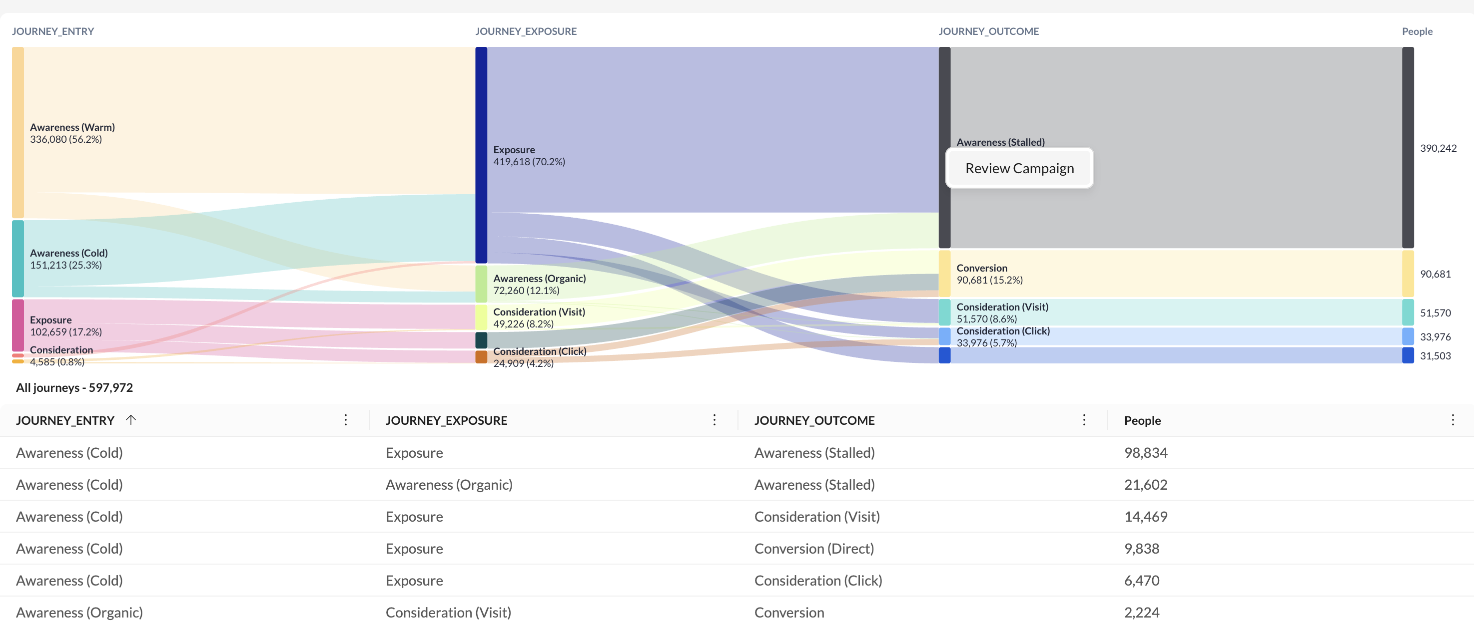
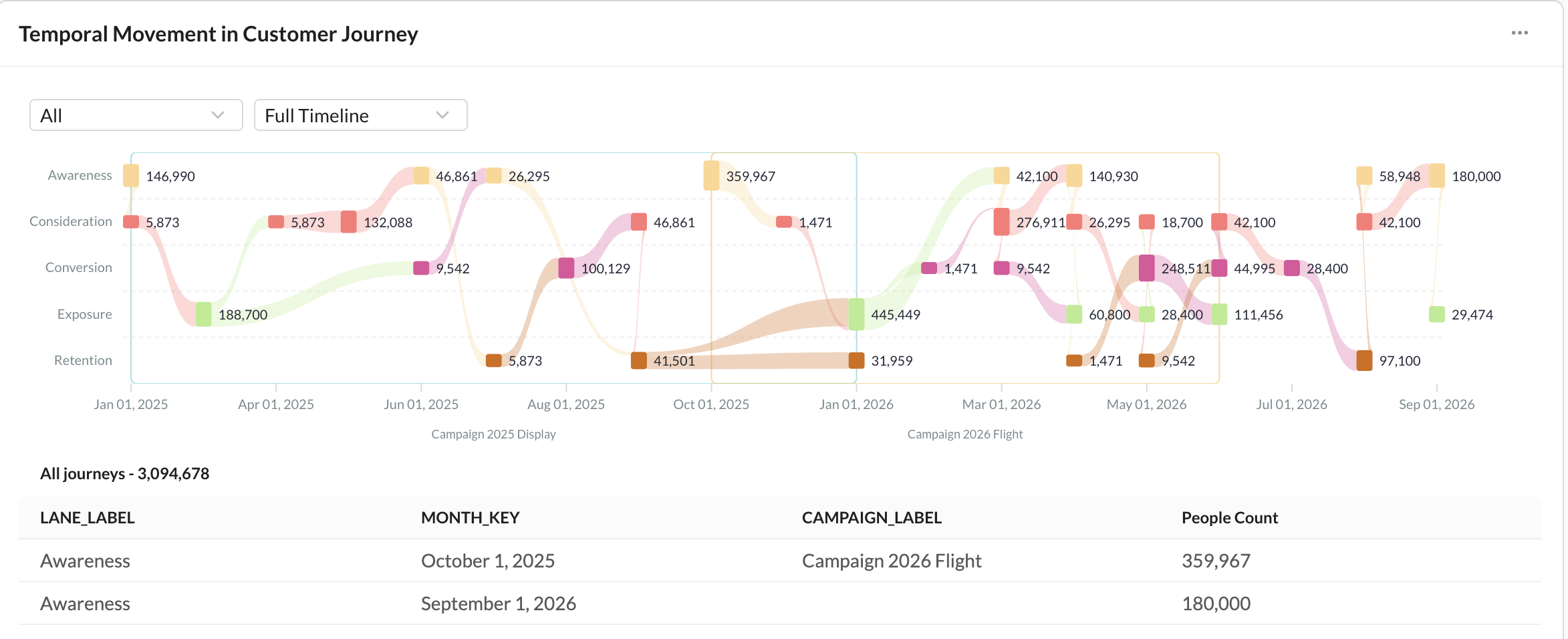
Sankey charts visualize how volume flows across ordered stages. Use them to see how customers, behaviors, or outcomes connect — for example, channel pathways, multi-touch attribution, or a customer journey.
-20260924-061322.gif)
Supported Features
-
Two modes: Summary and Temporal
-
One metric that drives flow width (for example, Conversions)
-
Summary: up to 5 ordered dimensions, shown left to right as stages
-
Temporal: one journey dimension, a required date dimension, and an optional secondary dimension
-
Optional data table under the chart on dashboard widgets
|
Mode |
Use when |
Setup |
|---|---|---|
|
Summary |
You want to see how a metric distributes across ordered stages, such as channel → campaign → conversion. |
Select one metric and up to 5 dimensions in journey order. Dimensions must also be selected in the report Dimensions panel. |
|
||
|
Temporal |
You want to see the same journey over time. |
Select one journey dimension, a date dimension, and a time split (Years, Half years, Quarters, Months, Weeks, or Days). An optional secondary dimension adds an in-chart filter. |
|
||
Sankey charts do not support Color By Dimension, conditional formatting, or sort controls. New Sankey widgets do not get an automatic Top N filter. Queries are capped at 1,200 rows — add a Top/Bottom N filter or other filters to keep the chart readable.
Switching from Summary to Temporal keeps only the first selected dimension. Blank stage values appear as No value.
Map Chart
Map Charts
Learn More: Map Charts
Map charts visualize geographic data.
-20260415-054249.gif)
Requirements
Requires geographic fields such as:
-
Latitude / Longitude
-
Country
-
State
-
Region
-
ZIP code