
Charts in the Zeta Marketing Platform are highly configurable, allowing you to tailor both the analytical depth and visual presentation of your data. Beyond selecting a chart type, you can control how metrics and dimensions are structured, how colors and legends are applied, and how display options such as stacking, sorting, and conditional formatting shape the final output.
Feature Support Matrix
|
Chart Type |
Secondary Metric |
Multiple Dimensions |
Color By Dimension |
|
Column |
Yes |
No |
Yes |
|
Line |
Yes |
No |
Yes |
|
Area |
Yes |
No |
Yes |
|
Horizontal Bar |
Yes |
Yes |
Yes |
|
MultiSeries |
Yes |
Yes |
Yes |
|
Combo |
Yes |
No |
Yes |
|
Pie / Donut |
No |
No |
Yes |
|
Radar |
No |
No |
Yes |
|
Sparkline / Big Text |
No |
No |
Yes |
|
Map |
Limited |
No |
Yes |
|
Sankey |
No |
Yes (Summary) |
No |
Metrics, Dimensions, and Axes
Learn More: Metrics & Dimensions Dictionary
Metrics
Primary Metric
The main measure that is visualized in the chart. Examples: Emails Sent, Opens, Revenue, Click Rate
Secondary Metric
Supported chart types: Column, Line, Area, Horizontal Bar, MultiSeries, Combo
Enabling a secondary metric disables Color By Dimension for supported chart types.
Dimensions
Dimensions define how data is grouped. Examples: Campaign Name, Send Date, Channel Name, Region
Single-Dimension Charts
Supported by: Column, Line, Area, Combo, Pie, Donut, Radar, Sparkline, Sankey Temporal.
Multi-Dimensional Charts
Supported by: Horizontal Bar, MultiSeries, and Sankey (Summary mode, up to 5 dimensions)
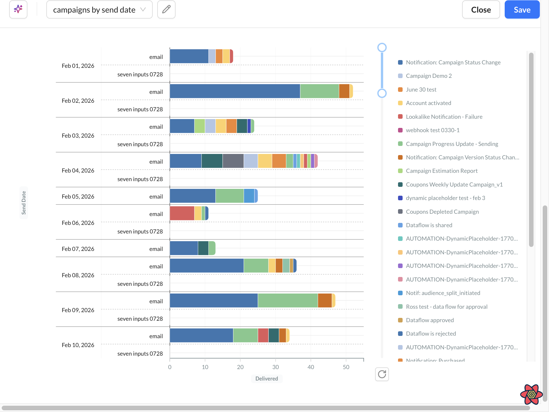
Dimension Limits
|
Configuration |
Max Dimensions |
|
Without Color By Dimension |
3 |
|
With Color By Dimension |
2 |
Each added dimension multiplies the number of rendered series. Example: 30 dates × 3 channels = 90 data rows
Use: Top N filters, Height: Large, Focused dimensions to improve readability.
Axes
The axis configuration changes depending on whether the chart is vertical or horizontal.
|
Configuration |
Vertical Charts |
Horizontal Bar |
|
Dimension Axis |
X-Axis |
Y-Axis |
|
Primary Metric Axis |
Y-Axis 1 |
X-Axis 1 |
|
Secondary Metric Axis |
Y-Axis 2 |
X-Axis 2 |
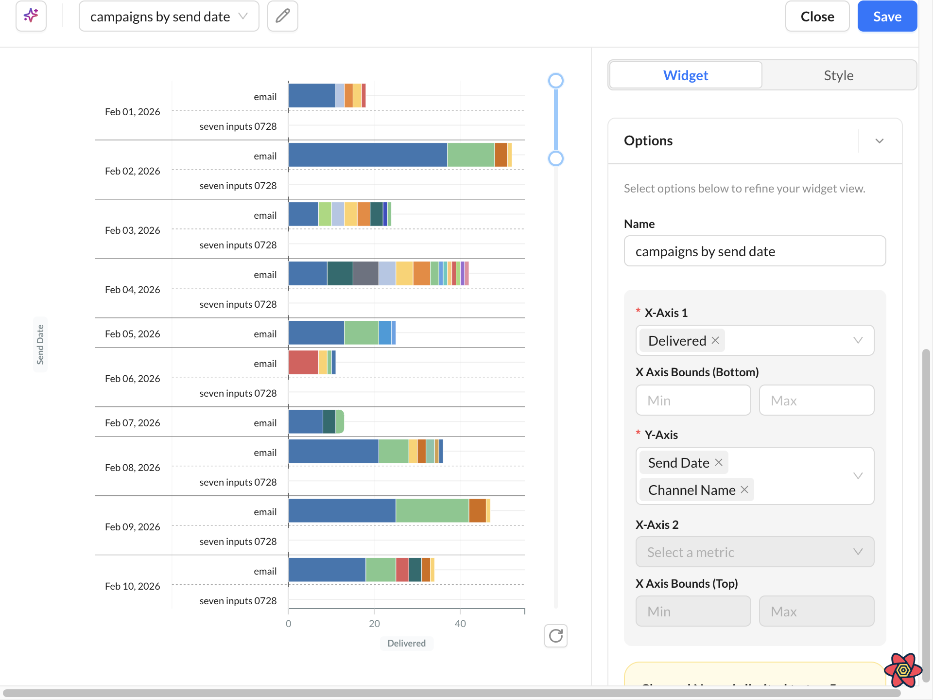
Color By Dimension
Color By Dimension controls which dimension determines the legend colors.
Supported chart types: Column, Line, Area, Horizontal Bar, MultiSeries.
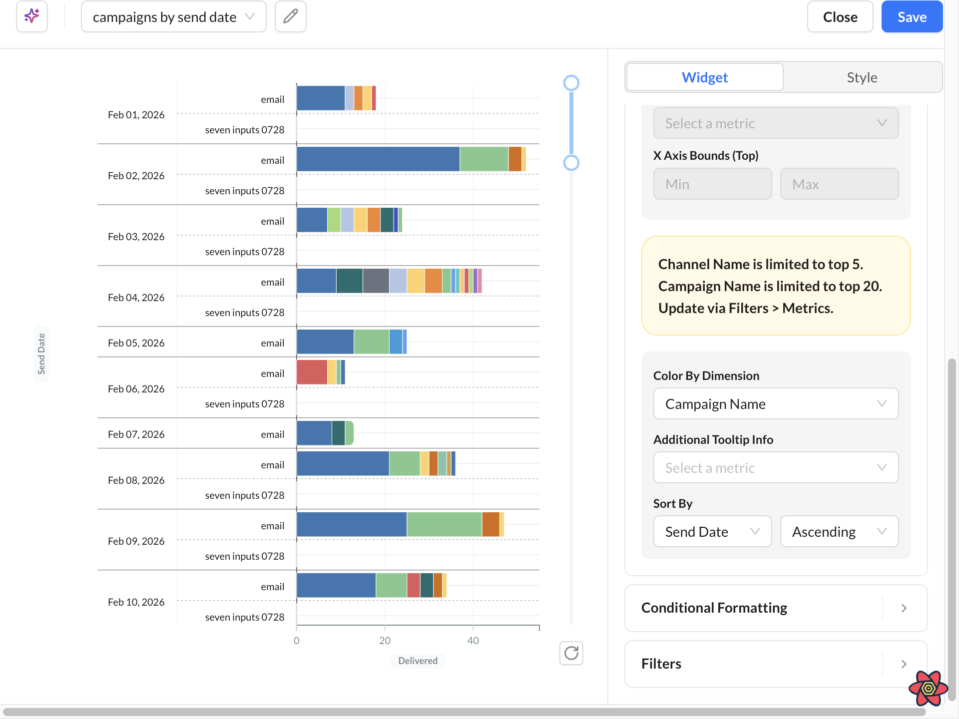
Color By Dimension is automatically disabled when:
-
Conditional Formatting is enabled
-
A secondary metric is configured
-
Horizontal Bar uses more than 2 dimensions
-
Horizontal Bar uses a secondary metric
-
MultiSeries dimension requirements are not met
Style and Display Options
Use Style and Display Options after metrics and dimensions are set. These controls do not change the underlying query. They change how the chart presents the result: labels, grouping, hover detail, filters, size, and sort order.
Chart tooltips
Hover a chart to inspect values without changing the query. Tooltips are designed for faster reading on reports and dashboards:
-
Easier targeting: On bar and column charts, hover anywhere in the column — you do not need to hit the filled bar. On line charts, the tooltip snaps to the nearest x-axis value as you move the cursor.
-
Clearer comparison: Multi-series charts show values for the series at the selected point (up to 10 metrics). The hovered series stays emphasized; other series dim.
-
Consistent numbers: Tooltip values use the same formatting as the chart, including currency, percentages, and thousands separators. Missing values display as No data.
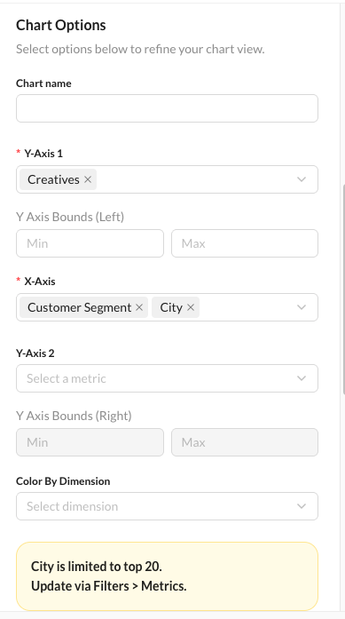
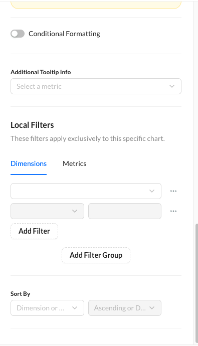
Layout: Stacked vs. Side By Side
Pick one layout based on the question you want the chart to answer. These modes are available on chart types that support stacked or grouped series, such as Column, Horizontal Bar, Area, and MultiSeries.
|
Setting |
Purpose |
Use when |
|---|---|---|
|
Stacked Charts |
Combines values to show total contribution, relative composition, and segment comparison. |
The story is the total and how parts add up. Example: Emails Sent by campaign, stacked by channel. |
|
Percent Stacked |
Converts stacked values into percentages totaling 100%. Requires Stacked mode to be enabled. |
Totals differ and you care about mix, not volume. Example: channel share of sends per campaign. |
|
Side By Side |
Displays grouped bars next to each other for direct comparison. |
Series should be compared at the same point, not combined. Example: Email vs. SMS volume per campaign. |
Side-by-side and Stacked modes are mutually exclusive. Avoid stacking high-cardinality dimensions. If the stack has more than a handful of colors, apply Top N / Top M first.
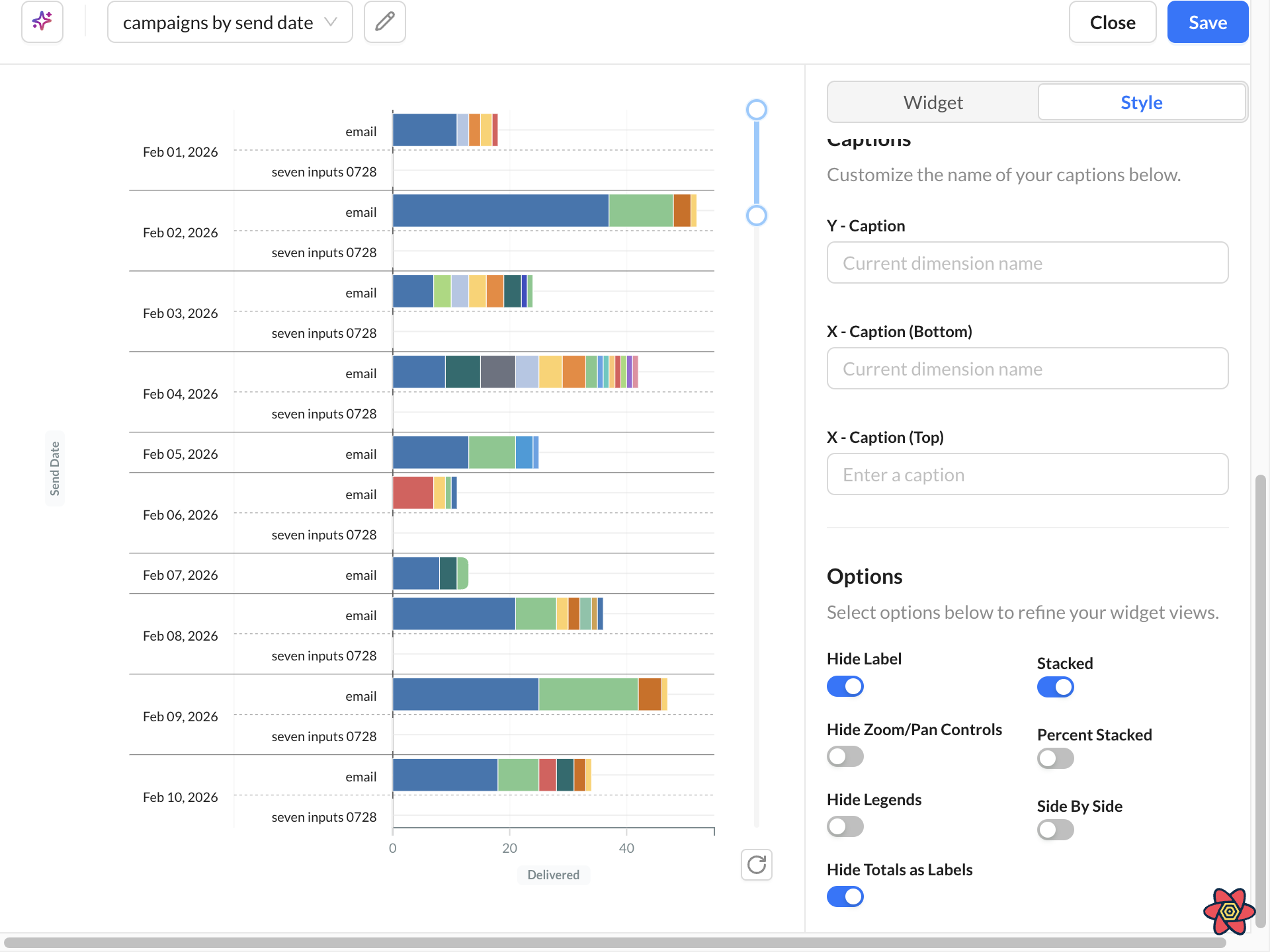
Filters
Reduce what is plotted before you resize the widget. A readable chart usually comes from fewer series, not a larger widget.
|
Setting |
Purpose |
Use when |
|---|---|---|
|
Dimension Filters |
Filter by dimension values such as campaigns, channels, regions, or date ranges. Supports include/exclude logic and multi-select filtering. |
You already know which members belong on the chart and want to hide the rest. |
|
Top N |
Shows the top N values ranked by a metric. Example: Top 20 campaigns by Emails Sent. |
One dimension has too many members, such as a long campaign list. |
|
Top M |
Limits secondary dimensions within each primary grouping. Example: Top 5 channels within each campaign. |
A second dimension creates too many colors or stacked segments inside each group. |
Top filters are applied independently per dimension. Campaign Name = Top 20 and Channel Name = Top 5 is not a global Top 25.
Use filters when the chart looks crowded, legends wrap, or Color By Dimension produces too many colors.
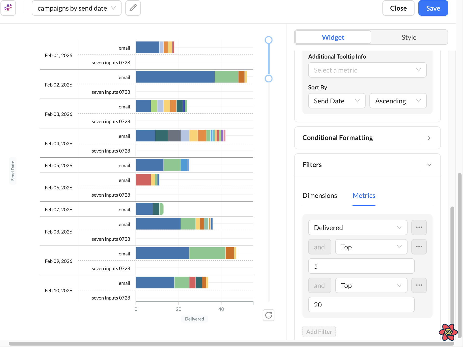
Conditional Formatting
Conditional Formatting uses rule-based color to highlight trends, outliers, and key metrics in charts and tables.
Learn More: Conditional Formatting
Best Practices
Keep Charts Readable
Avoid excessive dimensions and high-cardinality groupings. Recommended:
-
Use Top N filters
-
Limit unnecessary dimensions
-
Use Large height for dense charts
-
Use legends strategically