

Watch use cases and other training examples: Visual Composer Training Videos
For many marketers, it still takes too long to send campaigns, and content production is often the bottleneck. That’s why we’re excited to introduce Visual Composer in the Zeta Marketing Platform (ZMP). It’s our new AI-powered, codeless editor designed to help you generate, personalize, and launch multichannel campaigns faster.
Visual Composer Launchpad
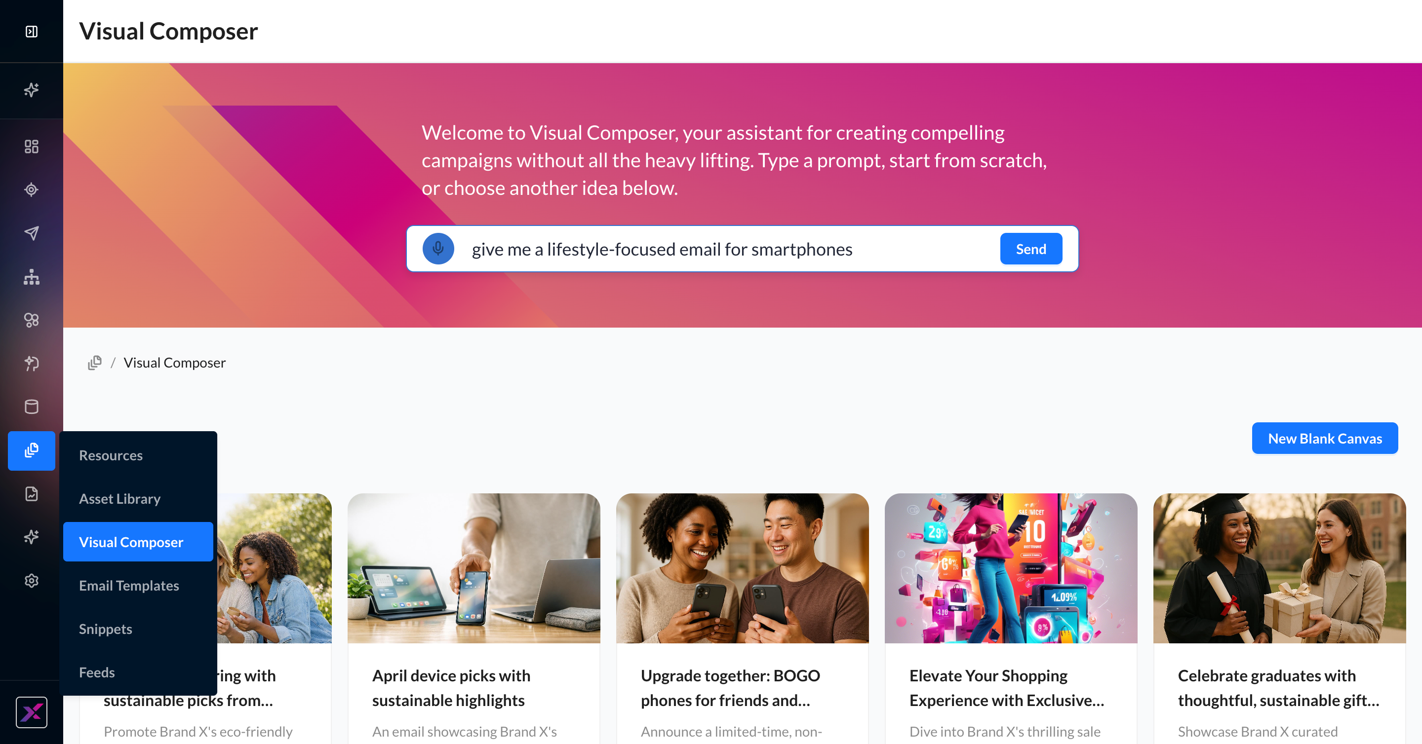
To get started, the Visual Composer launchpad has everything you need to have a fully built email template within a few seconds. You can access this page in three ways:
1. In the main ZMP navigation, find Content > Visual Composer
2. On the Email Templates page, click the button New Template > Visual Composer
3. On a Campaign edit page, click Add/Edit Content > Build in Visual Composer
The Visual Composer launchpad is a mix of AI generation, inspiration, and—if needed—blank canvas creation. Each of these methods will result in a new email template in the Visual Composer, where every change is recorded and auto-saved.
|
New Template Method |
Steps |
Outcome |
|---|---|---|
|
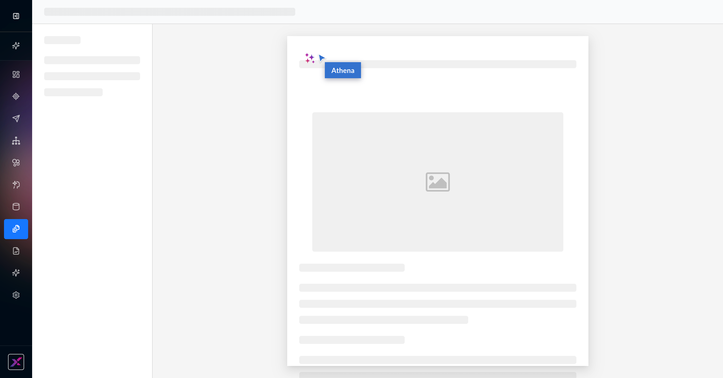
AI Generation Powered by Athena |
Using your keyboard or voice interaction, enter your instructions in the prompt bar at the top of the Visual Composer launchpad. |
Athena will get to work on generating an on-brand email template using your brand’s logo and assets. You will see the elements load as they’re generated. |
|
Campaign Inspiration |
Below the prompt bar, you will see up to 5 tiles of campaign inspiration ideas that are refreshed seasonally. Click on one of them to begin generating a template with your brand in mind. |
Athena will get to work on generating an on-brand email template using the theme of the campaign inspiration tile. You will see the elements load as they’re generated. |
|
Blank Canvas |
Click New Blank Canvas on the Visual Composer launchpad. |
The page will open to a brand new email template with a blank canvas so you can start from scratch completely. All Athena tools and template building blocks are still available to you. |
Converting Existing Templates to Visual Composer
For users with existing templates and campaigns created in Visual Editor and HTML Editor, you can open these items in Visual Composer as a simple, one-time conversion. This is not a reversible action, so if you need to keep the original templates for reference, you can simply duplicate the campaign or template and convert the copy to Visual Composer so you have the same content in two editor types.
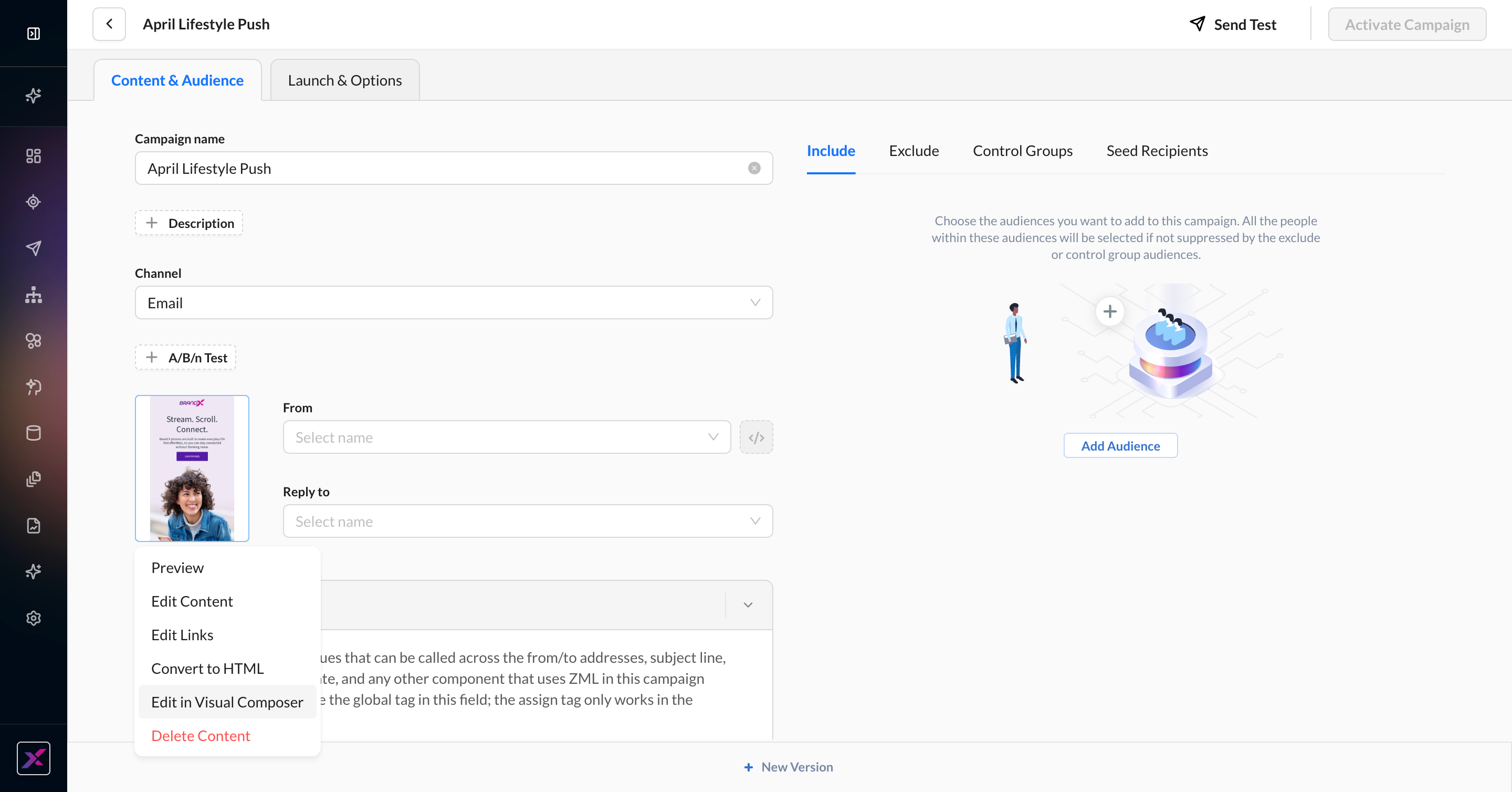
1. On the Email Templates page, click the … menu and find Edit in Visual Composer.
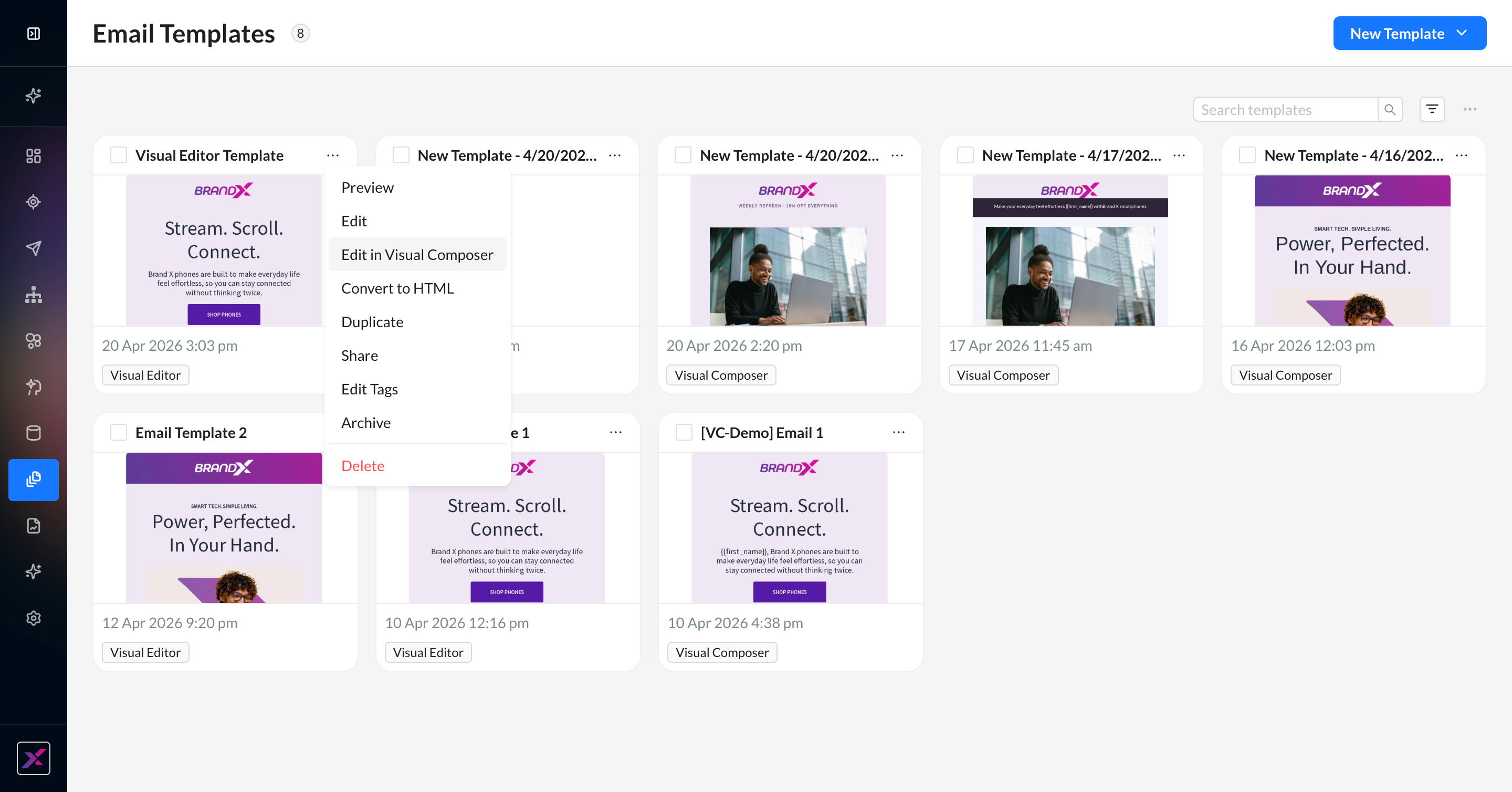
2. Clicking on Edit in Visual Composer will launch a confirmation modal. You cannot convert the template back to the previous editor.
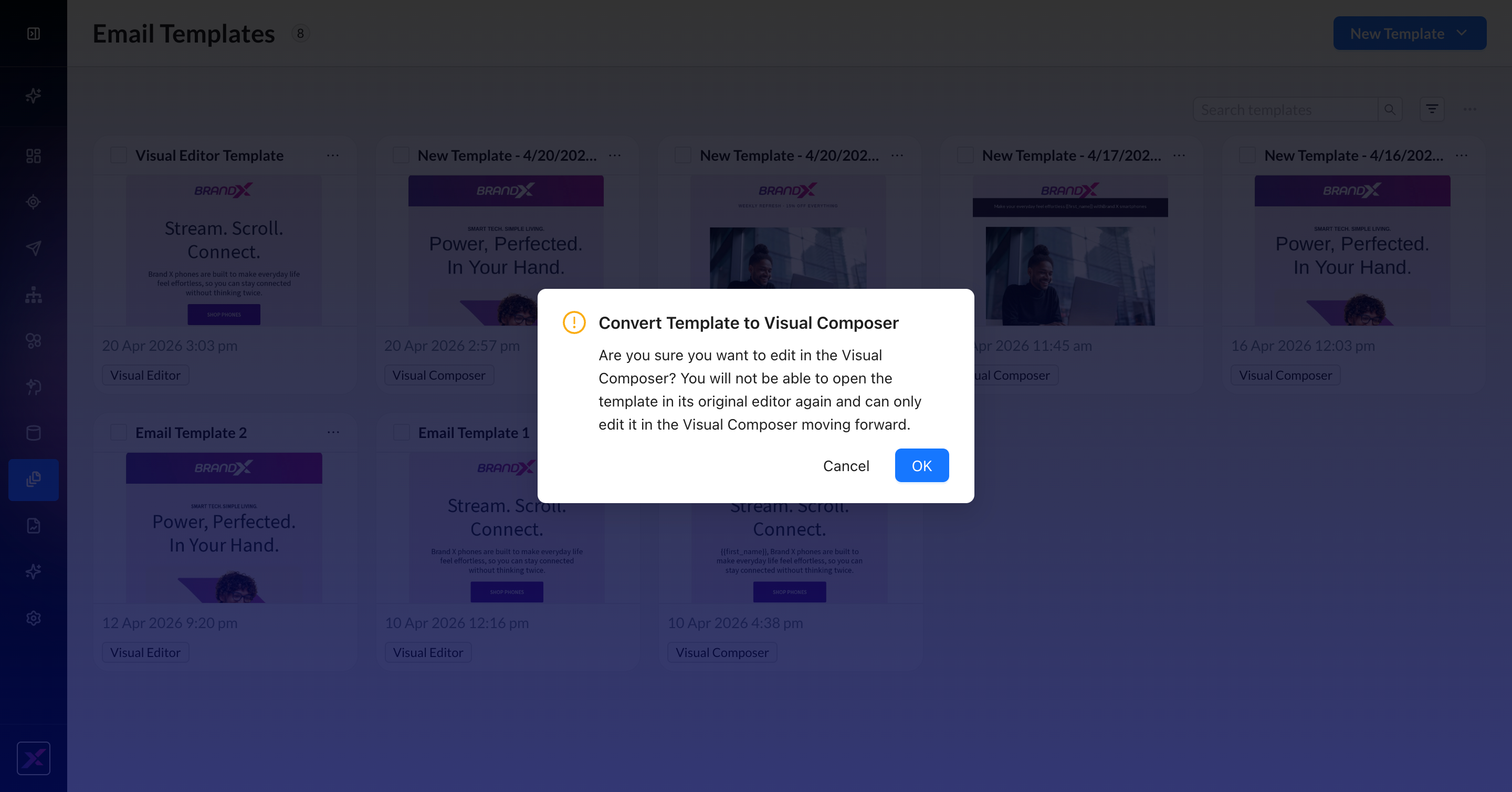
3. Clicking OK will open the template in Visual Composer, where you will have the full power of Athena directly in your workflow without having to rebuild your content.
4. For Campaigns, you can convert an existing messaging template to Visual Composer by clicking the content thumbnail and selecting Edit in Visual Composer to initiate the same process as above.
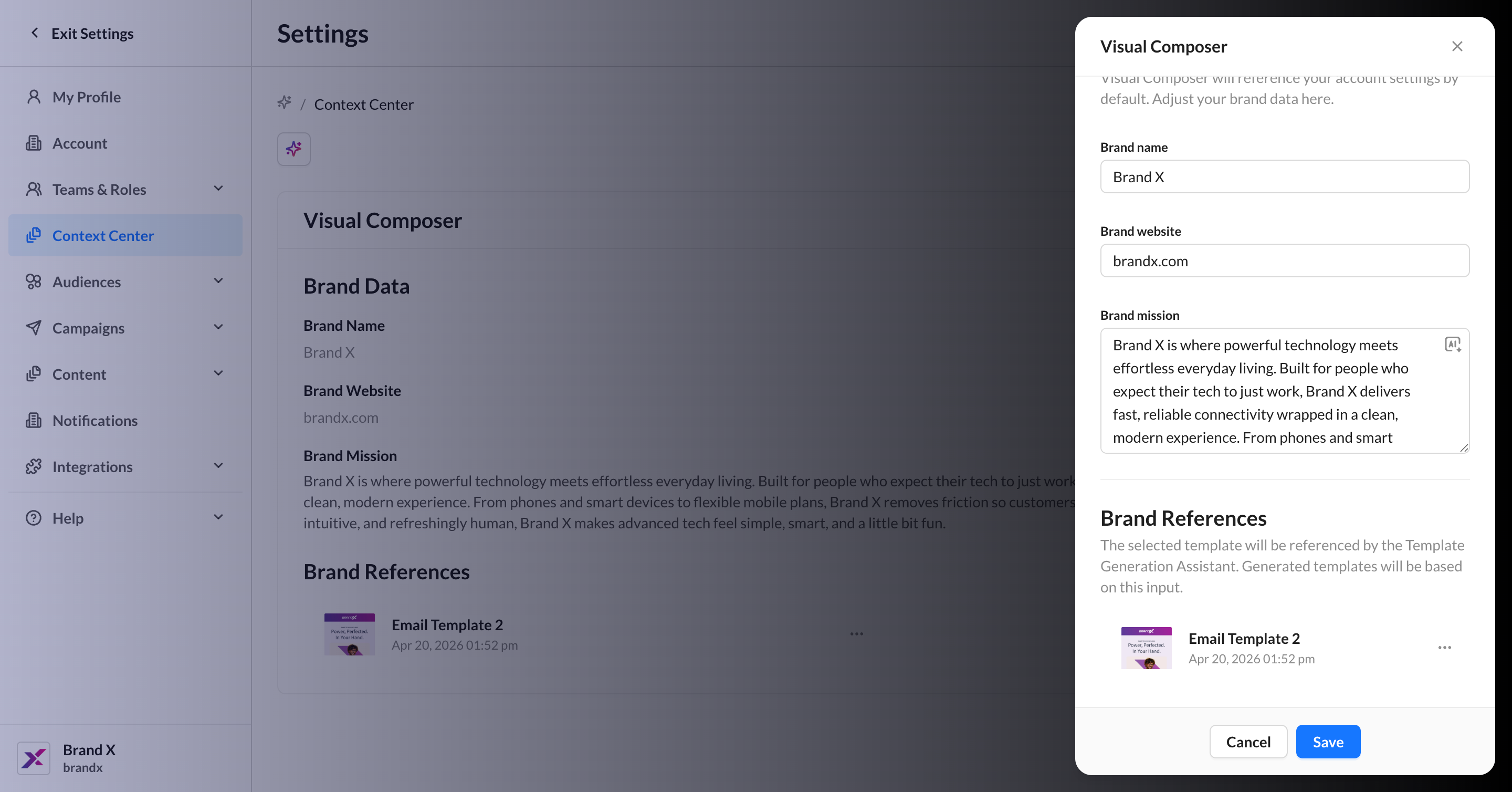
Context Center for Visual Composer
Access to Context Center is currently limited to super users in an account.
When generating templates in Visual Composer, Athena uses Context Center to learn about your brand and ensure templates are generated using the correct brand context for the active account (it doesn’t connect with the family of accounts). By default, your Brand Name and Brand Website are pulled from the name and website listed in the account settings. You can further customize your brand context by adding a Brand Mission and selecting a Brand Reference from your current template library to use as a base layout for all generated templates. Any template in the account—regardless of editor—can be used as a reference template.
Account super users can control these four inputs for Visual Composer by navigating to Settings > Context Center.
Building in Visual Composer
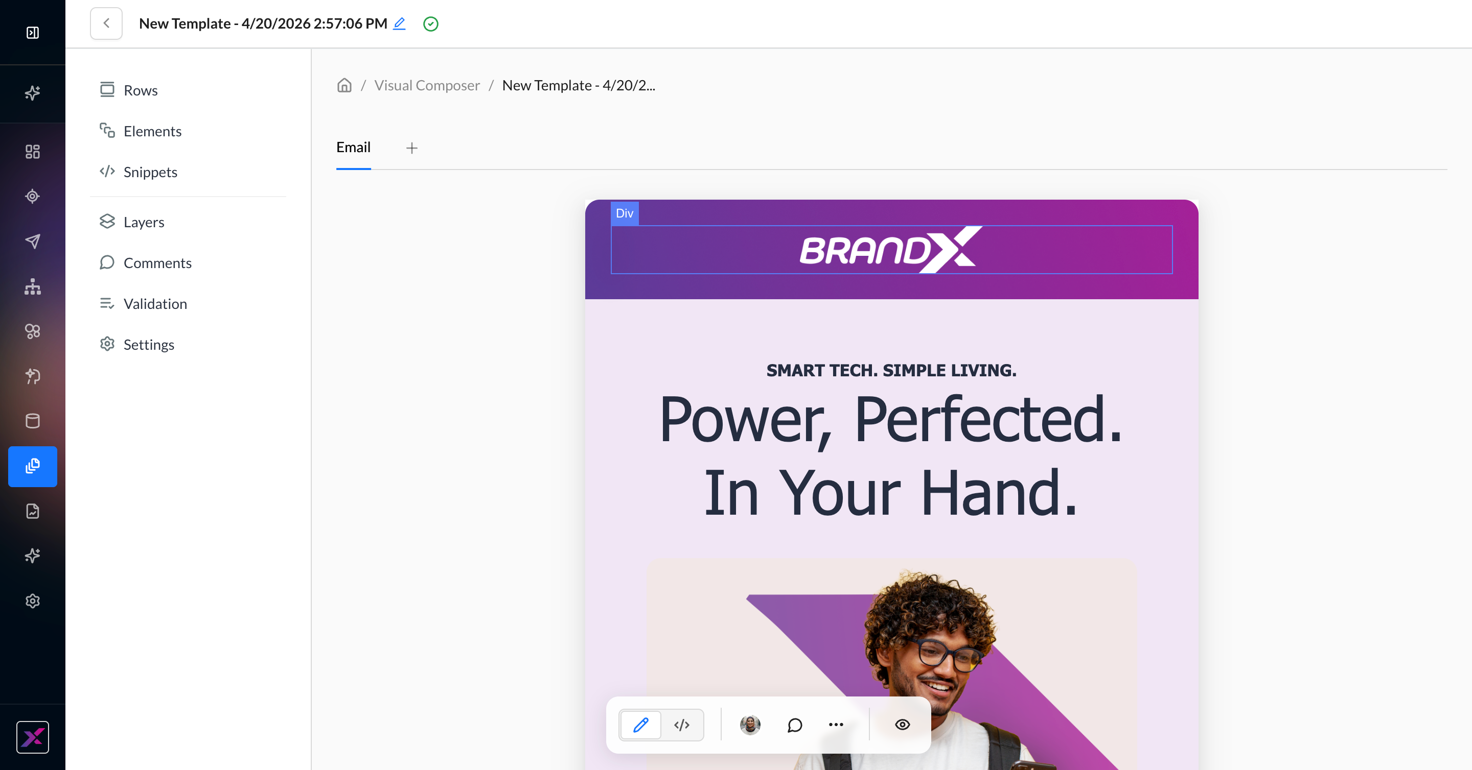
Visual Composer provides standard codeless content blocks to build your email.
Actions Toolbar
When a row or content element is selected, the actions toolbar will transform to instead display the settings for the selected block. To unselect a row or element, click it again.
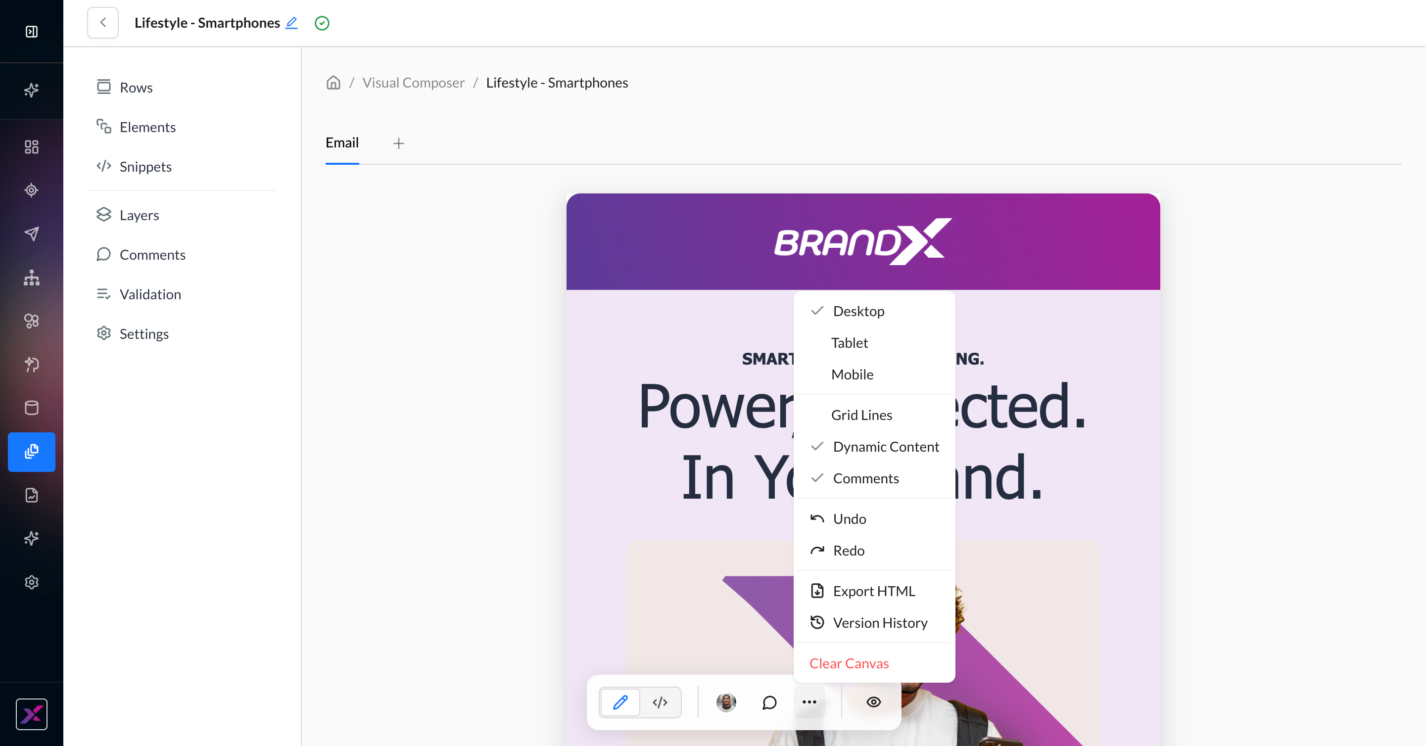
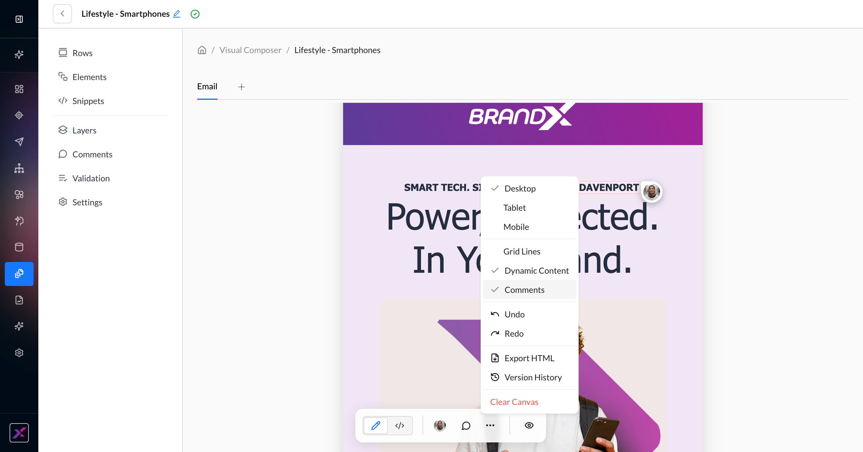
Consistent across builder interfaces in the ZMP, the actions toolbar is your all-in-one companion to building out your template. It contains both new features, like Code Mode and commenting, plus trusted features from existing editors, like version history and export HTML.
|
Toolbar Item |
What It Does |
|---|---|
|
Visual/Code Mode Switcher |
Changes the canvas from fully visual to a view of the raw HTML that you can edit directly. Unlike Visual Editor, you have view and edit access to all parts of the HTML, including the |
|
Collaborators |
A list of icons to denote all users currently viewing the template. Hover on each icon to view the name of your teammate. |
|
Add Comment |
Allows you to place a comment anywhere on the canvas. |
|
|
Select the device size for the canvas |
|
|
Show or hide grid lines, dynamic content, and comments on the canvas.
|
|
|
Undo and redo changes to the canvas. You can also use your operating system’s standard keyboard commands. |
|
|
Export the raw HTML via clipboard or download. You can optionally minify the HTML prior to export. |
|
|
See a full timeline of changes to the canvas to view, compare, or restore older versions. Visual Composer uses auto-save, so these changes use timestamps to the second. |
|
|
Clear the canvas completely to start over from scratch. You can undo this or restore an older version from version history. |
|
Preview |
Click the eye icon to preview your template or campaign. |
Rows
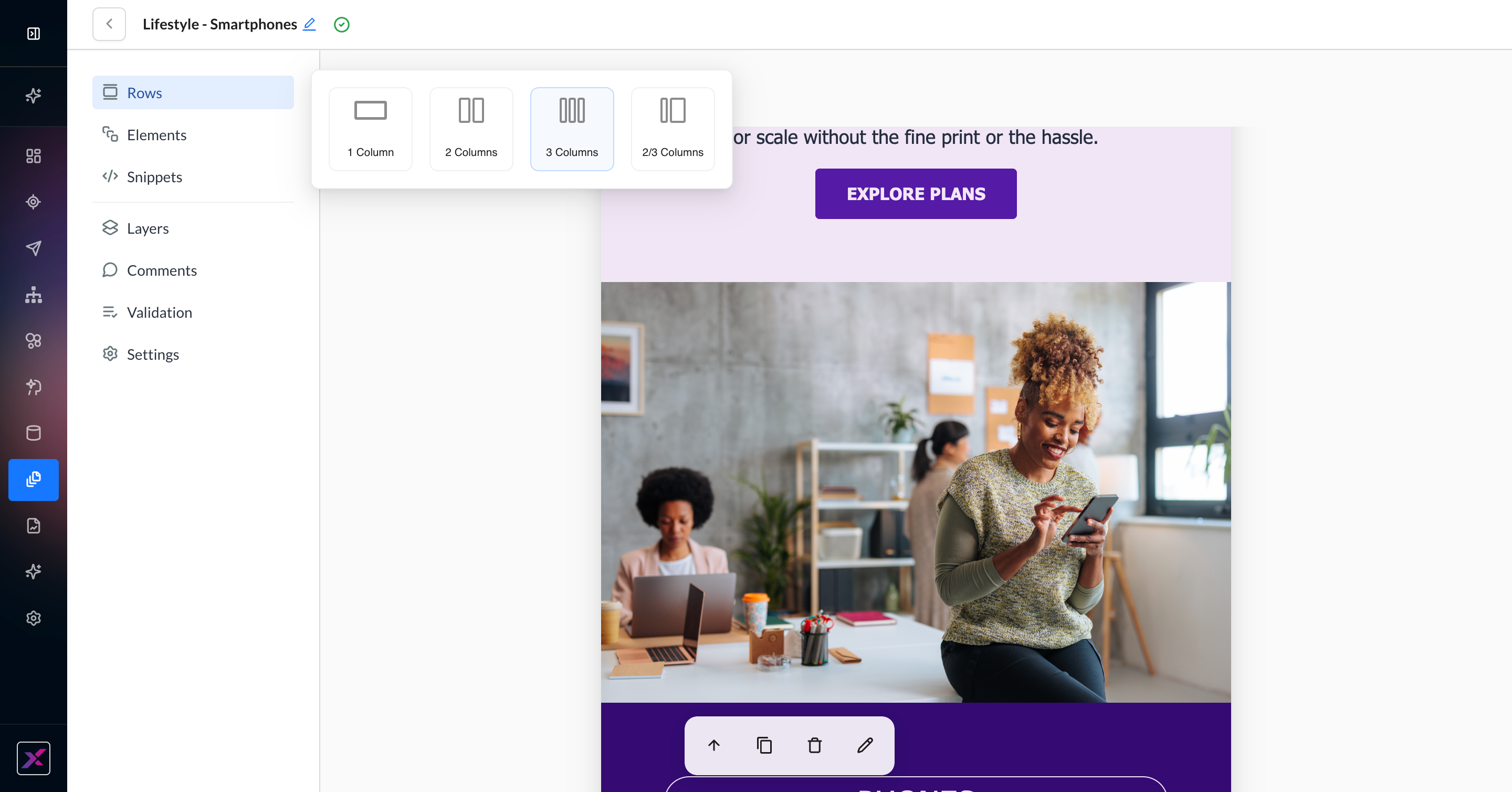
Rows are used to define the general structure of your email, help break up the template, and enhance the flexibility of settings that need to be set for specific parts of the email. You can reorder rows by dragging and dropping them into place on the canvas.
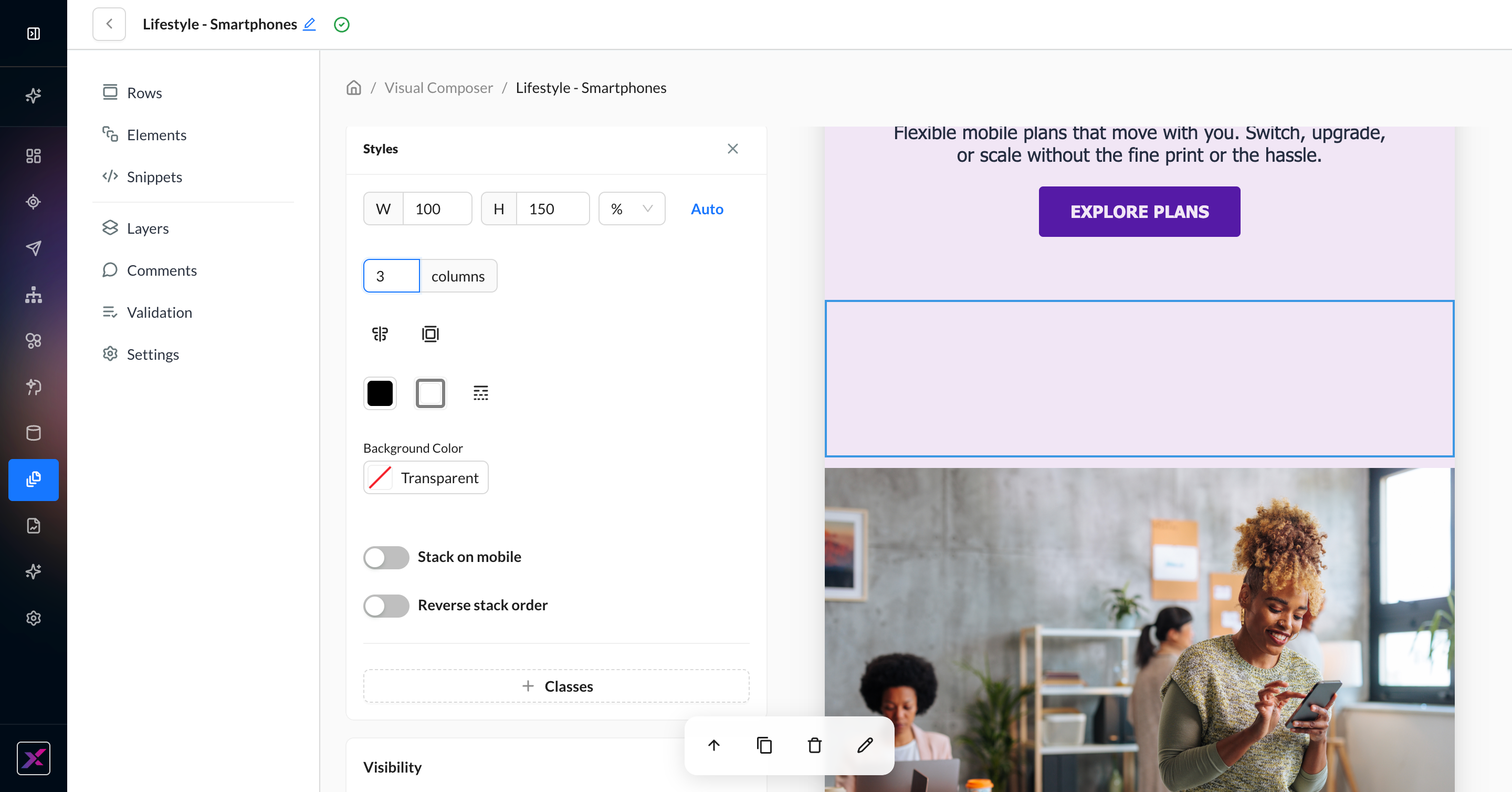
Rows allow up to three columns of content, and in mobile, these columns always stack left above right. Stacking can optionally be disabled, but this may lead to undesirable rendering. Additional row properties are available by clicking on the row outside of the highlighted content area.
When you select a row, the actions toolbar changes to reflect the available actions for a row.
-
Select Parent
-
Duplicate
-
Delete
-
Edit Settings
1. Click Rows, then drag your preferred row size onto the canvas.
2. Open the settings by clicking the pencil icon in the row-specific actions toolbar. Here, you can optionally set columns, size, colors, alignment, and mobile behavior. You can also add customization to classes, such as naming. If you can’t find the row right away, open the layers tree, turn on the grid lines, or click the up arrow to find your parent row.
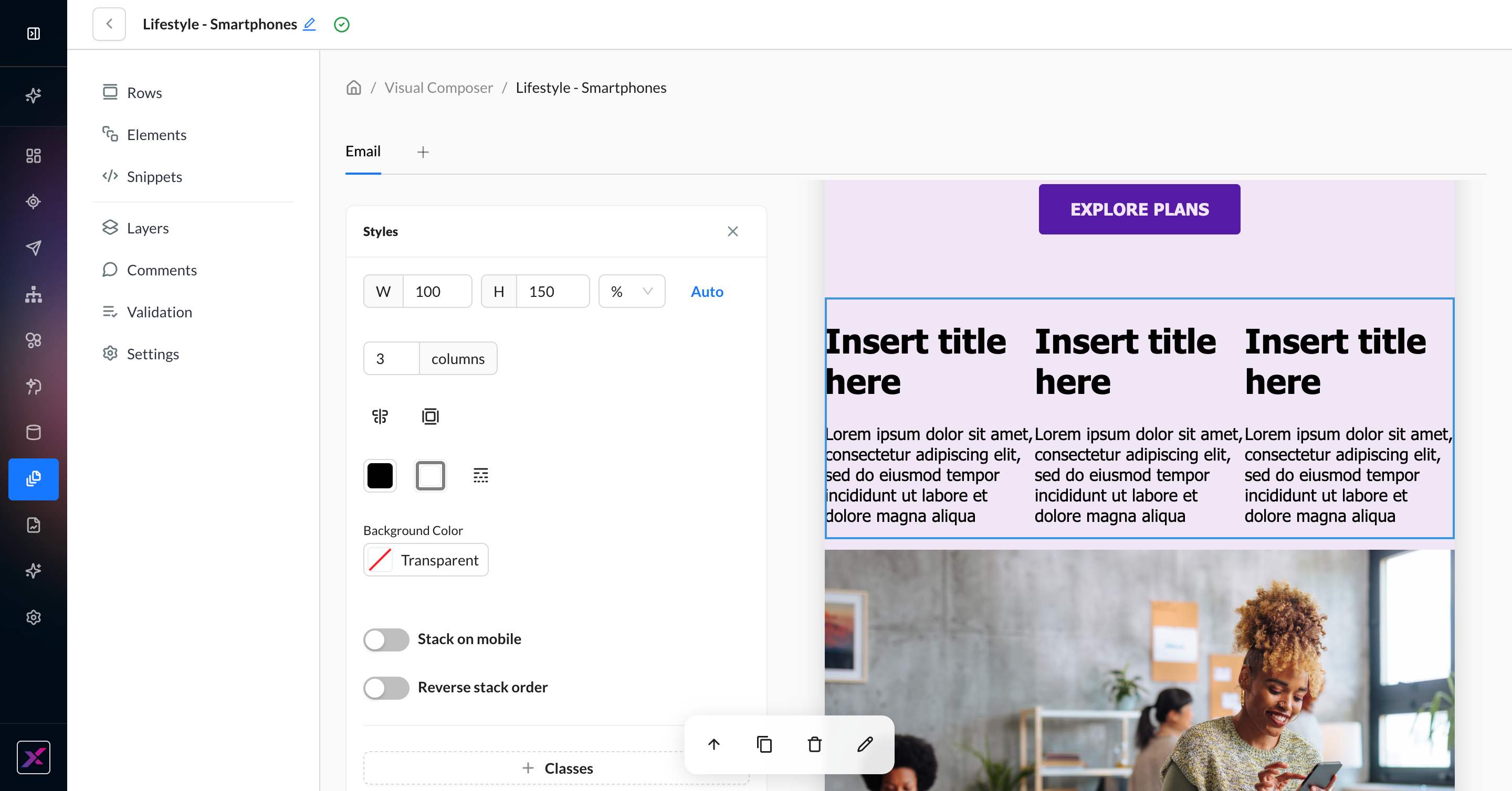
3. Add your elements in their respective columns by clicking Elements and dragging your preferred block into the column.
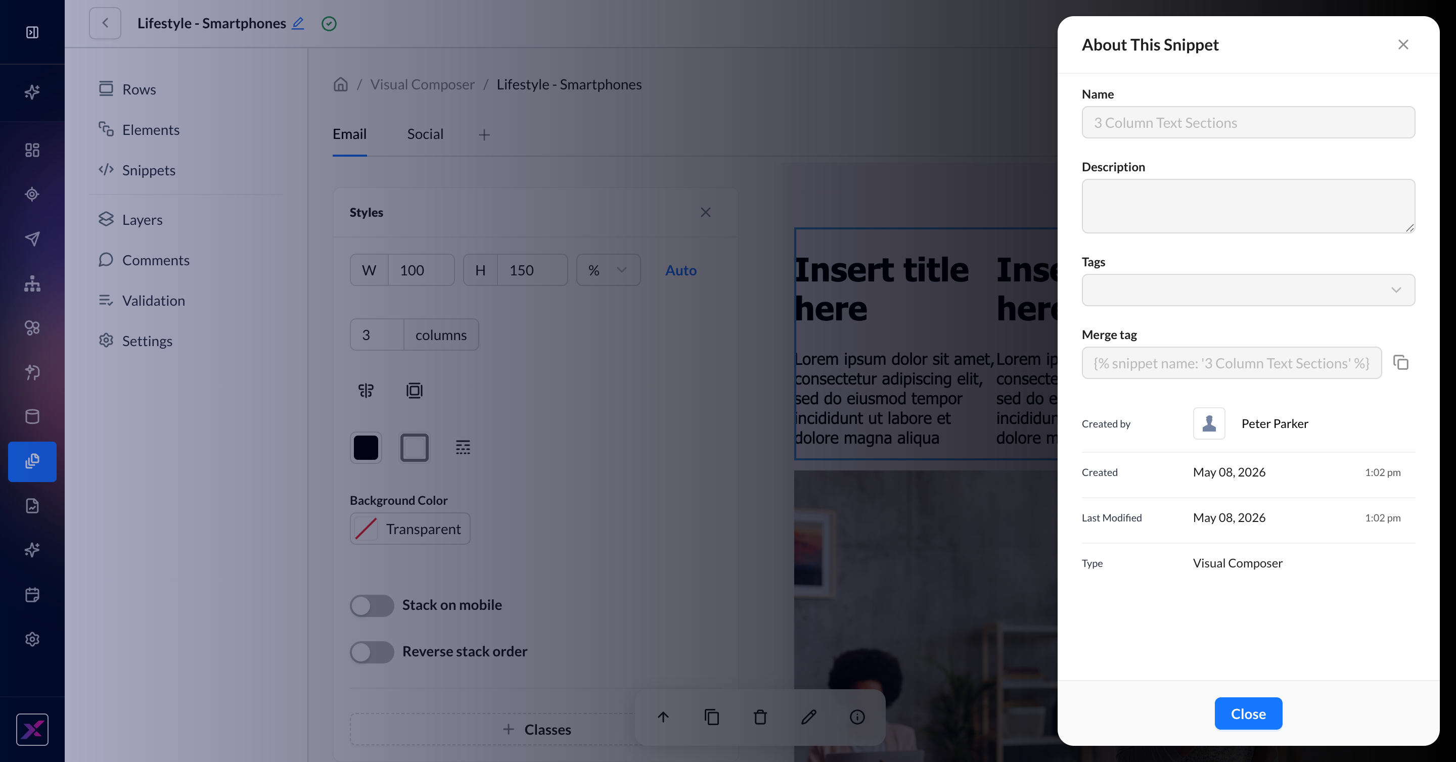
4. To create a snippet from the row, click the + button at the end of the actions toolbar. You will be prompted to name the snippet, and it can be used via a merge tag in other templates and snippets.
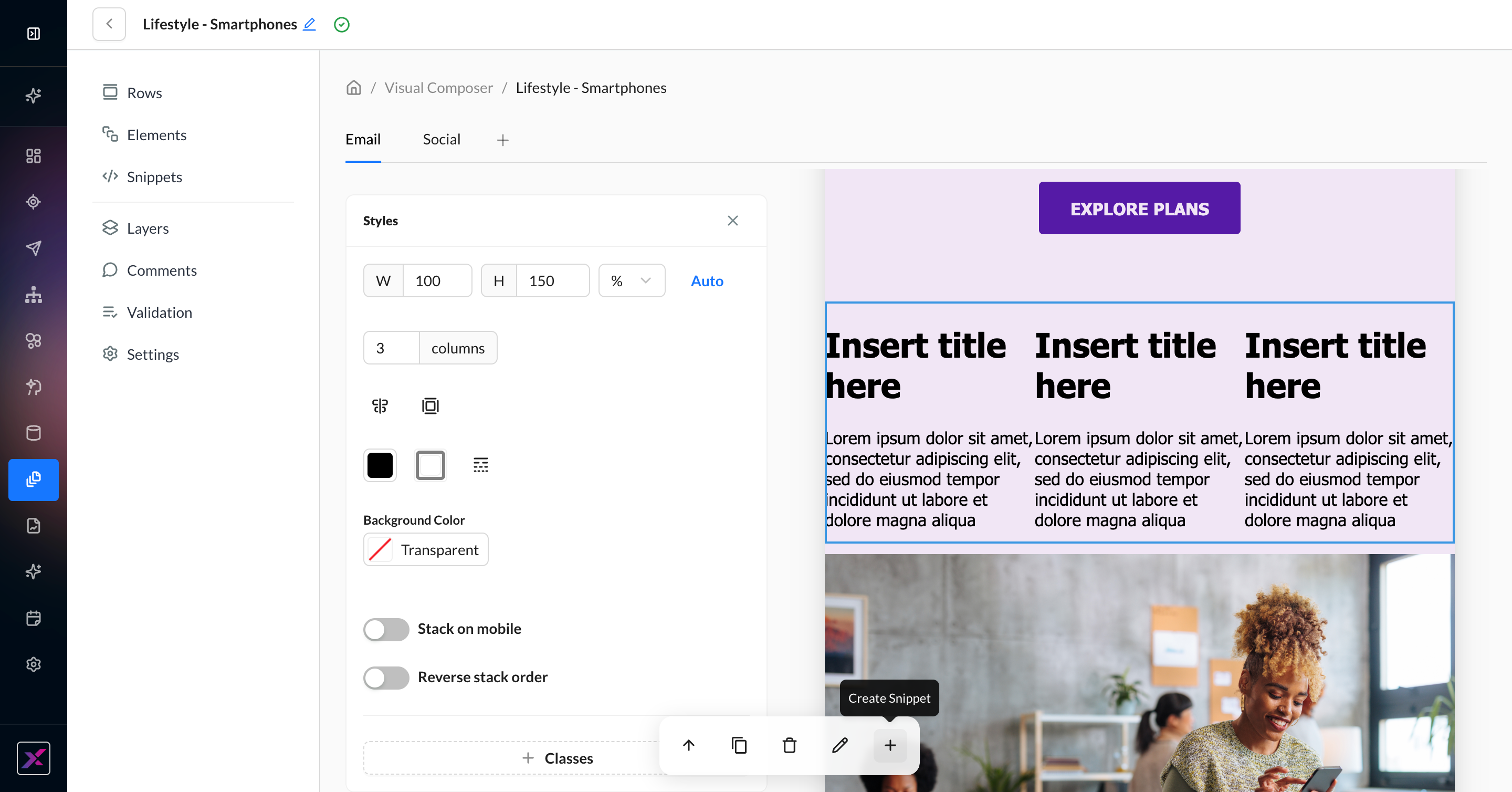
5. Once saved, the + button will be replaced by an info icon to display the newly created snippet’s metadata. You can edit the snippet as a standalone entity by navigating to the Snippets page and opening it in the Visual Composer snippet mode.
Content Elements
To add a content block to your email, click Elements and drag the content element into the appropriate row. To see further options for the content block, click on the pencil icon in the actions toolbar.
When you select a content element, the actions toolbar changes to reflect the available actions for an element. Some elements have more options than these 4 and will be denoted in the table below.
-
Select Parent
-
Duplicate
-
Delete
-
Edit Settings
Each row and content element has an optional classes setting to help you organize your raw HTML and CSS better.
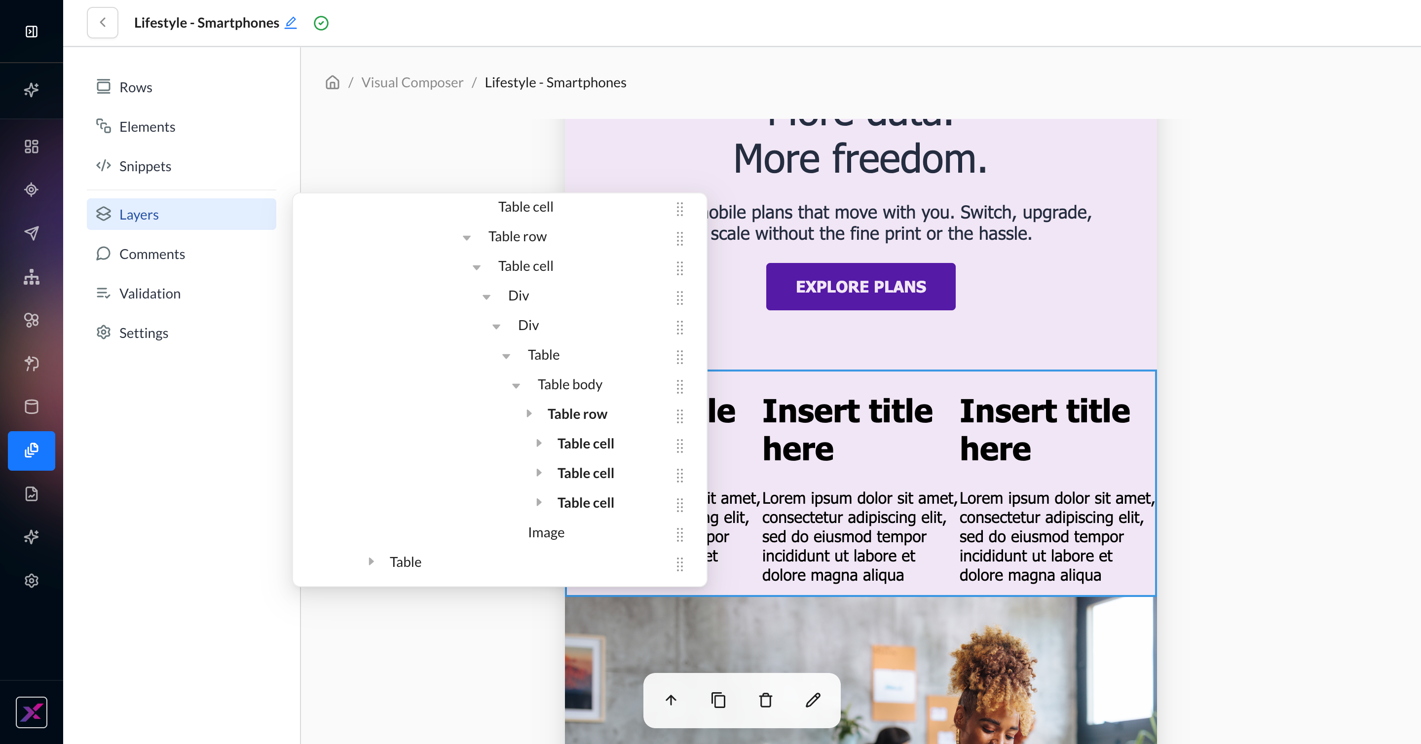
Layers
With many tables, rows, and divs, it can be difficult to get a view of lineage from the canvas itself. The Layers button on the side panel allows you to see a full tree of nested elements. This clickable tree can help you navigate the canvas as well as reorder rows if needed. You can also reorder by dragging and dropping elements on the canvas itself.
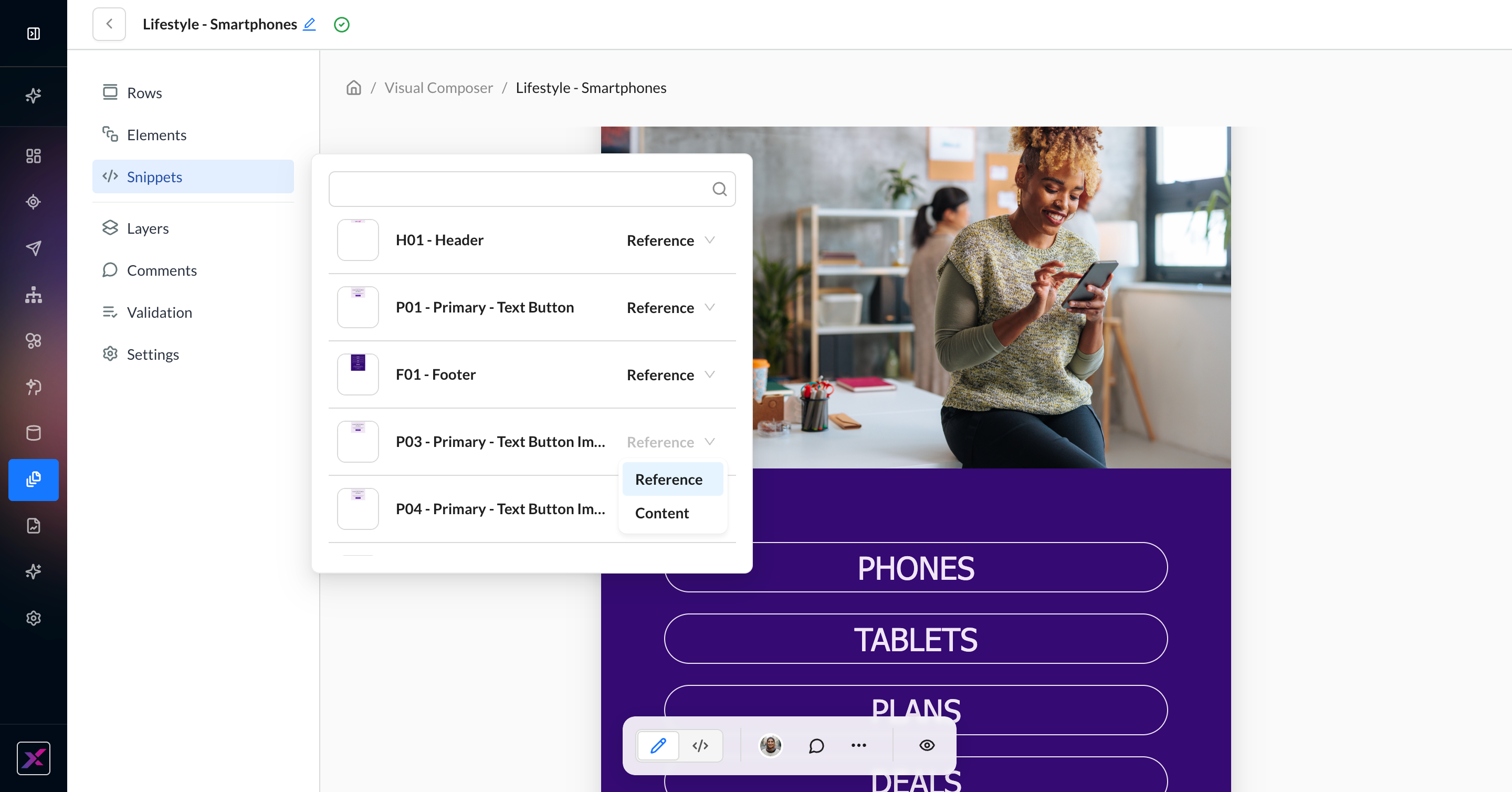
Snippets
Learn more about snippets: Content Snippets
As with previous editors, there are two ways to add snippets to the canvas in Visual Composer:
-
Reference - dropping a merge tag directly onto the canvas
-
Content - dropping the content of the snippet directly onto the canvas.
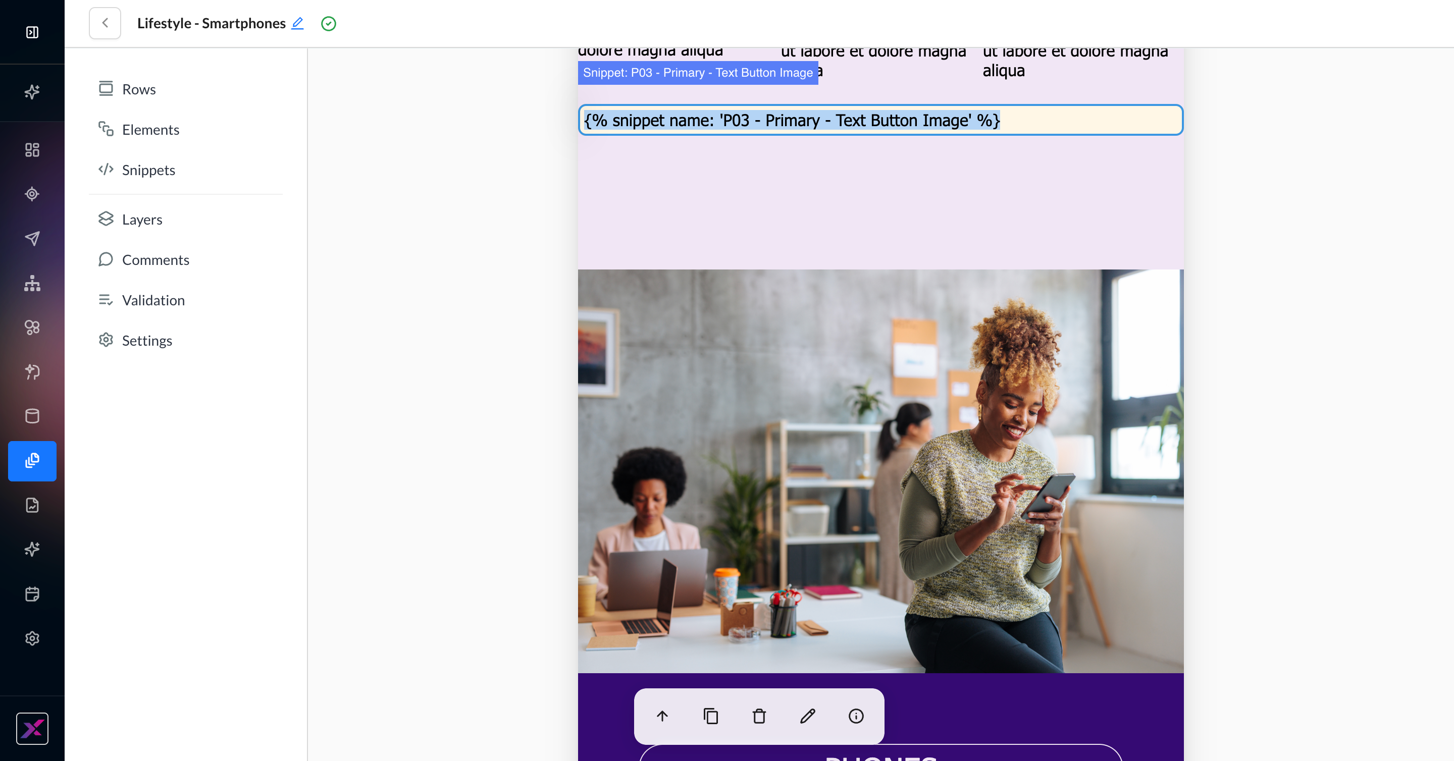
1. Click Snippets on the side panel. This list contains all snippets in the account.
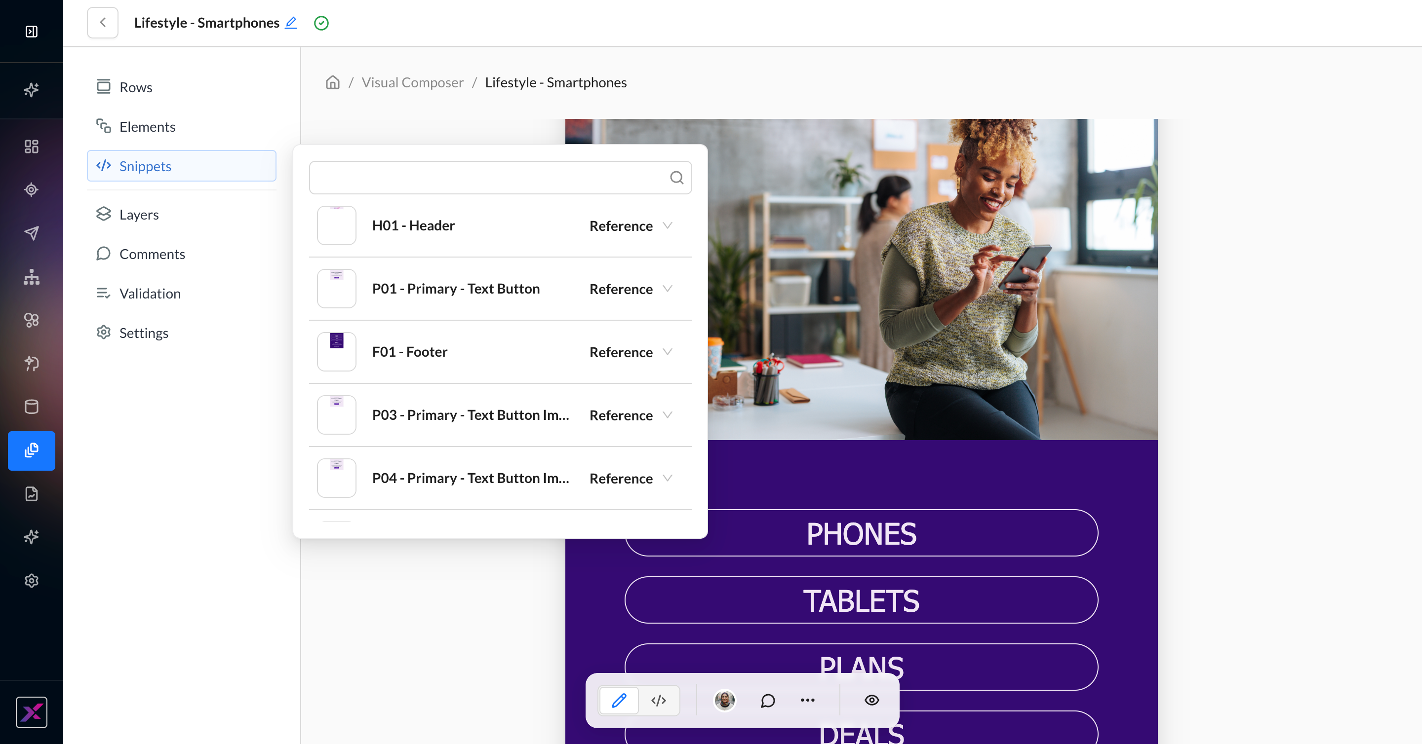
2. When you find your snippet, dragging it onto the canvas will insert a merge tag (reference). If you’d prefer to use the content only, change the selection on the right-hand side of the row first.
3. For references, a merge tag will be inserted and its live preview will appear on the canvas with the standard yellow border for dynamic content. Because it’s a merge tag, you cannot edit the content directly. For content, the literal elements will be placed into the template and disconnected from the snippet’s content. Any changes to the parent snippet will not affect the content in the template; only references (merge tags) are controlled remotely.
4. To edit a merge tag, double-click on the displayed content or click the edit button when the snippet block is selected. You can then edit the tag to use a different snippet. To delete the snippet entirely, use the delete button in the actions toolbar when the dynamic content is selected. The info icon will display the About This Snippet panel to get the metadata, including the merge tag.
To see a list of all campaigns, templates, and snippets where a snippet merge tag is used, visit the snippet and open the About This Snippet panel. Click on References to see a searchable and clickable list.
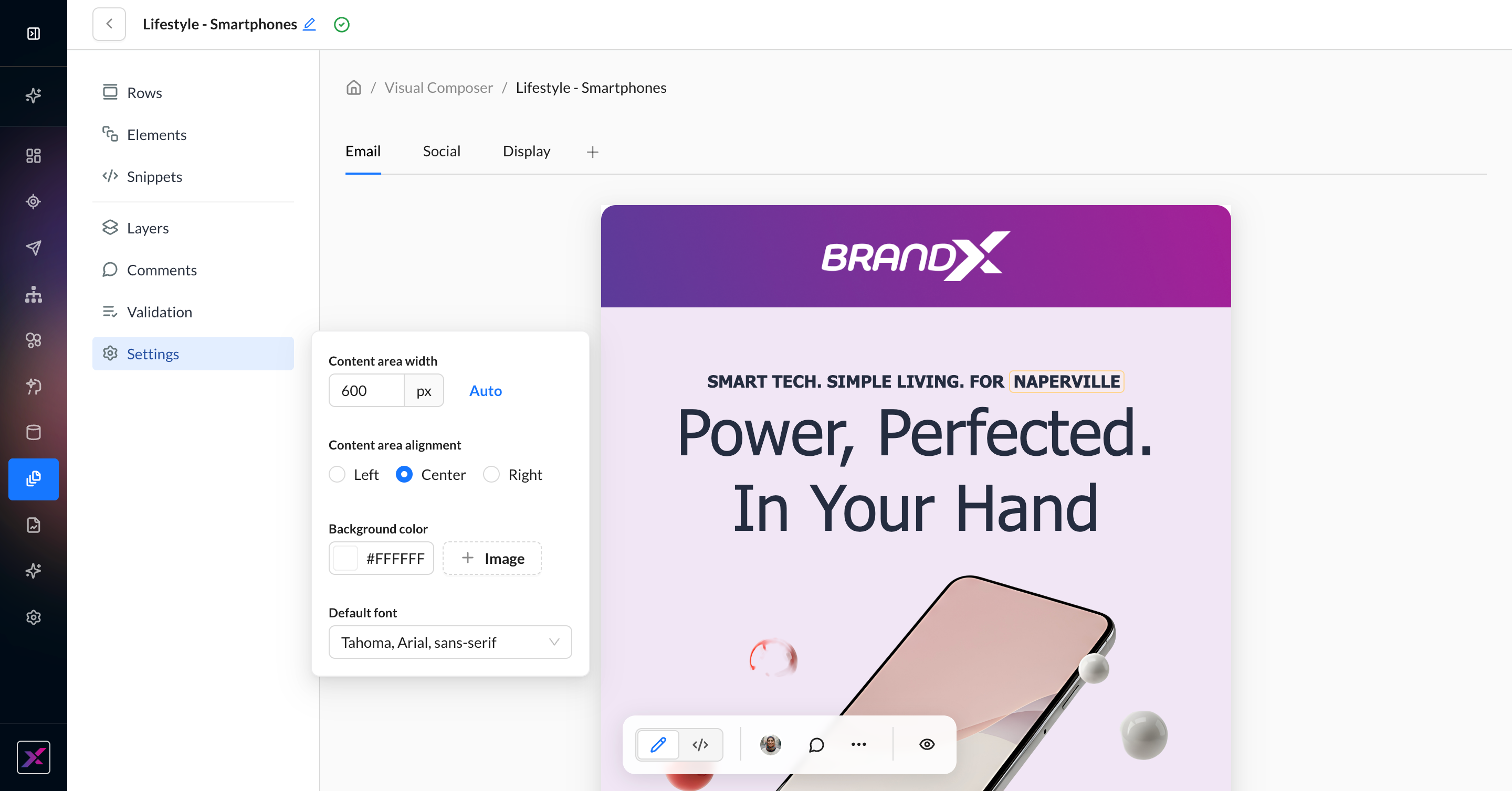
Settings
To add custom fonts to your account, reach out to your Account Manager.
For template-level settings, click the Settings button on the left-hand navigation to reveal a list of additional options. This only applies to the Email channel.
|
Settings Item |
What It Does |
|---|---|
|
Content area width |
Sets the canvas width for the entire template. By default, it’s 600px. You can click the Auto button to instead fit the canvas to the content width. |
|
Content area alignment |
The alignment of the content on the canvas:
|
|
Background color and image |
Set the background color and image of the canvas. Set the image by clicking the + Image button and choosing from the Asset Library or a hosted URL. To remove it, click the + Image button again. If you select a background image, you can further customize:
|
|
Default font |
Select the default font family for your email template, including fallbacks. If your account has added custom fonts, they will appear here. |
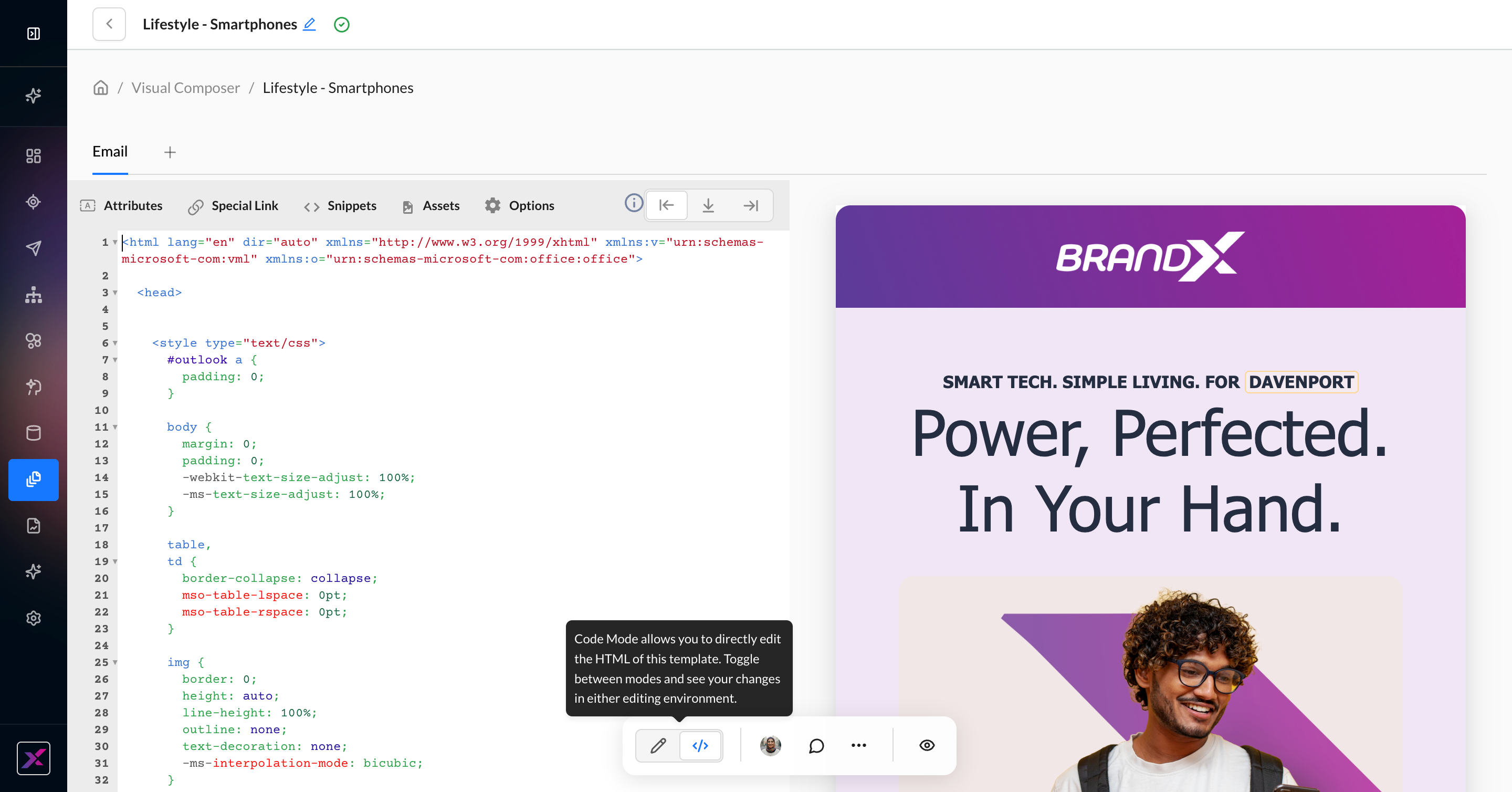
Code Mode
Currently, merge tags still can’t be added to the <head> node; they will be sanitized to the top of the <body> section upon saving.
Previously, choosing between HTML Editor and Visual Editor required trading off visual editing for complete control over the raw HTML. Visual Composer removes this question so that you can do both—unlocking use cases for style sheets, class naming, and more.
To switch, click the toggle in the actions toolbar. Any change you make in either direction will be immediately applied.
Dynamic Content in Visual Composer
Learn more about Zeta Markup Language (ZML)
Visual Composer was built with seamless codeless personalization in mind. Get your results, whether you know how to code with ZML or not.
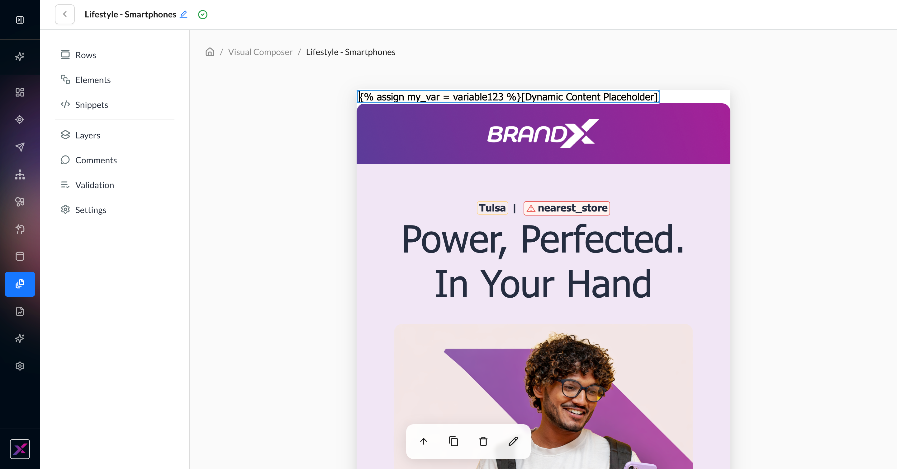
Sample Placeholder Data
By default, any dynamic content that’s detected in the Visual Composer will be clearly differentiated in the canvas.
-
Yellow highlight to denote a merge tag (red highlight to denote a tag that doesn’t exist or has a syntax error)
-
Rather than a raw merge tag like
{{first_name}}, you will never see code in the Visual Composer canvas. Instead, there will always be sample placeholder data to allow you to better visualize how the data will look when rendered. The random user is cycled every few minutes. -
Since snippets are unique at the account level, the in-line preview will be consistent with what’s currently saved in the snippet being referenced. It does not cycle to different users, unless the display logic changes.
-
A tag with no direct output like
{% assign my_var = variable123 %}will instead be displayed as[Dynamic Content Placeholder]
Inserting Dynamic Content
Codeless Blocks
1. When typing in a text block, you can add a dynamic tag either by typing your tag directly (eg, {{first_name}}) or by clicking the lightning bolt icon at the end of the in-line editing toolbar. This will auto-insert {{first_name}} by default, which you can change later.
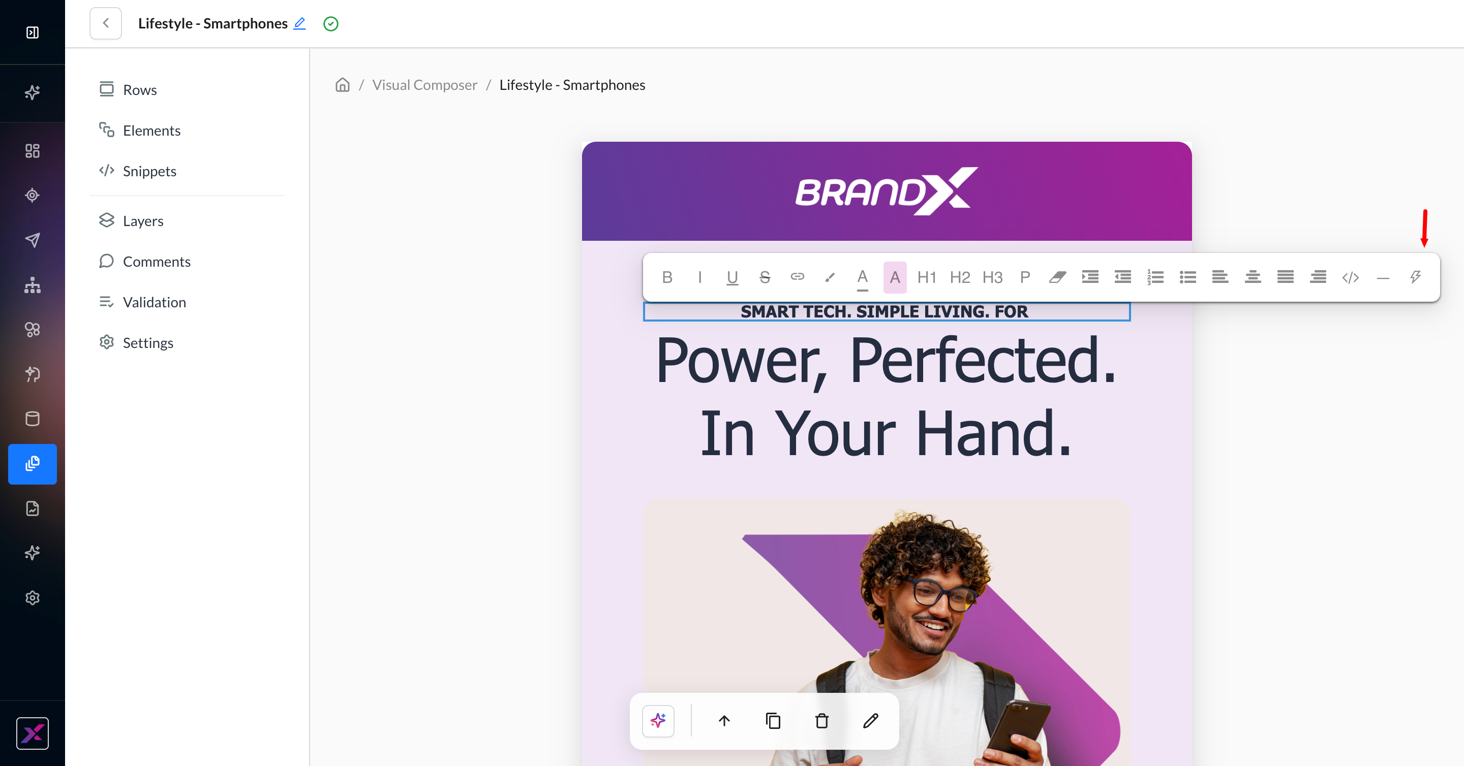
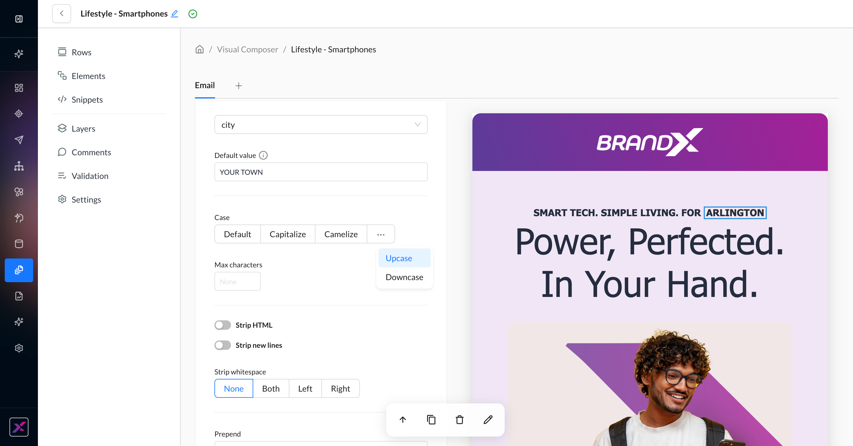
2. Click the highlighted text to open a new panel of settings to customize your merge tag.
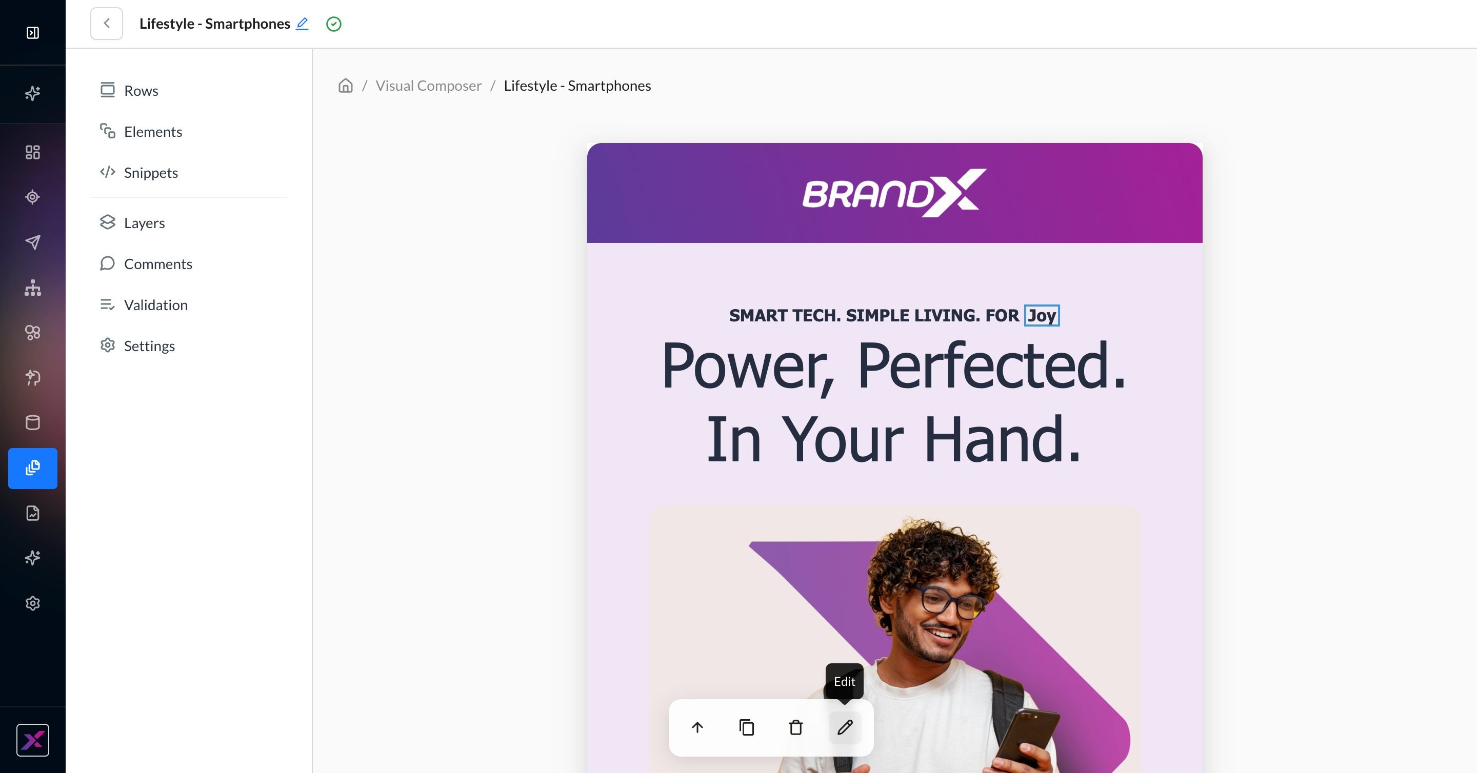
3. From the dropdown list, choose any of the profile or contact properties set up in the account.
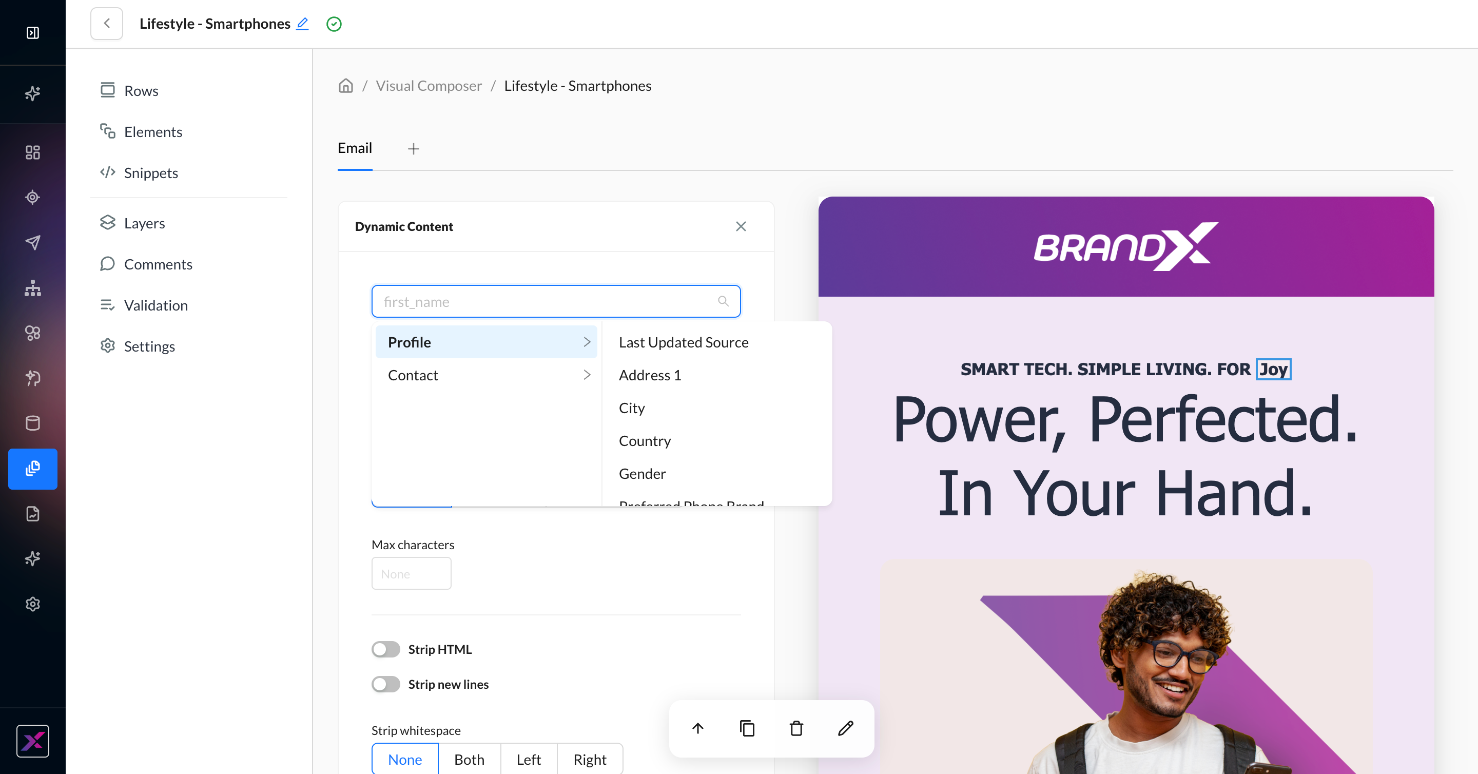
4. Further customize with a default value if needed or any of the listed ZML filters, such as upcase, truncation, stripping unnecessary characters, prepend, append, singularize, and pluralize.
5. If you’d prefer to code directly in the canvas, you can do that in Visual Mode using any element on the canvas or the Dynamic Content element settings to isolate the coding row. You can also open Code Mode to edit the raw HTML side-by-side with the canvas.
Advanced Merge Tags
In addition to user and profile properties, you can also see sample placeholder data for the following datapoints:
-
Event properties
-
Resources
-
Recommendations
-
Feeds
-
Snippets
While they require coding, you can still take advantage of the placeholder data for a better view of the final rendered email. You can double-click on the merge tags to edit directly in the canvas.
Visibility Conditions
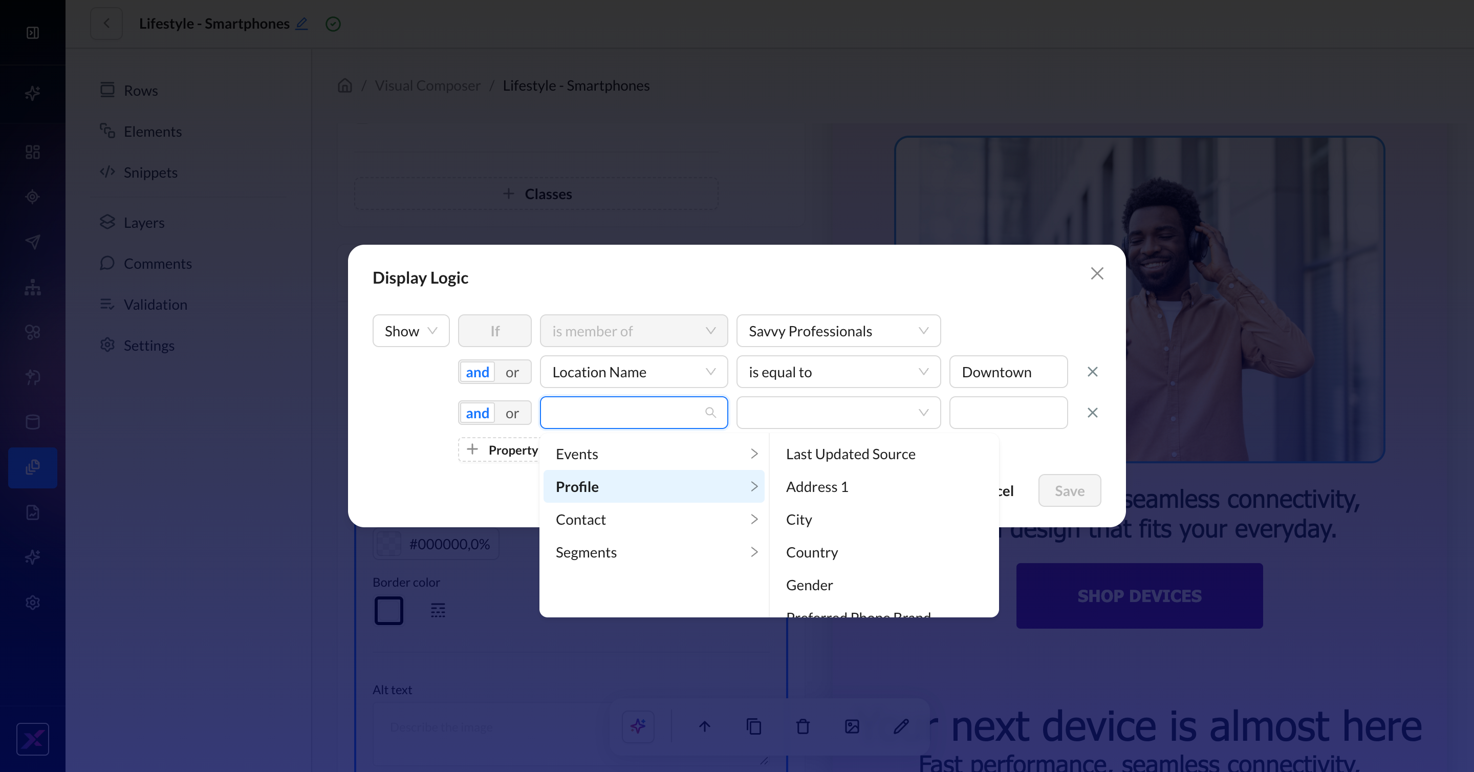
Personalization isn’t just displaying profile properties — there are often use cases where entire pieces of content depend on various levels of segmentation to determine what to show or hide for a customer in their delivered campaign. The Visibility tool provides a simple, codeless workflow to change out content and specify rules and content changes for each. The original content effectively becomes the default fallback if none of these rules are met.
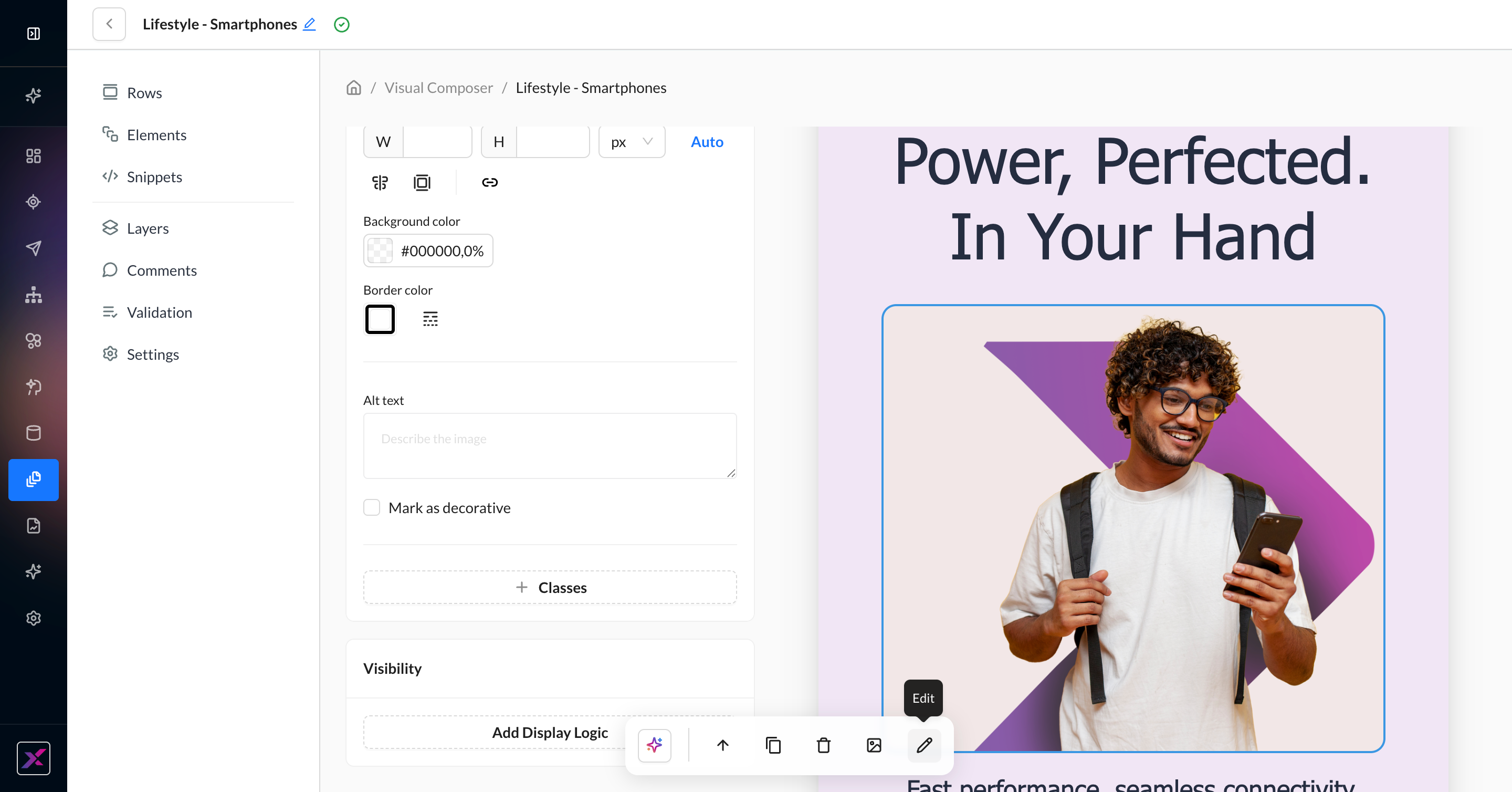
1. On a row or content element, click the Edit icon to open the settings.
2. Scroll down to Visibility and click Add Display Logic.
3. Your existing settings for the row or content element are duplicated beneath New Rule. Edit the settings for the rule. Anyone who does not meet the rule will receive the original content.
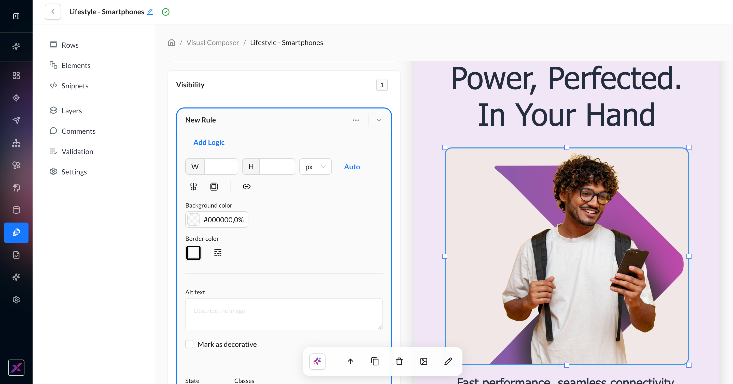
4. When you’ve adjusted your content, click Add Logic to open your visibility conditions. You can choose to show or hide based on event, profile, and contact properties, or segments. Each rule supports AND and OR operators, so you can mix and match across data types. Save your rule.
5. When you return to the canvas, the default content will reappear. You can click on your rule (auto-named based on your first condition) to return to your logic and its content.
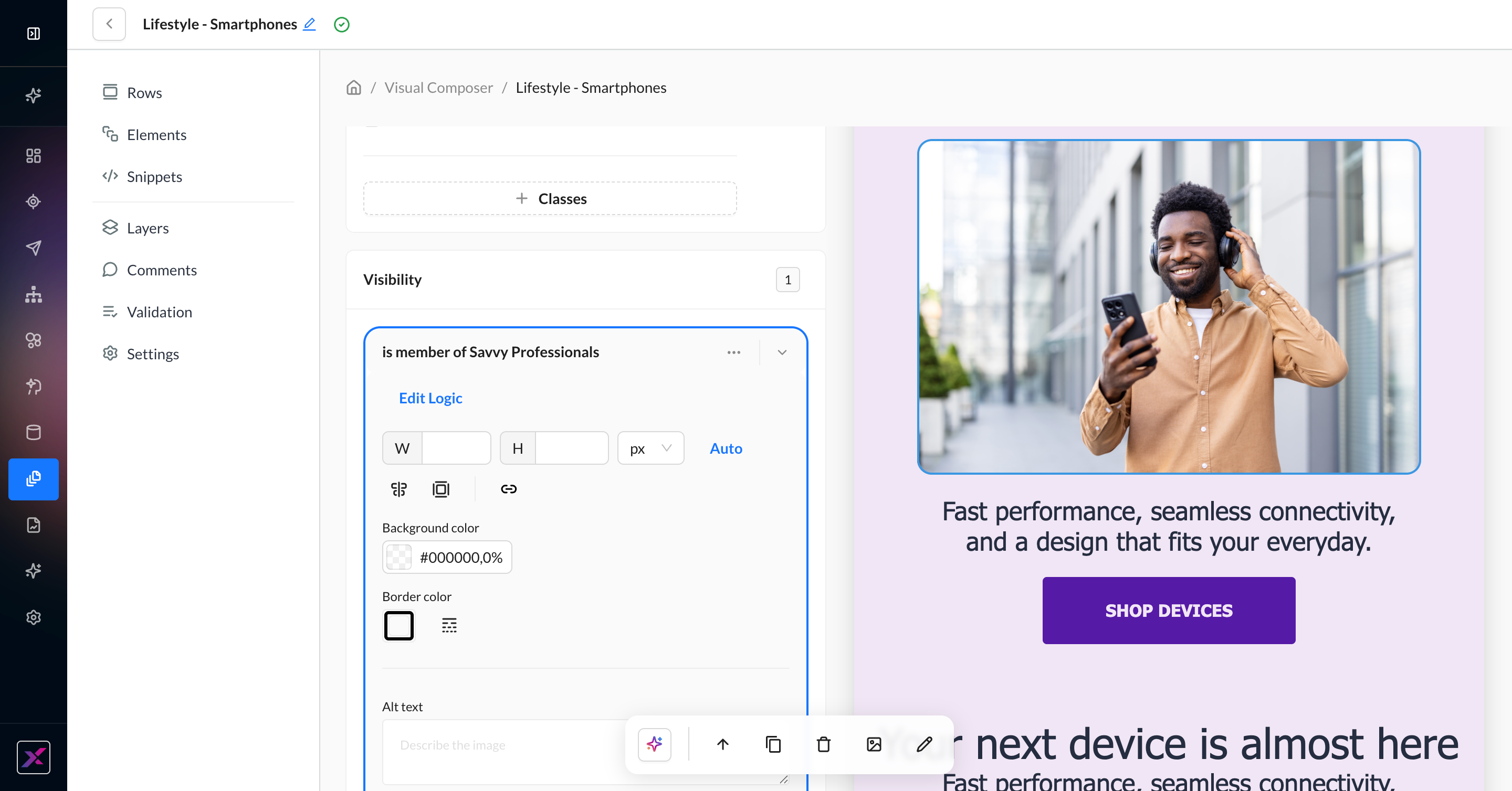
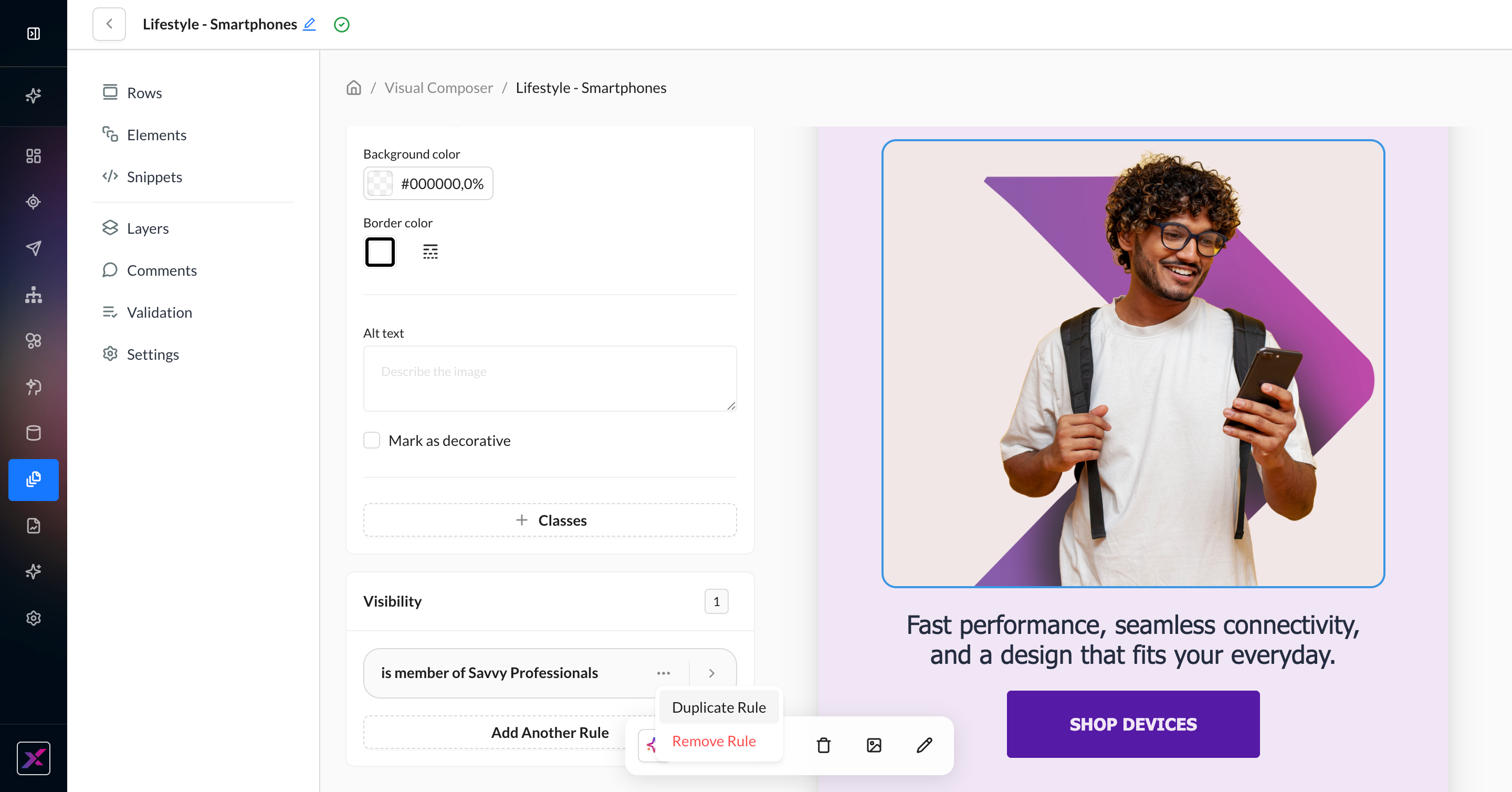
6. Once you have one visibility rule, you can click the … button to duplicate or remove it, or click Add Another Rule to start from the original content. While there is no limit to the number of rules you can create, all rules must follow the show or hide selection of the first rule.
7. By default, new rules are prioritized in chronological order. When you have more than one rule, you can reorder them by collapsing the row and dragging it above or below the other rows.
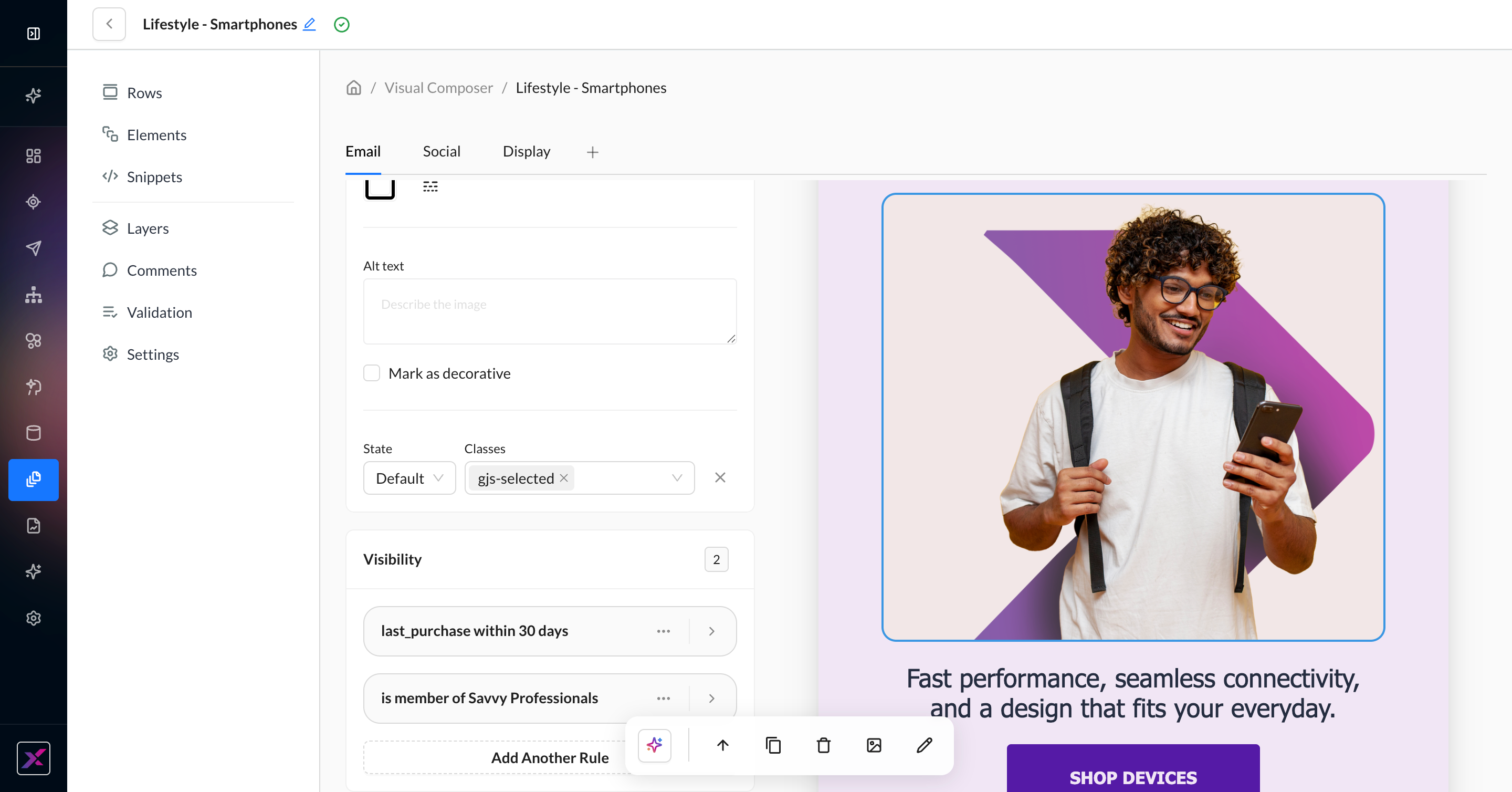
Some features that are not user-personalized, such as thumbnails and version history, will show display logic options stacked on top of each other. Do not worry — the Visual Composer canvas, preview page, and proofing tools are all capable of selecting a single user to generate a preview for, and only one of the display logic options will be shown in those views.
Product Recommendations
For best results, add a row to the canvas before you add a Product Recommendations block. You must have Resources set up in the account.
Leverage the Recommendations API codelessly with the Product Recommendations block. This content element provides 1:1 personalization with your customers for campaigns tailored to their preferences.
1. Click Elements in the left-hand navigation panel and then find Product Recommendations. Drag the block onto the canvas, preferably in an empty row.
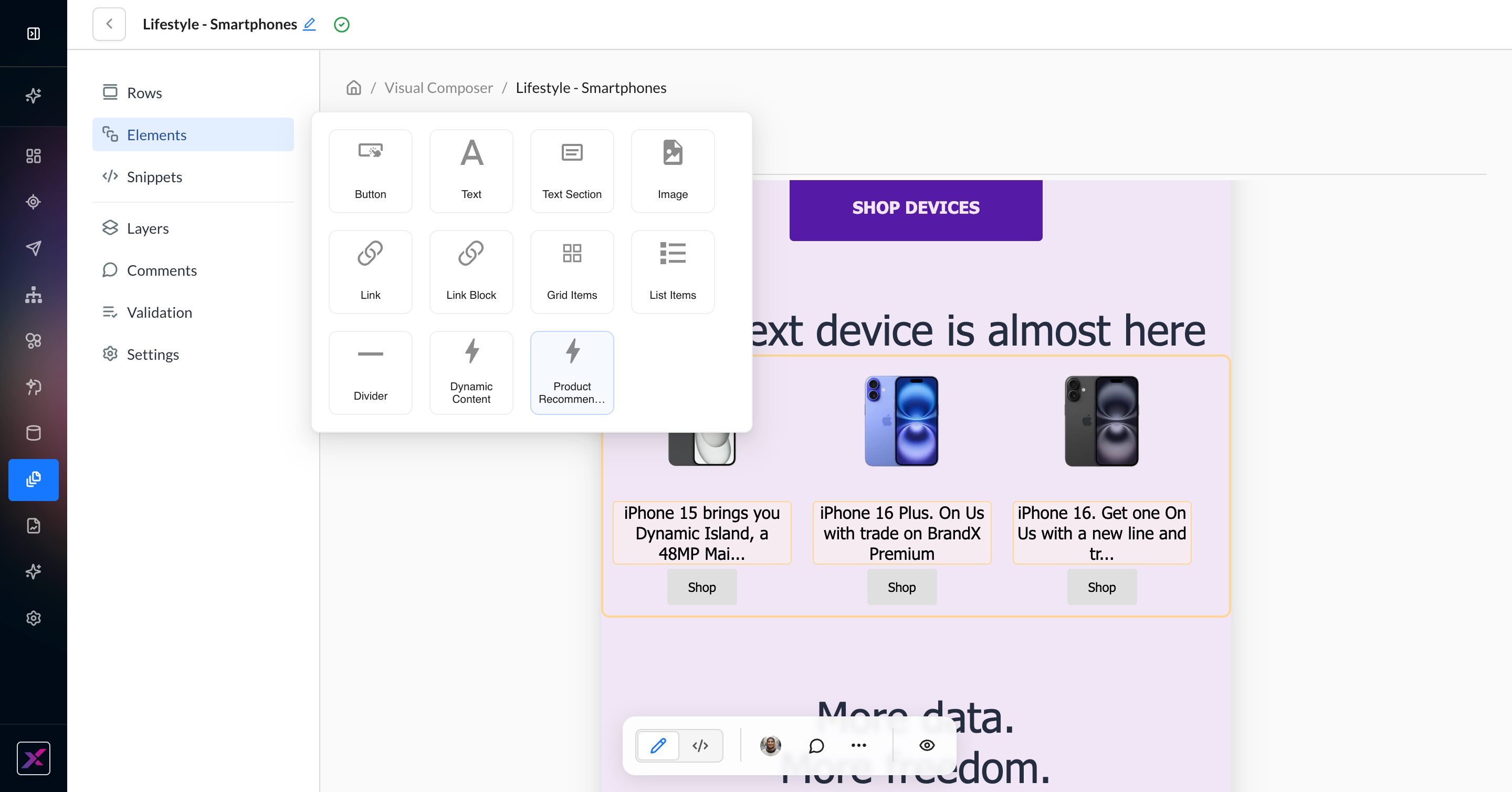
2. Find the Zml container and click the Edit button to open the codeless settings. By default, resources from your global filter are selected.
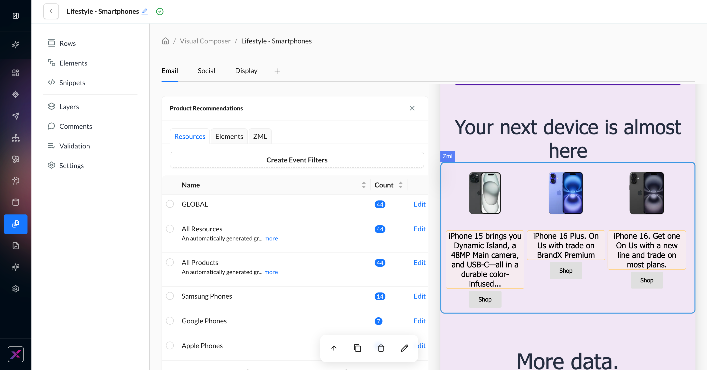
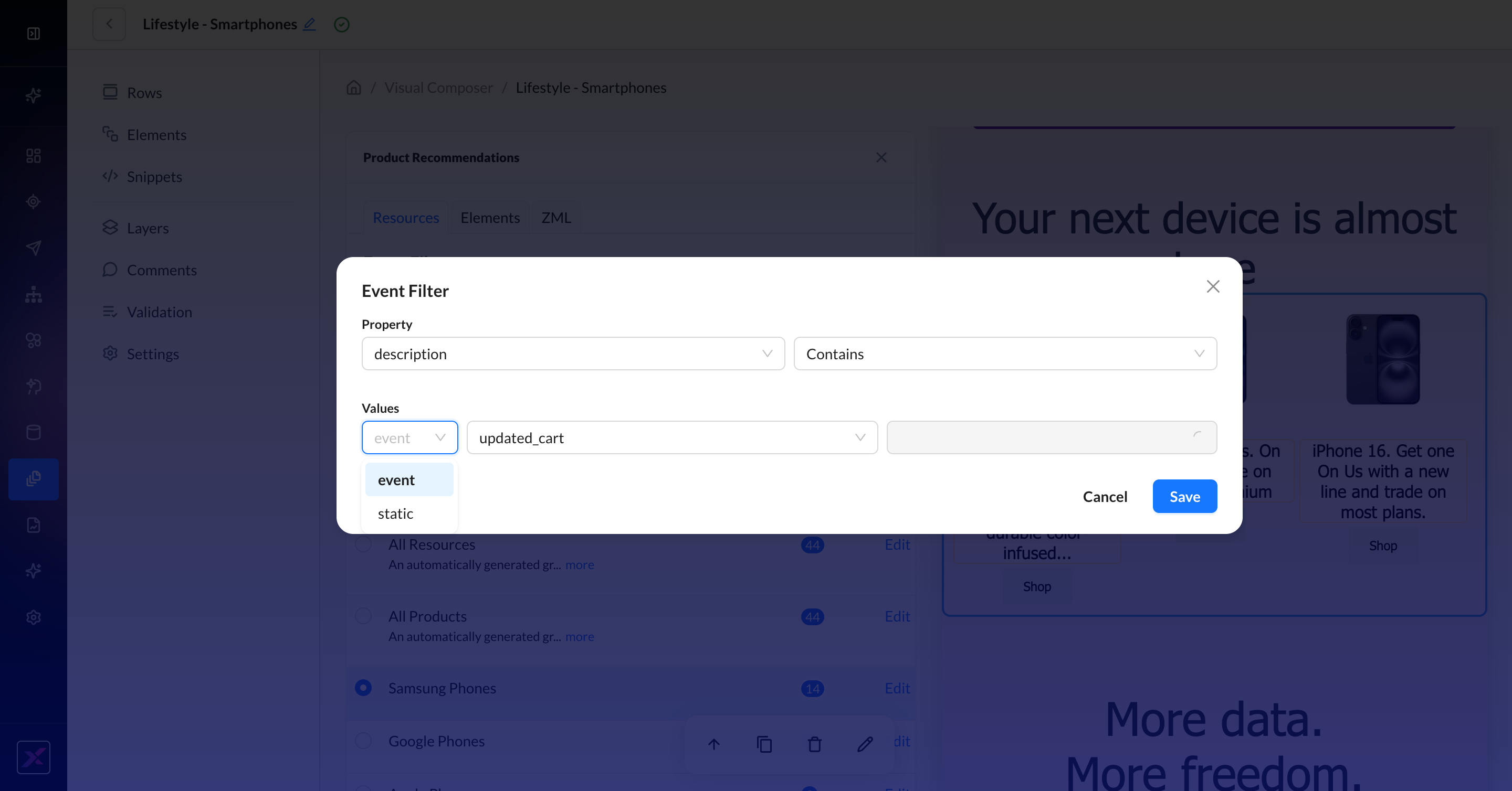
3. Select a Resource Group to populate the three recommended resources.
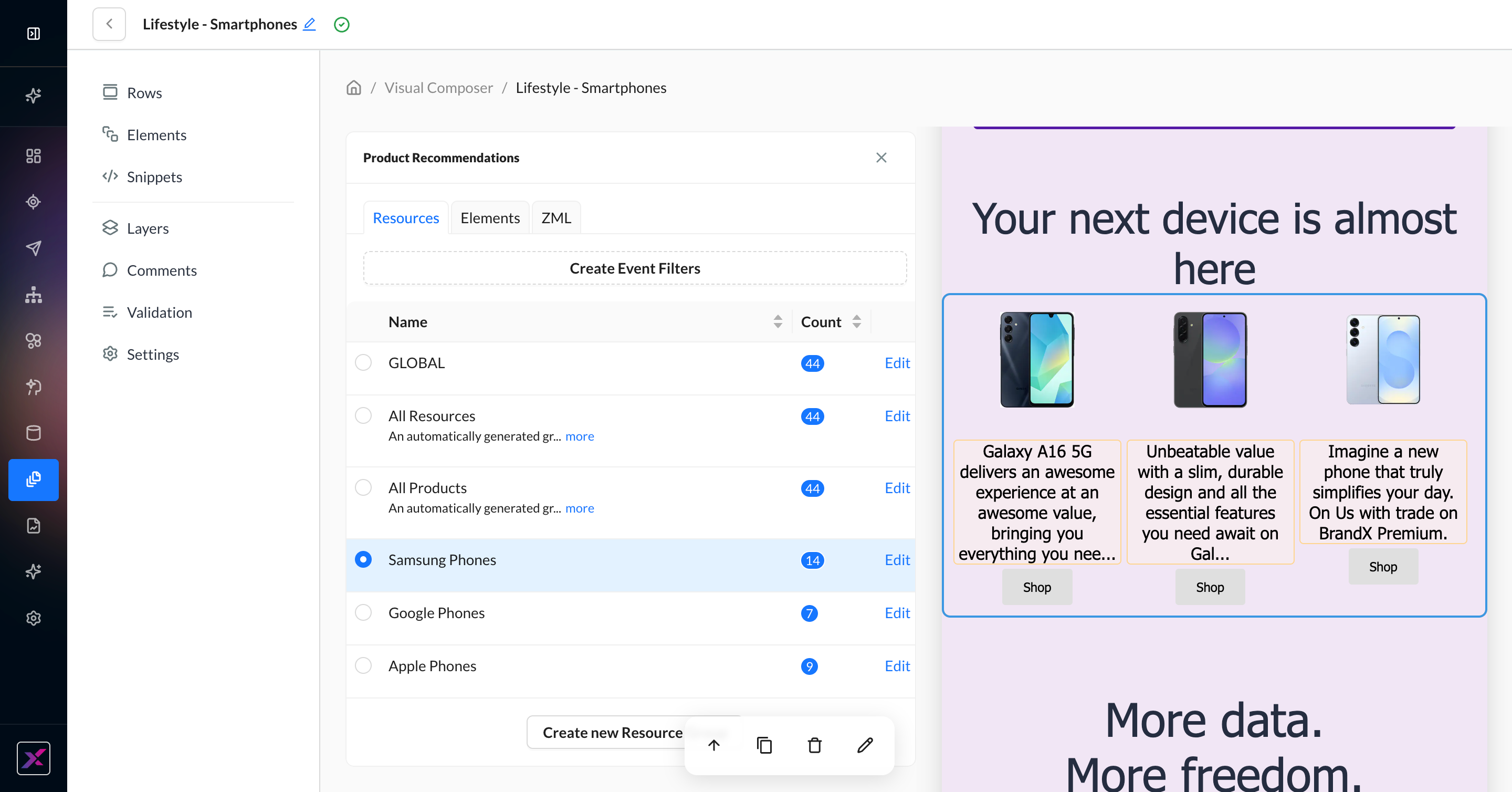
4. Alternately, you can choose to create an event filter to call your resources instead of the Resource Group. Here, you can choose to match resources based on a recent event property or a static keyword.
5. Click on the Elements tab to codelessly update what’s returned from your resources:
-
Show or hide Content Elements: Image, Headline, Short Text, Link
-
Click the palette icon to set the maximum character limit before truncation
-
Select Horizontal or Vertical layout
-
Specify # of recommended items
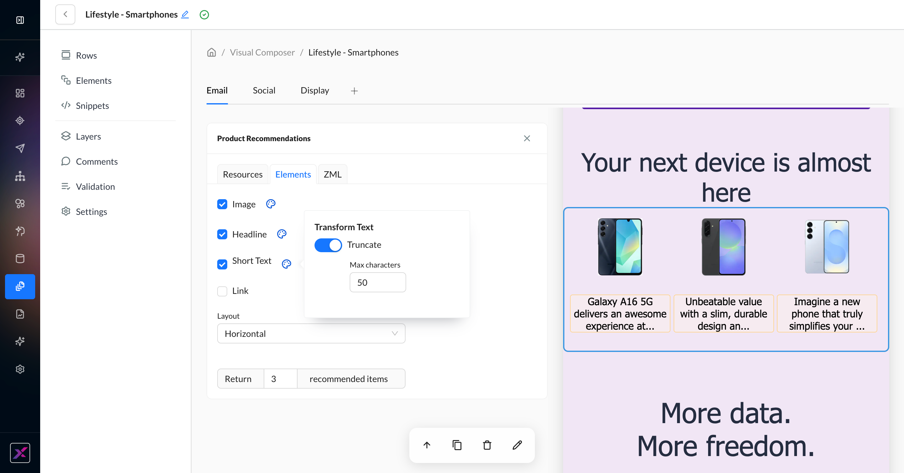
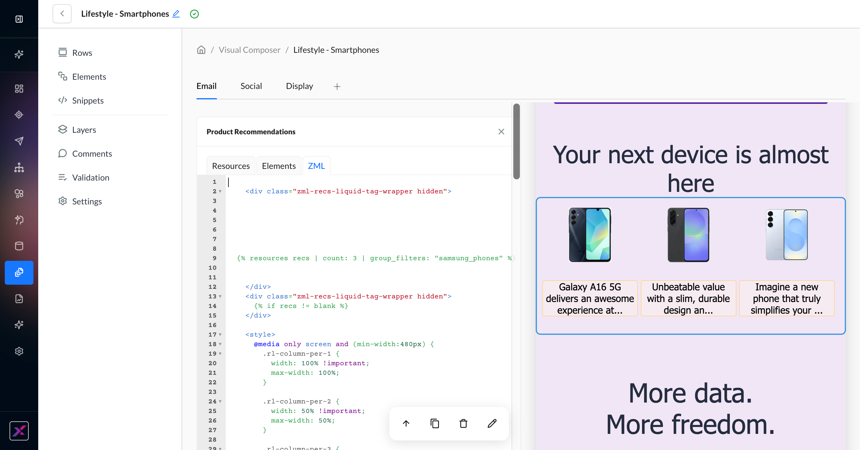
6. For advanced users, click the ZML tab for the raw code for the block to review or make specific changes directly.
Athena in Visual Composer
Besides generating entire email templates, Athena can also work on the details of fine-tuning your content in Visual Composer. There are four built-in assistants you can leverage:
-
Image
-
Text
-
Validation
-
Cross-channel
Image Generation
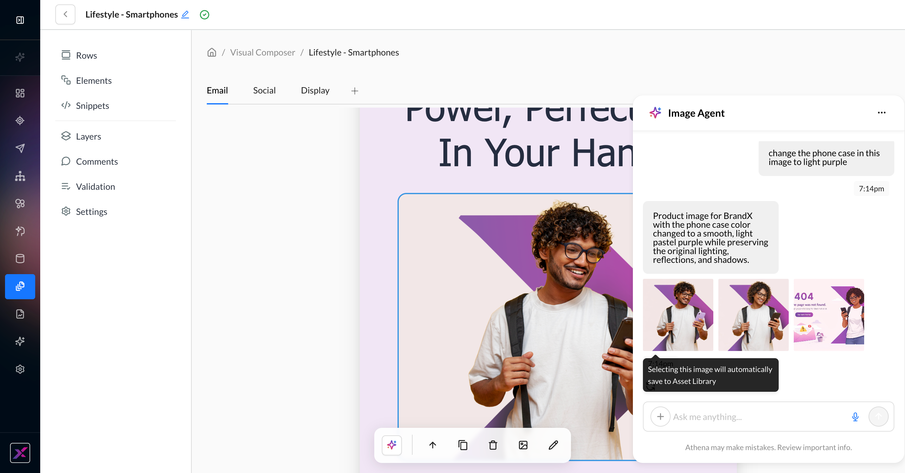
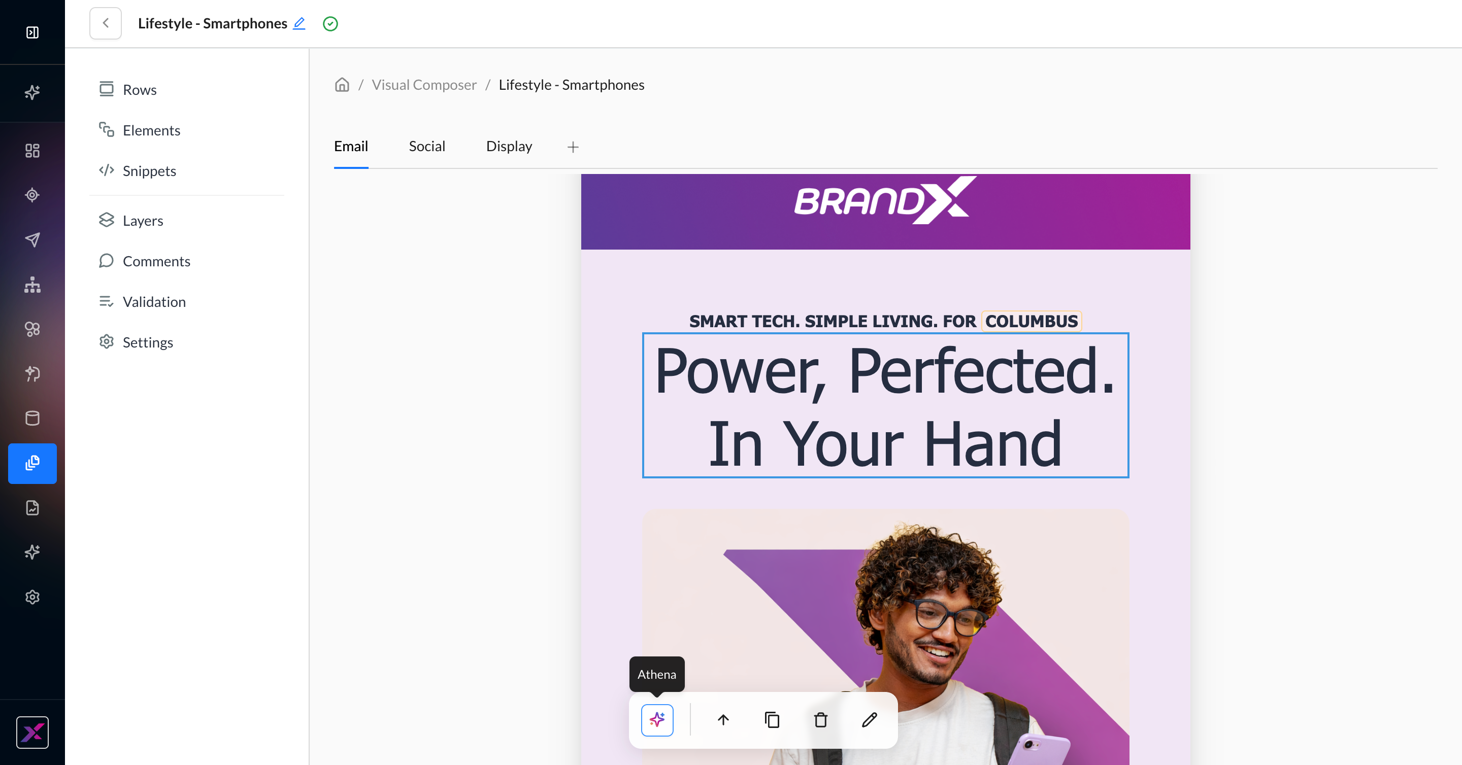
1. On the image element, click the Athena icon in the actions toolbar to open the Athena chatbox. You can close the chatbox by clicking the Athena icon again or closing the thread using the … button.
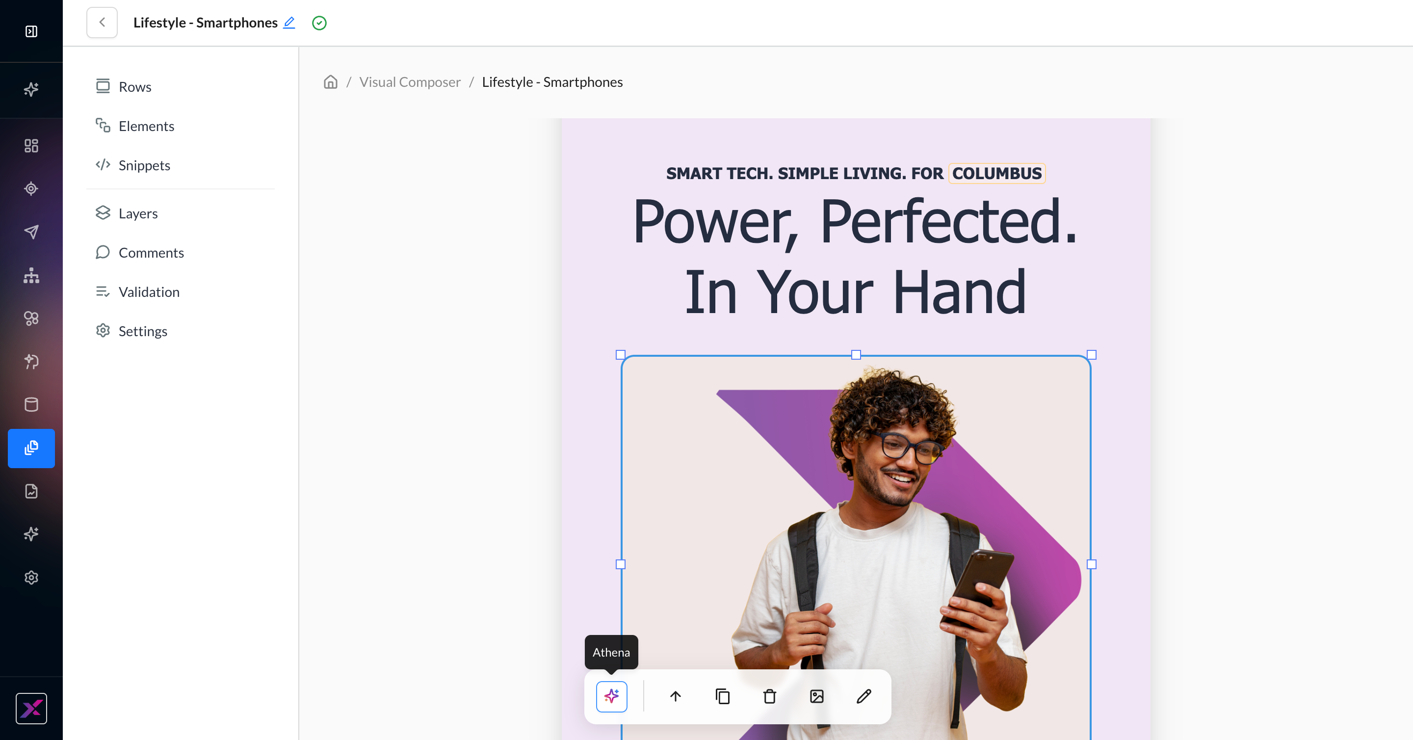
2. In the Athena chatbox, you will be served 3 recent images from the Asset Library that you can insert into the image block in addition to the prompt. Click the … button to change the image quality. By default, the Enhanced model is used.
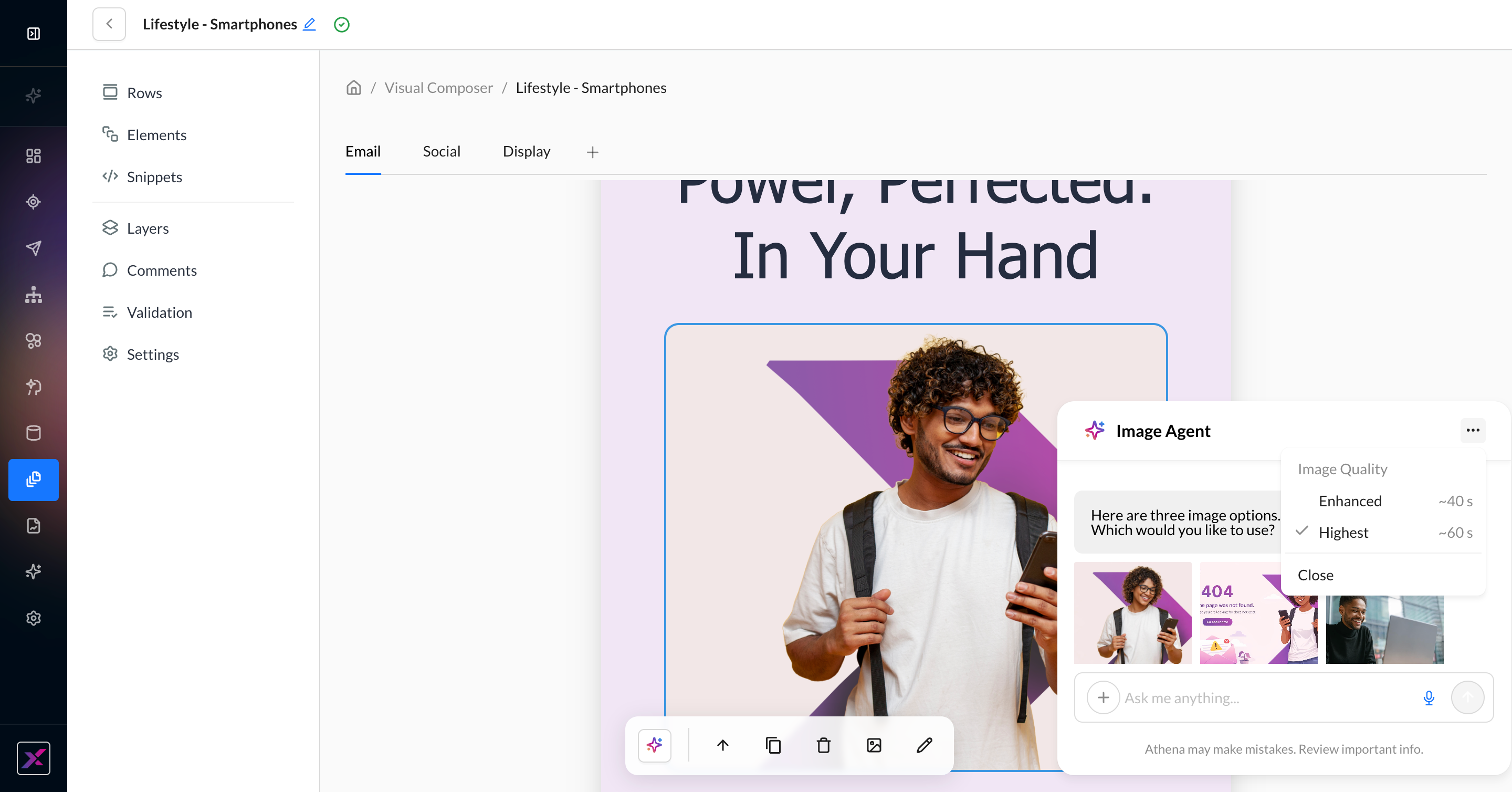
3. Write your prompt. You can either ask Athena to edit the current image, attach an image by clicking the plus button, pasting an image URL, or simply describing what you want.
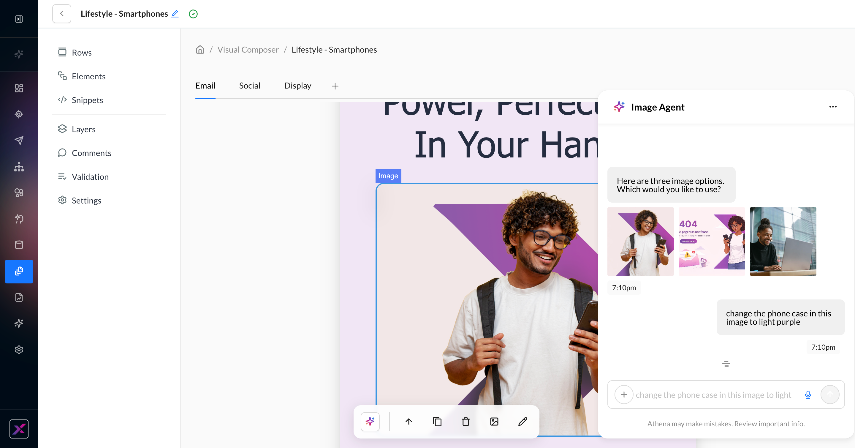
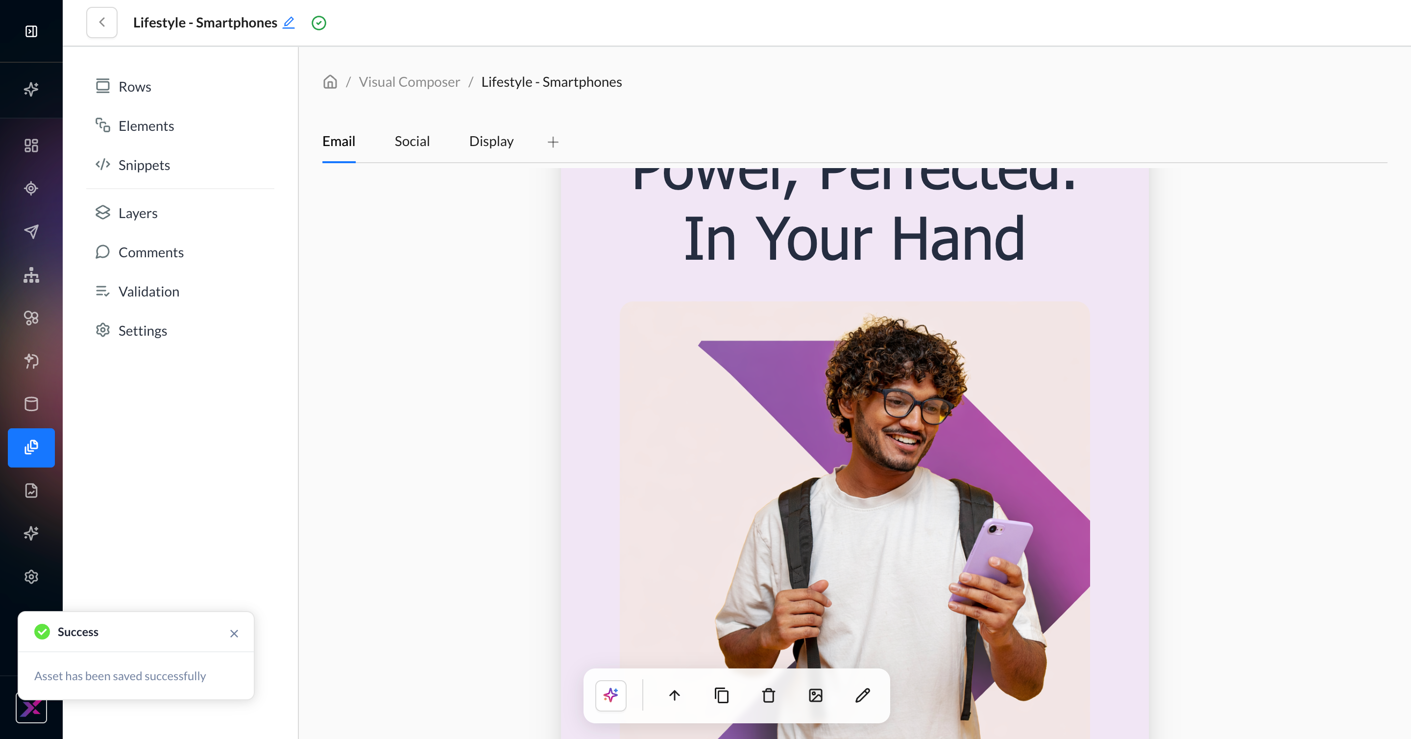
4. Within 1 minute, Athena will return an image in the left-hand part of the row, along with a description of the generated image. If you like it, simply click the image, and it will be added to the canvas and Asset Library. You can click the regenerate button or continue the thread to further refine your image.
5. Continue editing your template with your new image.
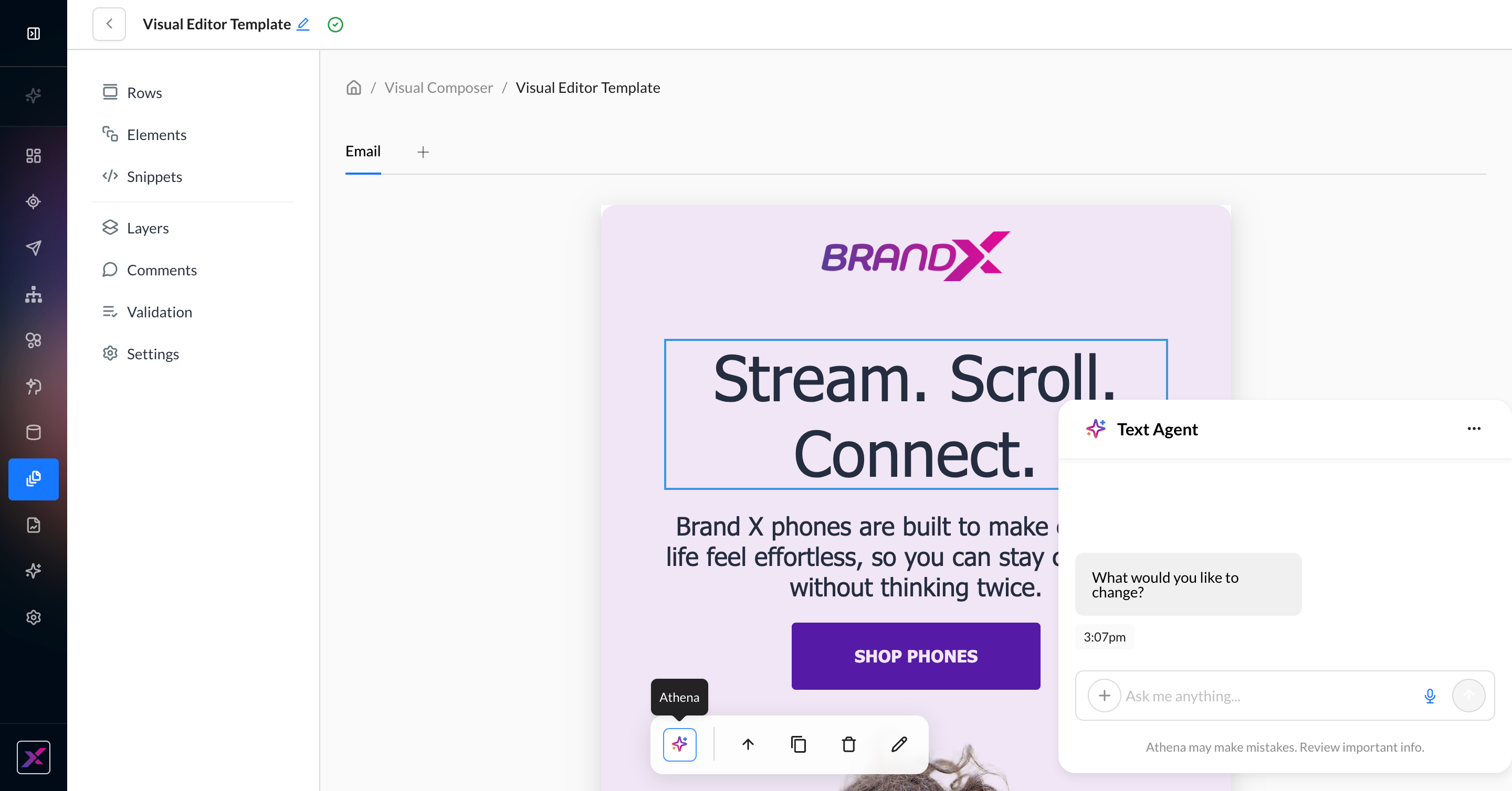
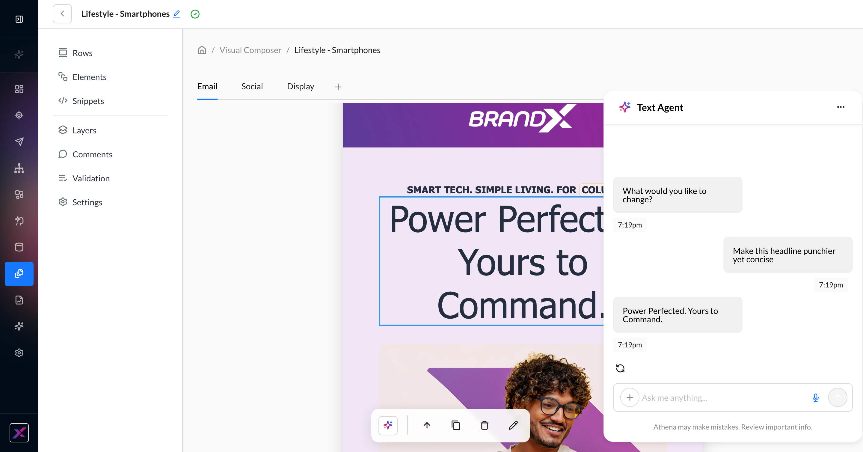
Text Generation
1. On the text element, click the Athena icon in the actions toolbar to open the Athena chatbox. You can close the chatbox by clicking the Athena icon again or closing the thread using the … button.
2. Write your prompt with as much detail as possible. While Athena can generate the content of your text, such as tone and clarity, it cannot update your formatting. Unlike the image agent, the text agent in Visual Composer uses a single generative model.
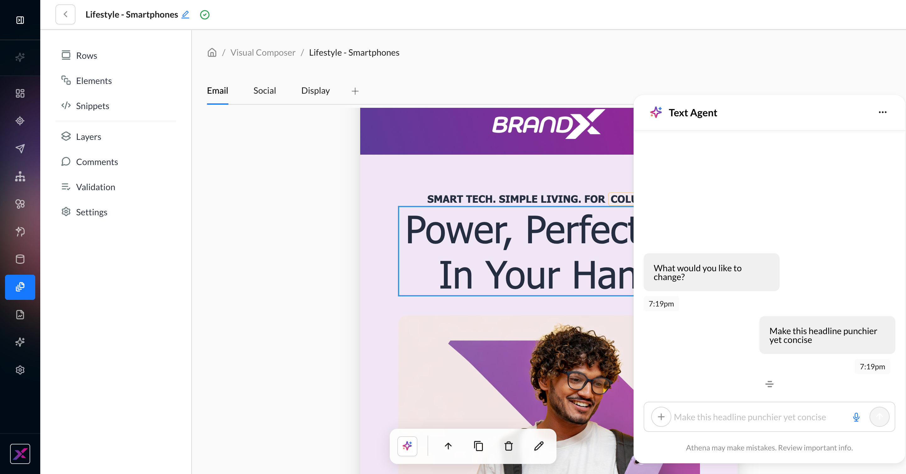
3. Your content element will be updated automatically. You can click the regenerate button or continue your thread to further refine your text.
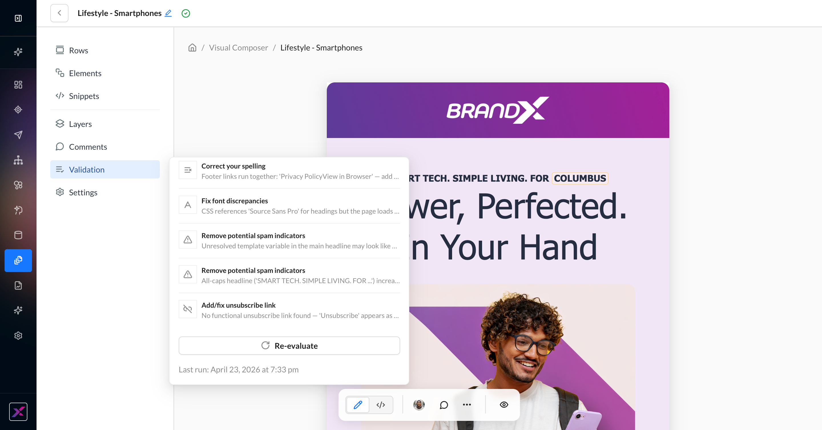
Pre-Launch Validation
When you’re ready with a draft of your content, you can run the validation agent on each channel for a quality check.
1. Click the Validation button on the left-hand settings panel.
2. This can take up to 1 minute, so you can close the panel and continue viewing rows and elements while you wait. A red dot will appear on the Validation button when it’s ready.
3. The validation panel will display scores for correctness, clarity, and deliverability, as well as a summary of its findings and individual recommendations around spelling, font discrepancies, bad links, spam indicators, etc.
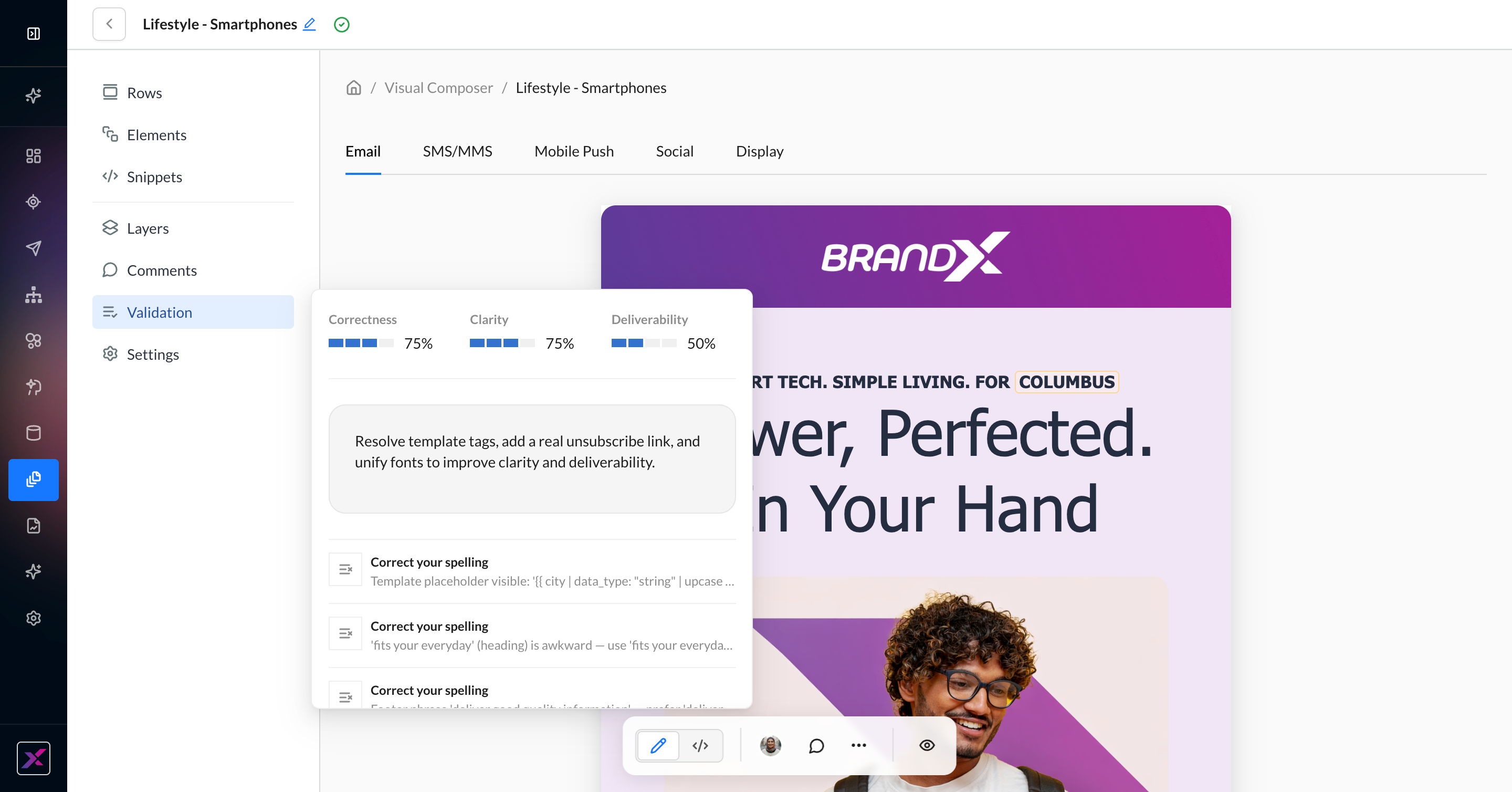
4. The validation panel will display the timestamp of the last run so you can keep coming back to it as you edit your content to address its findings. When you’re ready to run it again, click Re-evaluate.
Cross-Channel Variants
Cross-channel variants are only available in marketing templates, not campaigns.
While Visual Composer’s strongest capabilities are in email editing, it can also help you generate on-brand creative for a full omnichannel experience.
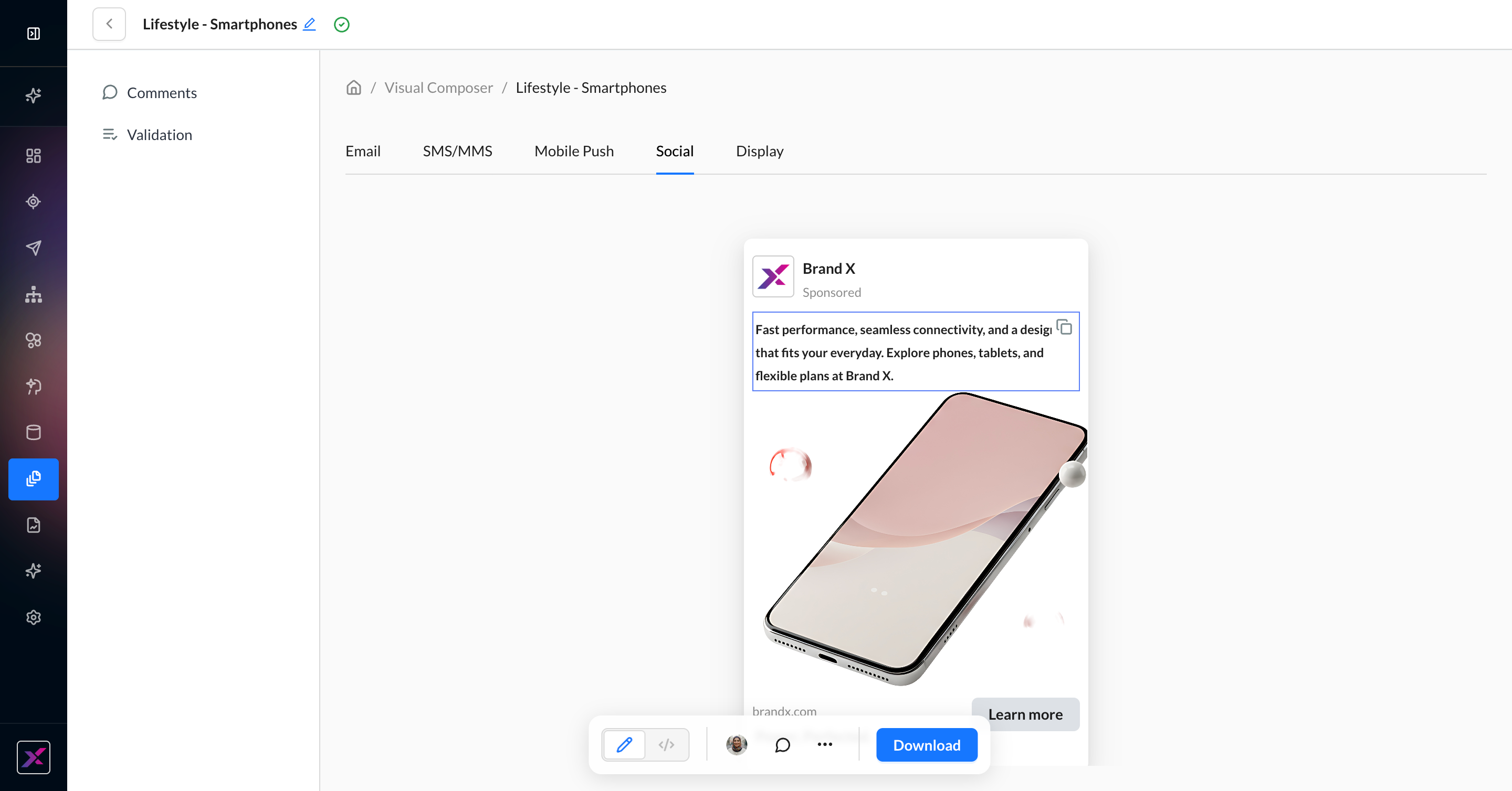
1. Click the plus button in the top row next to the Email tab. Select between Social, Display, SMS/MMS, and Mobile Push.
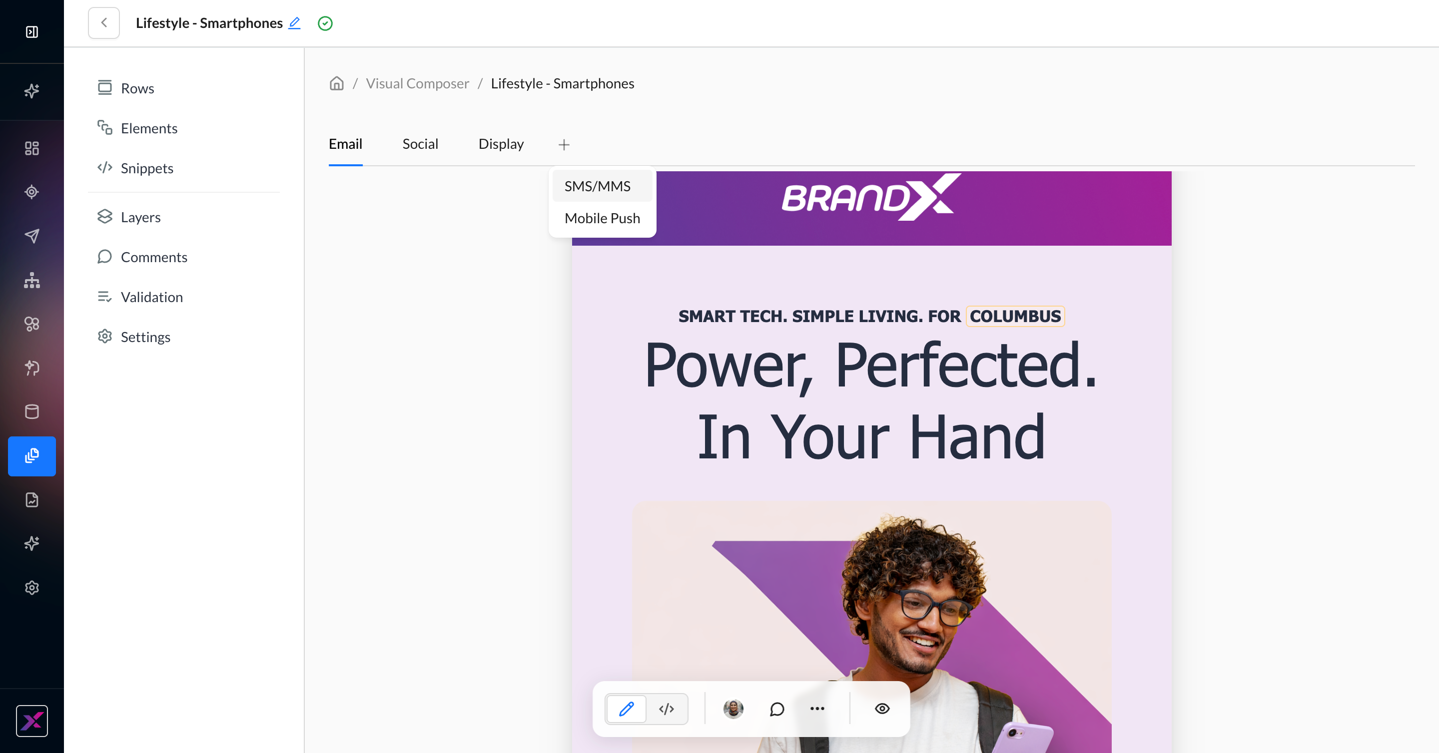
2. An agent will read your current email on the canvas to generate creative in the selected channels. This can take up to 1 minute. When your channel is ready, you’ll see a red dot on the channel tab.
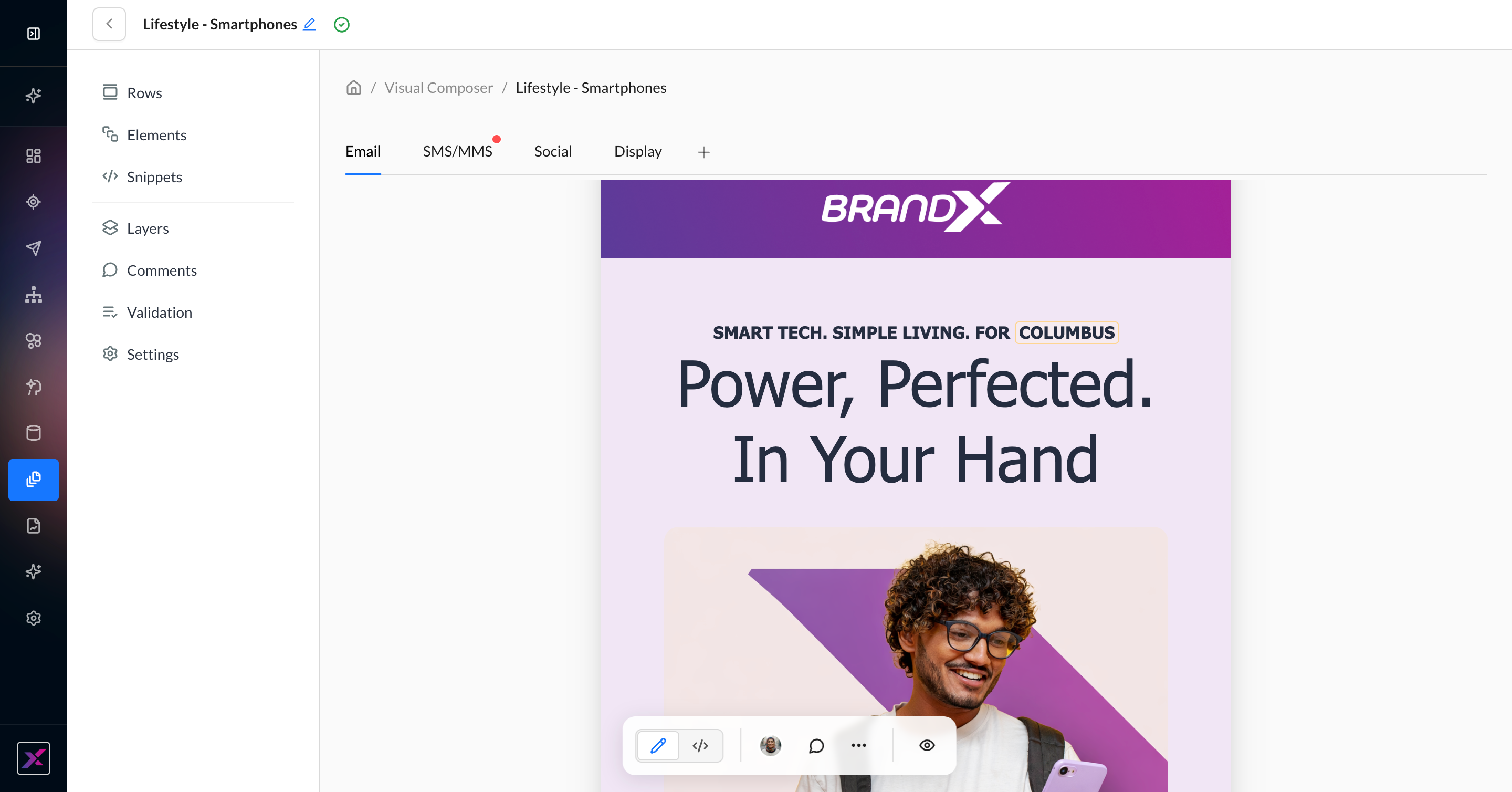
3. Click the channel tab to review the generated content.
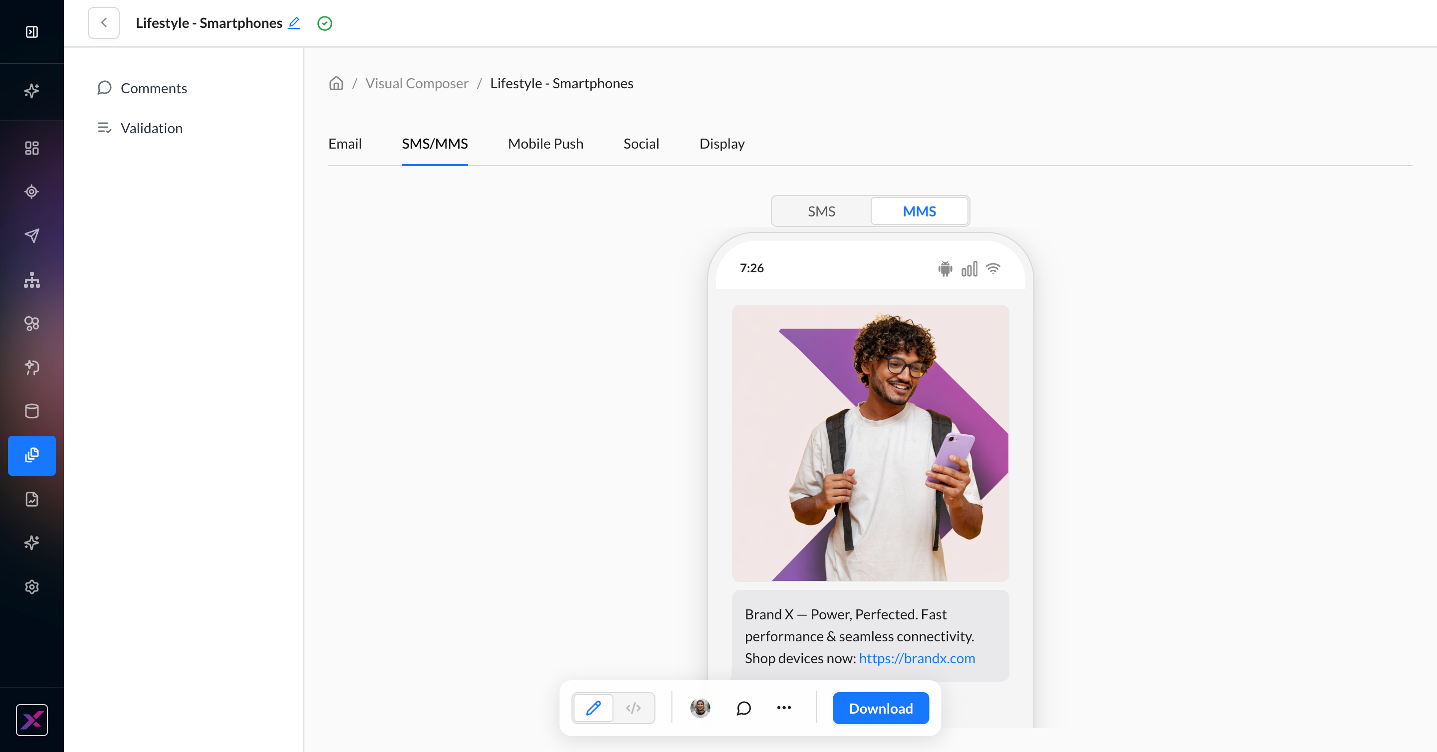
4. For native ZMP channels like SMS/MMS and Mobile Push, you can edit the content directly in the canvas. This includes images, text, and dynamic content, as well as text and image agents.
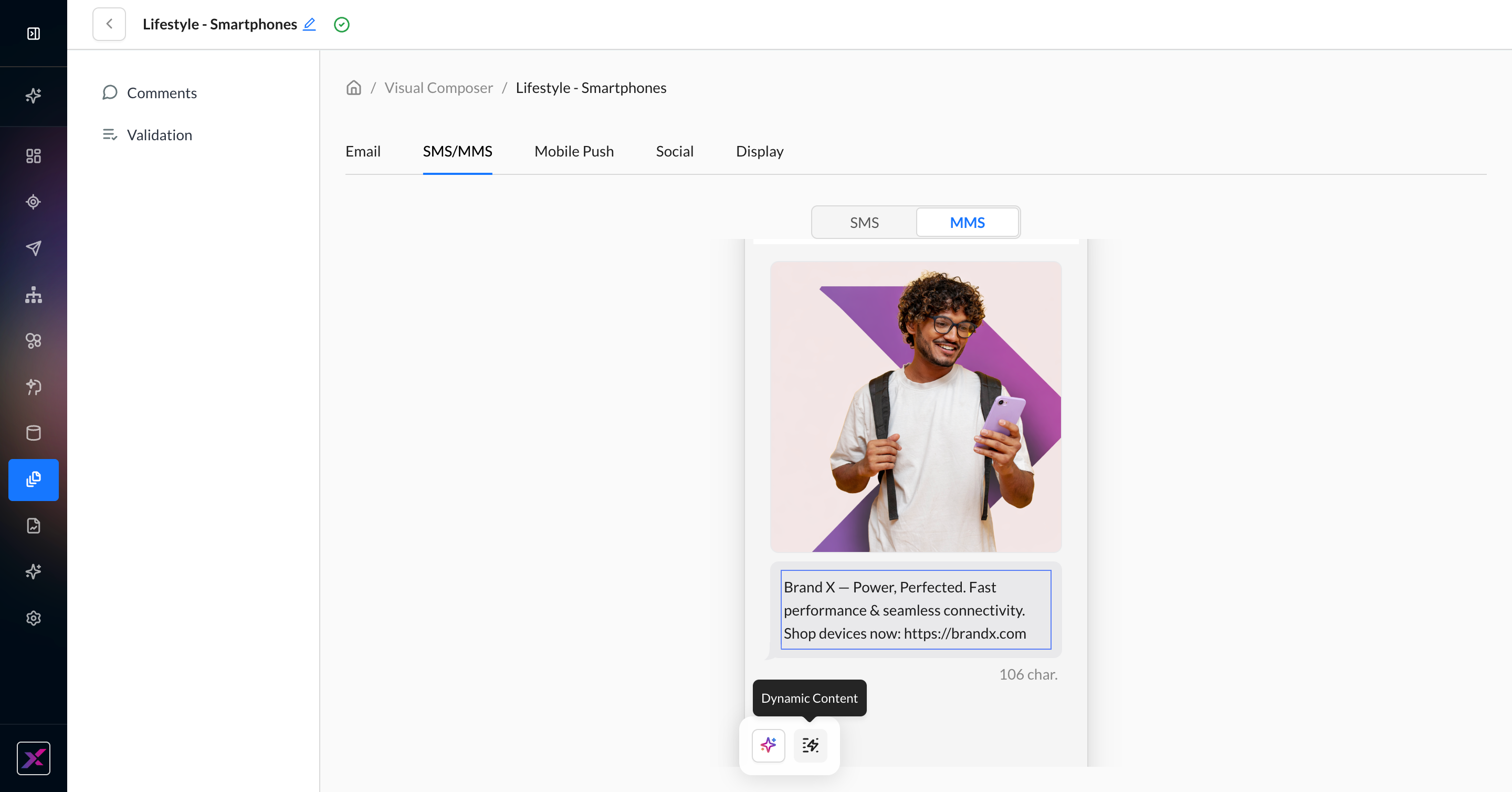
5. For all non-email channels, you can copy the text to your clipboard and click the Download button to save the images to your computer.
Collaboration in Visual Composer
With Visual Composer, collaborating with teammates on your templates and campaigns is more interactive than ever.
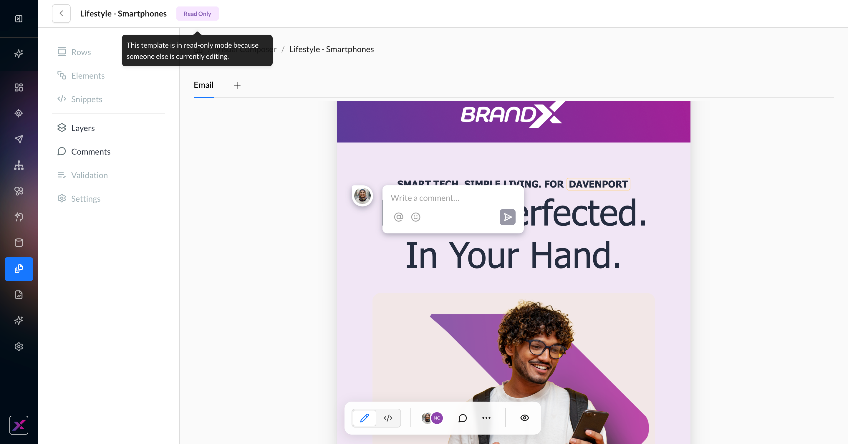
Comments
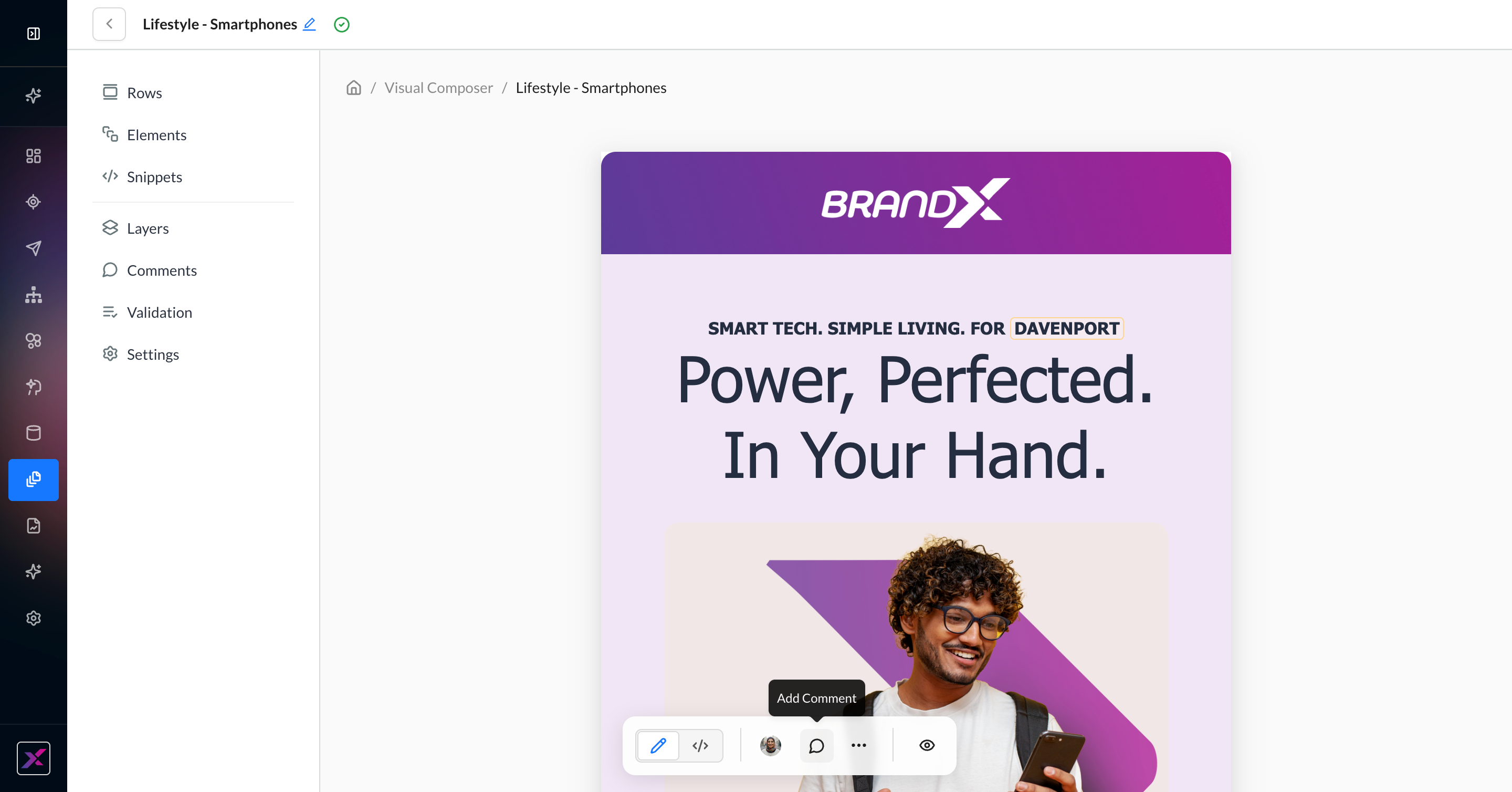
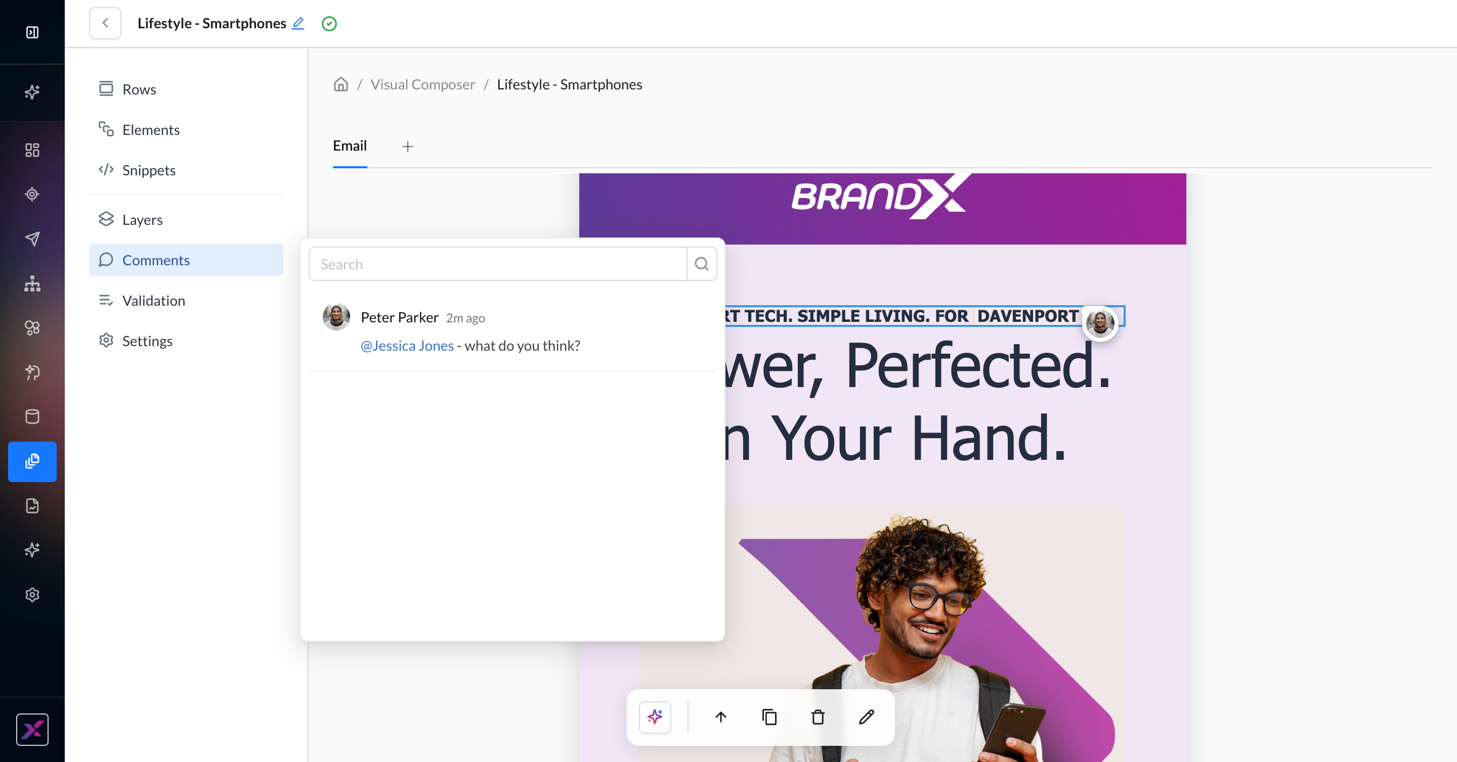
1. To add a comment, click the comment icon in the actions toolbar and drop it anywhere on the canvas.
2. Write your comment and tag your teammates if necessary. Only users who are directly added to the account are eligible to be tagged.

3. You and the tagged user will get an email notification for any updates to the thread.
4. To see the comments in list format, click the Comments button on the side panel.
5. You can also edit, resolve, or delete a comment.
6. To hide comments from the canvas, click the … button in the actions toolbar and click Comments. You can re-show them using the same steps.
Editing Priority
Anyone with editing access to a campaign or template can edit it in Visual Composer. Now, additional users can be in the canvas at the same time to see live updates, and their cursors with name labels can be followed. Only the first user can edit in a given session; all subsequent users will be in view-only mode, although they can still comment.
Once the first user leaves, the next user to enter the session or refresh will get edit access to the template.
Version History
You can still view, compare, and restore older versions of a template or campaign in Visual Composer. Click the … button in the actions toolbar, then Version History to access the timeline. Since Visual Composer uses auto-save, you can expect a larger number of versions. This has no effect on your ability to view, compare, or restore—you can collapse by date to help you navigate better.
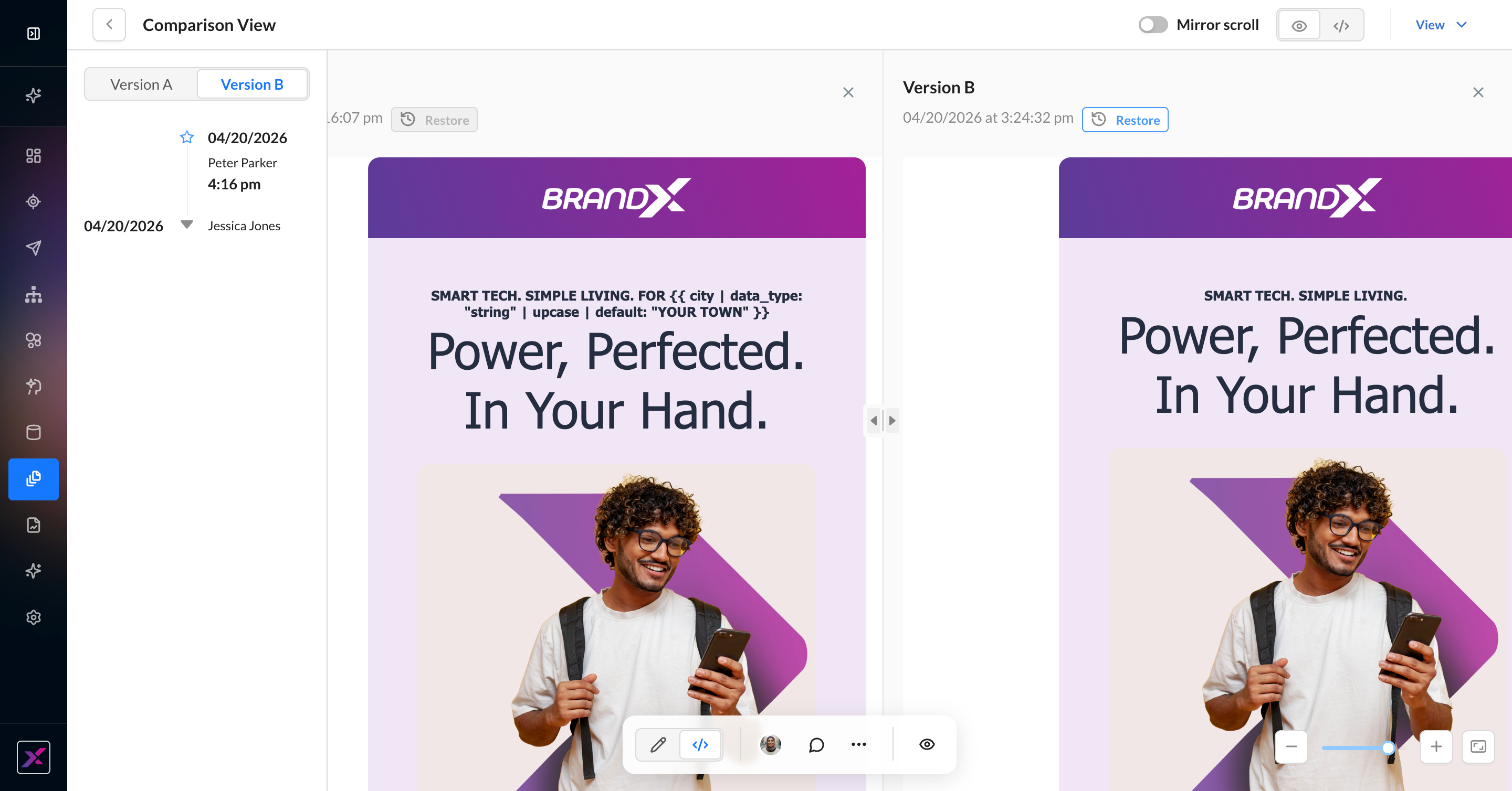
Display logic will appear stacked in version history, but it does not change the actual behavior. Restoring a template with display logic will work as expected.