

The Visual Editor in the Zeta Marketing Platform enables marketers to focus more on content and less on writing, maintaining, and fixing HTML.
Using the Visual Editor
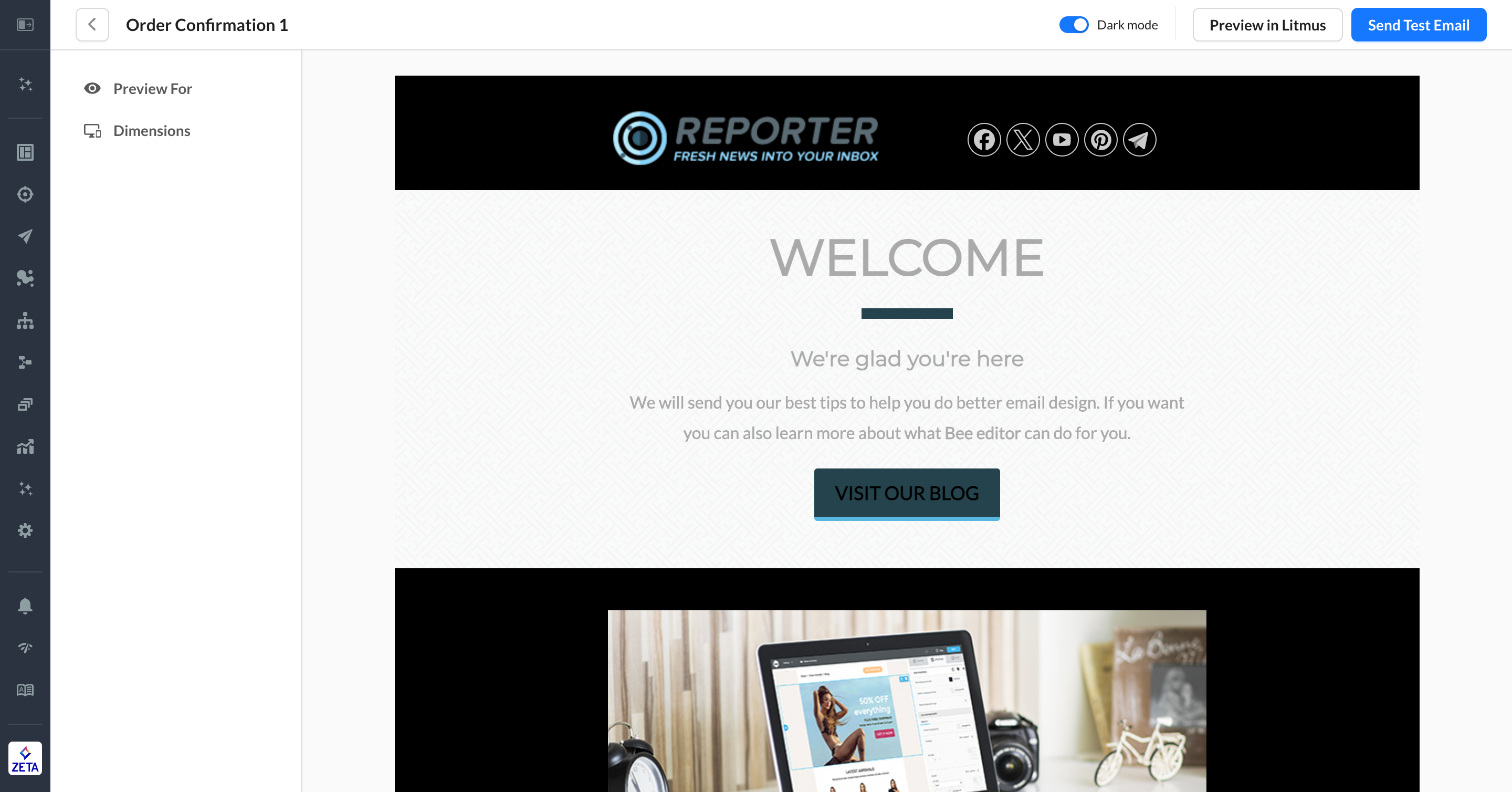
The templates created with the Visual Editor are responsive by default and should render correctly in all popular email clients. The first step in creating a new template is to choose your starting point. There are a number of pre-built templates and examples to choose from as well as the option to start from scratch in the Basic Designs. Once you choose a template to work with, the editor will load in, and you're able to give the template a name. Templates in the Visual Editor are built using Rows, and Content is added to those rows to create the email.
The Visual Editor also has a number of default settings in the Settings tab on the right side of the editor. Start by setting the global default options in the settings tab and then continue to build out your template.
Rows
Rows are used to define the general structure of your email, help break up the template, and enhance the flexibility of settings that need to be set for specific parts of the email.
Rows allow up to six columns of content, and in mobile, these columns always stack left above right. Stacking can optionally be disabled, but this may lead to undesirable rendering. Additional row properties are available by clicking on the row outside of the highlighted content area.
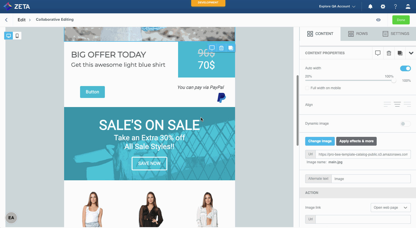
Column properties are also available here. These options can be used to adjust background colors for specific rows, add or remove padding, and adjust borders. Once the overall structure of the template is configured using rows, it's time to start working on content.
Content
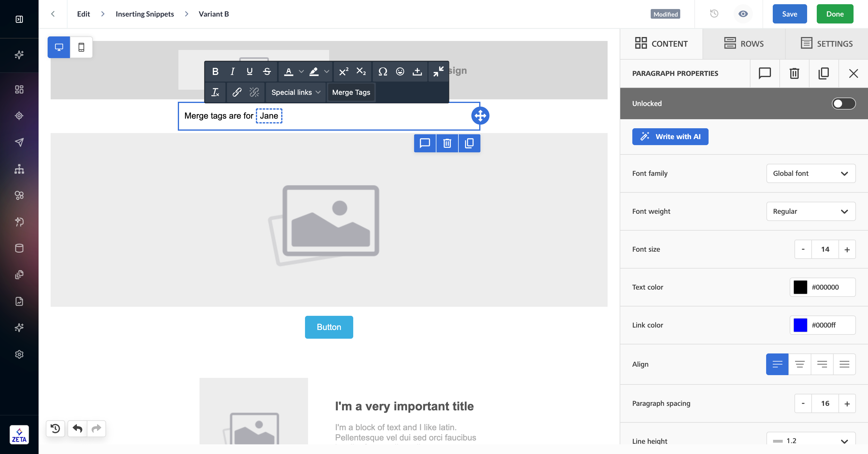
To add a content block to your email, click and drag it into the appropriate row. To see further options for the content block, click on the block in the email template.
Content Defaults
Reach out to your account team to set default settings on any of the content blocks.
-
Defaults may be set on your ZMP account for each content block. This may be font settings, alignment, image placeholder, etc. These settings will be applied when adding a new block to the email content. For example, different styles can be set as defaults set for H1, H2, and H3 title headings in the Title Block.
There is no way to determine the size of HTML files. Email Templates may include a snippet/resource code that changes dynamically based on the media included after the email delivery. Once the campaign is deployed, we can see the file size in Outlook.
Merge Tags
Learn more about Zeta Markup Language (ZML).
Personalize your content with merge tags, which are dynamic pieces of Zeta Markup Language (ZML) code that can be inserted codelessly. In the text-based content blocks, select Merge Tag from the in-line editor to open a list of user properties in the account.
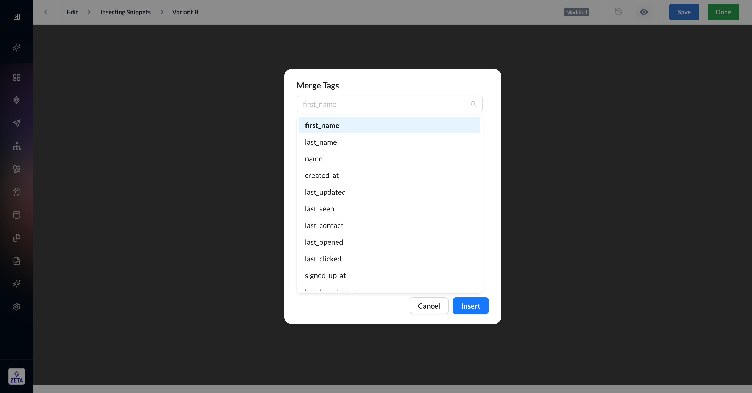
Once inserted, a sample value will appear with a dotted line around the merge tag to give you a clear picture of how the merge tag will look when it’s rendered in a real email.
While only user properties are supported as merge tags, there are several ways you can use ZML code to dynamically populate your content, including:
-
Event properties
-
Resources
-
Recommendations
-
Snippets
-
Feeds
Mobile Design Mode
By default, the Visual Editor is launched on the web editing view. Click on the Mobile icon in the top-left area to switch to mobile view. You can continue to edit your content while in mobile design mode. An eye icon will also appear when there are contents hidden on mobile. This icon can be used to show these contents.
Dark Mode Preview
On preview, the Dark Mode Preview toggle can switch to dark mode preview. This allows you to simulate how the email content will render on a device or application in dark mode.
Note: This feature provides only a general approximation of the dark mode experience with full-color inversion. Every application or device may have different behaviors when dark mode is enabled.
Collaborative Editing
Reach out to your account team to get this feature enabled for your ZMP instance.
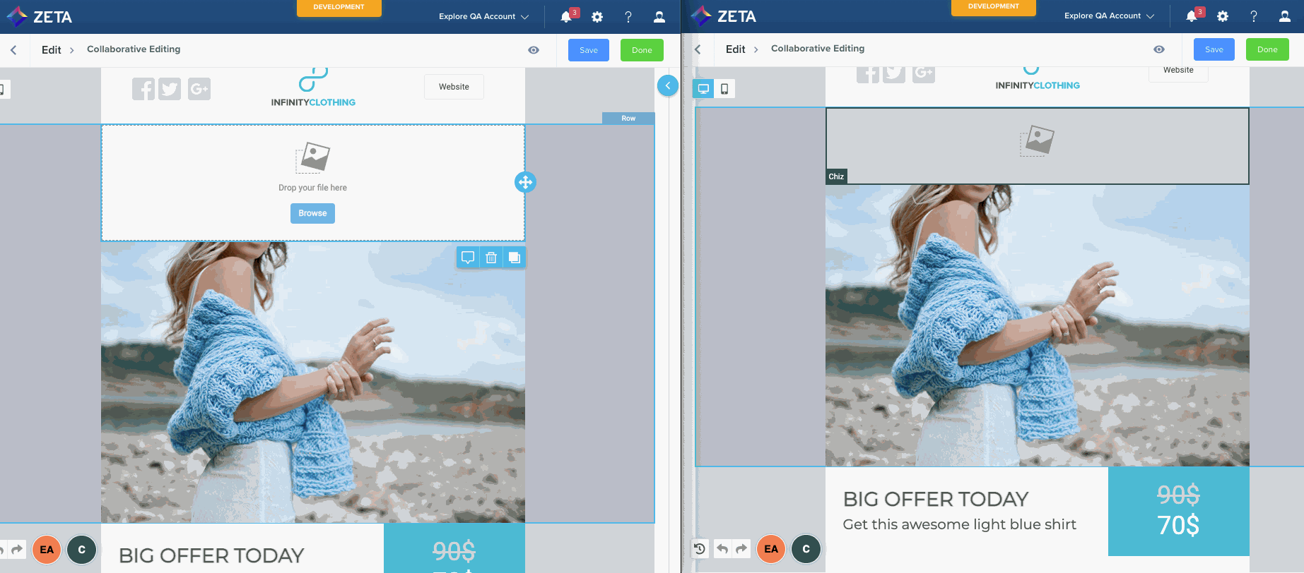
The visual editor supports collaborative editing with multiple users in real time. This feature is only available in Campaigns > Content & Audience and is not supported at the template level.
When a user joins the editing session, the editor will display a colored block containing the user's initials on the bottom left of the screen. The block's color indicates the color others will see when that user has selected content. As additional users join, different blocks will be added, displaying the number of users that have joined along with their selector color.
There is a hard limit of 20 simultaneous users in the same editing session, but we recommend keeping it to 10 or less to help prevent confusion and ensure performance.
Auto-Saving
Reach out to your account team to get this feature enabled for your ZMP instance.
The Visual Editor will save automatically once the content changes are made, ensuring that all your changes are saved. This feature is only available in Campaigns > Content & Audience and is not supported at the template level.
Write with AI
The Visual Editor allows you to leverage generative AI to create content blocks in 1/10th of time, ensuring 10x impact. This AI Paragraph Assistant can help you create new email content from scratch with a simple prompt.
Click on the Write with AI button to get started.
-20231120-104430.gif)
The AI Paragraph Assistant is supported on these content block types:
-
Paragraph
-
Title
-
List
-
Button
Locking Content
Reach out to your account team to get this feature enabled for your ZMP instance.
The Visual Editor allows you to lock content or content rows. This is helpful if you want some groups of users to have limited functionality when editing content using the Visual Editor.
-20231120-103712.gif?cb=501d2cfbe6064e8c0f86c1682f8ecbd8)
For example, suppose a restaurant franchise has:
-
a corporate legal group that requires that all emails include specific legal language in the footer (They want to minimize risk by ensuring that nobody outside the legal group can change this text)
and
-
a local franchisee who wants to send an email about the latest improvements to the restaurant to drum up business.
By locking content, this restaurant can set its account in a way that:
-
Members of the legal team can be assigned to a role, ‘Legal Team Content Creators’, and this role includes the ‘Lock Campaign Content’ permission.
-
Franchisee marketers can be assigned to the role ‘Franchisee Marketers’, and this role does not include the ‘Lock Campaign Content’ permission.
This will allow legal to ensure that nobody outside the legal team is editing the text in the legal footnote or removing the module altogether.
FAQs
|
Question |
Answer |
|---|---|
|
How to embed a video via the Visual Editor? |
The video content block allows you to share your video content in an easy way in your emails. You only need to copy and paste the URL of your video from YouTube or Vimeo. Beefree will do the rest: it will grab the cover image for the video, overlay a play icon on top of it, and link it to the video content. Learn more about adding video to your email. |
|
Why wouldn’t the images appear in the ZMP preview mode? |
Image domain’s SSL certificate is not trusted (because it has been revoked), and on our corporate network, we are not allowed to connect to domains with untrusted certificates. We need an updated certificate installed before this can work again. |