

The Analyze Map provides local, map-based reporting for mobile-oriented campaigns, rendering impressions, geofence points, clicks, and conversions on latitude/longitude maps. You can select data points on the map to visualize delivery and performance trends.
The feature is available for Geofence campaigns exclusively.
Navigation
1. Click on the DSP logo in the upper left corner. Within the menu that appears for Advertisers and Admin, select the Account that contains your advertiser, and then select your Advertiser.
2. As the Advertiser’s campaigns are displayed, select the campaign you would like to view from the list.
3. With the campaign open, click on the breadcrumb menu atop the page and select Manage > Campaign Analytics > Mobile.
.gif?cb=960718ec3107ab772b9019c7e352e028)
Mobile Report Features
|
Feature |
Description |
|
+/– |
Choose + to zoom in on the map, – to zoom out. |
|
(date range) |
Choose to invoke an interactive calendar that lets you set the campaign period you wish to study.
|
|
(map) |
The map location varies depending on controls. You may drag the map to new locations.
|
|
(location) |
Enter the name of a location, usually a city and state. The map focuses on that location. |
|
View Type |
Use the left-right arrows to scroll the list of available views. Choose a view type to control what the graph displays. Choices include: |
|
Heatmap |
Red areas have the highest concentration of the metric displayed, with yellow at medium intensity and green the lowest. This view is good for getting a general idea of the areas seeing the most and least penetration. Try zooming out to get a better idea of the big picture and zooming in to get a more detailed one. |
|
Intensity |
This view shows Ad events as individual dots where they occurred. In addition, color is used to indicate multiple events, with a deeper red color representing the most events and a lighter yellow the fewest. |
|
Bubble |
This view displays Ad events as larger, orange circles. This view is better suited for studying a large area. |
|
Simple |
This view is similar to the Intensity view, but does not include the intensity coloring. |
|
Metrics |
Specify the metrics to display:
|
|
Line-Items & Tactics |
Check the boxes for the Line-items/Tactics you wish graphed. Choose the top box to include all the items. Choose the small arrowhead to control whether subsidiary items appear. |
|
Geofences |
Checkboxes to display Geofences on the map. For example see Figure 2. The outlined circles denote the Geofences. The outlined circles denote the Geofences: 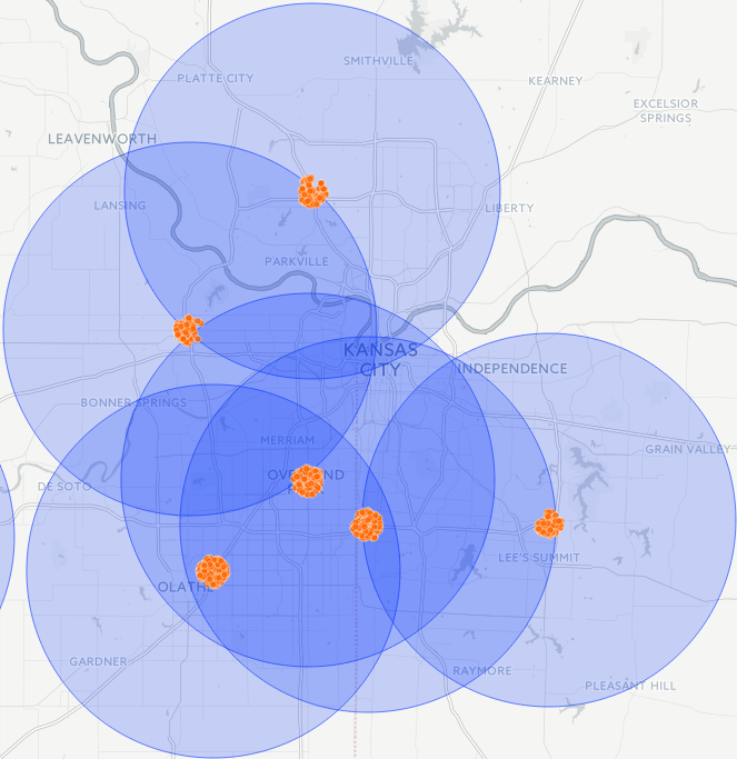
|