
Table Chart
For a Table chart,
Add a chart name to label your visualization.
Enter dimensions and metrics to define your data inputs.
Toggle display totals on or off for quick summaries.
Apply local filters to refine dimensions and metrics.
Add filter groups for more advanced filtering options.
-20250829-140617.gif?inst-v=c9ff232f-9ce9-47e4-b199-f6548f0817c1)
The Styles tab for Table Chart allows you to:
Customize the size of your chart views.
Pivot Table
Pivot Tables allow you to transform flat report data into an interactive cross-tabulated view, making it easier to analyze metrics across multiple dimensions such as Campaign, Channel, Audience Segment, or Date. Pivot mode enables fast comparative analysis directly within Report Builder without exporting data externally.
To switch a table widget from Standard Table to Pivot Table,
1. Hover over the widget tile to reveal the action bar.
2. Click the ⋯ (three-dot) overflow menu icon in the top-right of the tile.
3. Select Toggle Pivot Mode from the dropdown.
-20260518-101127.gif?inst-v=c9ff232f-9ce9-47e4-b199-f6548f0817c1)
The widget will reload in Pivot Table mode.
Pivot Tables render as cross-tabulated grids where row groups, pivot columns, and aggregated metric values dynamically update the visualization.
Pivot functionality is supported only for Table Widgets in Report Builder and Dashboard views.
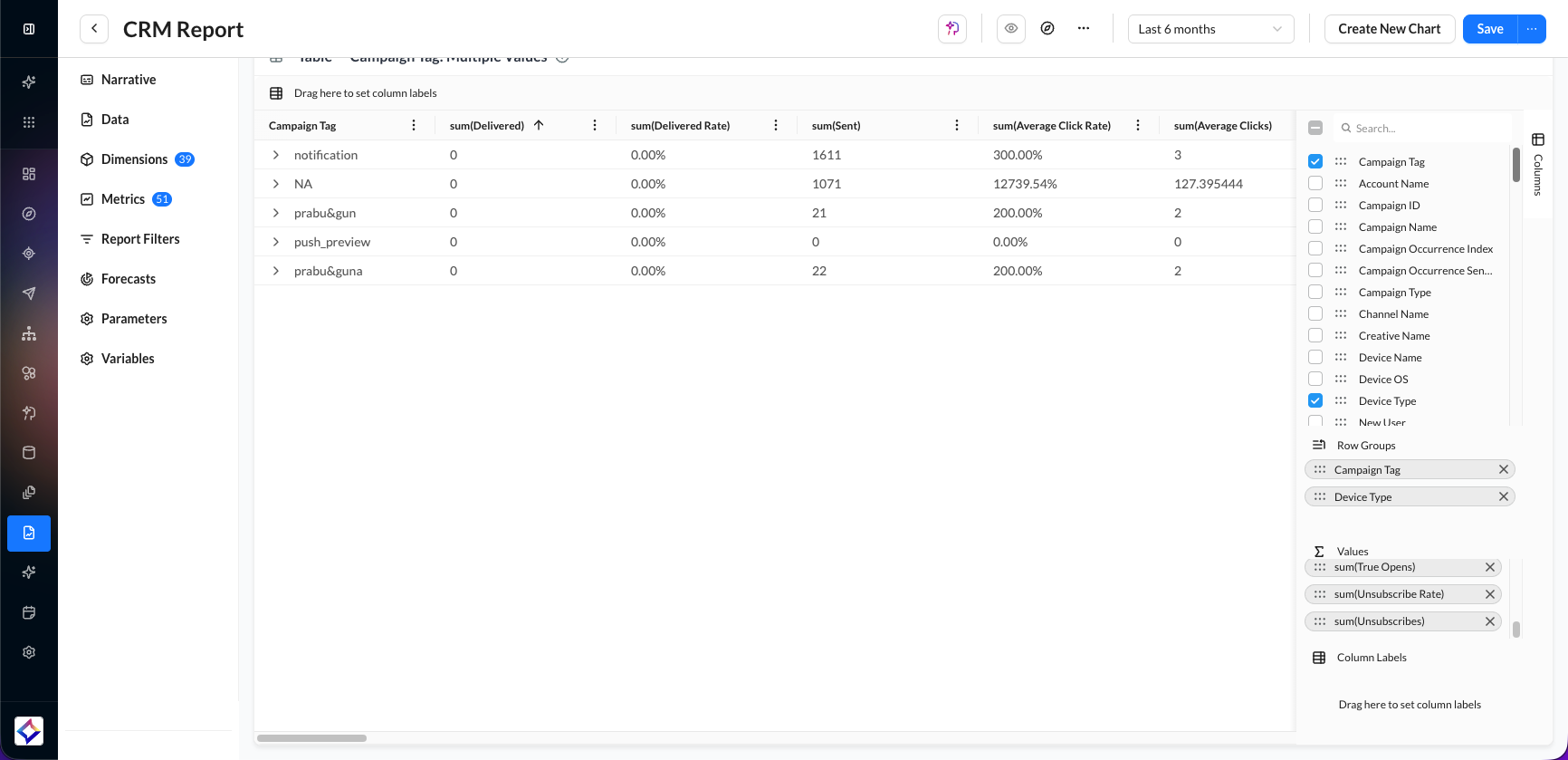
Pivot Tables support several advanced configuration and display options, including:
Row Groups (up to 3 dimensions) for hierarchical row organization.
Pivot Columns (up to 2 dimensions) for dynamic column headers.
Metric Aggregations (up to 10 values) using Sum, Count, Average, Min, and Max functions.
Fullscreen editing with AG Grid Column Panel for drag-and-drop pivot configuration.
CSV and Excel export support with pivoted layouts preserved in the export output.