
Charts & Visualizations

You can bring your reports to life with powerful, customizable charts and visualizations. Once you’ve added your data type, selected relevant metrics, and defined your dimensions, explore a range of intuitive chart configuration options to tailor your report. Whether you're highlighting trends, comparing categories, or showcasing performance, these visual tools make your insights clearer and more impactful.
Creating Charts
Click the Create New Chart button in the top-right corner of your report.
-20250723-063727.gif?inst-v=c9ff232f-9ce9-47e4-b199-f6548f0817c1)
From the panel that slides open, choose from the available chart types to customize and enhance your report with intuitive chart configuration options.
From the panel that slides open, choose from the following chart types:
Conditional Formatting
Conditional Formatting (CF) lets you visually highlight data in Report Builder widgets using rule-based color formatting. You can apply thresholds, ranges, and color scales to emphasize trends, outliers, and performance indicators across supported chart types.
When a Report widget is added to a Dashboard, its Conditional Formatting rules are copied automatically. Dashboard-level edits remain local and do not affect the source Report.
To add Conditional Formatting:
1. Within a chart or a widget, navigate to the Conditional Formatting settings panel and toggle it on.
-20260513-044835.gif?inst-v=c9ff232f-9ce9-47e4-b199-f6548f0817c1)
2. Select a metric to evaluate and define thresholds or value ranges.
-20260513-050412.gif?inst-v=c9ff232f-9ce9-47e4-b199-f6548f0817c1)
3. Choose a color scale or formatting style.
4. Save the rule.
You can create multiple rules per widget and reorder them to control rule priority.
Rules are evaluated independently for each applicable bar, column, line series, map region, or table cell.
Multidimensionality
Multidimensional charts let you visualize metrics across multiple grouped dimensions, making it easier to compare performance across categories such as Campaign, Channel, Date, or Region. This functionality is ideal for comparative breakdowns, trend analysis, and performance monitoring across large datasets.
Multidimensional support is available for the following chart types:
Horizontal Bar Chart: supports up to 3 dimensions on the Y-axis and an optional secondary metric axis.
MultiSeries Chart: supports up to 3 dimensions on the X-axis and an optional secondary metric axis.
Other chart types, such as Column, Line, Area, and Combo, support only a single dimension.
-20260518-091838.gif?inst-v=c9ff232f-9ce9-47e4-b199-f6548f0817c1)
Multidimensional charts support several advanced visualization options, including:
Color By Dimension for visually separating grouped data series.
Stacked, Percent Stacked, and Side-by-Side layouts for comparing totals and proportions.
Top N / Top M filters to limit high-cardinality dimensions and improve readability.
Conditional Formatting for highlighting trends or threshold-based performance indicators.
Multidimensional charts can also be combined with Variable-Based Dimensions & Metrics to create more flexible and interactive visualizations.
Variable-Based Dimensions & Metrics
Variable-Based Dimensions & Metrics allow charts and visualizations to dynamically change the dimensions or metrics they display based on selected parameter values. Instead of configuring a chart with a single fixed field, users can create flexible visualizations that adapt to different reporting scenarios without rebuilding the chart.
This functionality combines:
Variables → Parameters for defining selectable inputs
Variables → Calculated Fields for dynamically switching dimensions or metrics based on those parameter selections
These dynamic fields can then be used throughout charts, filters, and visualization settings just like standard dimensions or metrics.
Head over to any chart and open the Variables tab to create and manage Parameters or Calculated Fields, including dynamic dimensions and metrics for your visualizations.
.gif?inst-v=c9ff232f-9ce9-47e4-b199-f6548f0817c1)
Variable-Based fields use parameter-driven logic to determine which dimension or metric should appear in a visualization.
For example:
A chart can switch between Campaign, Channel, or Region as the primary dimension.
A metric selector can dynamically display Revenue, Clicks, or Conversions depending on the selected parameter.
You can create more interactive reports without duplicating multiple charts for each reporting view.
These dynamic selections help simplify dashboards and improve report flexibility across large datasets.
Creating Parameters
Parameters control which dimensions or metrics are displayed in a chart.
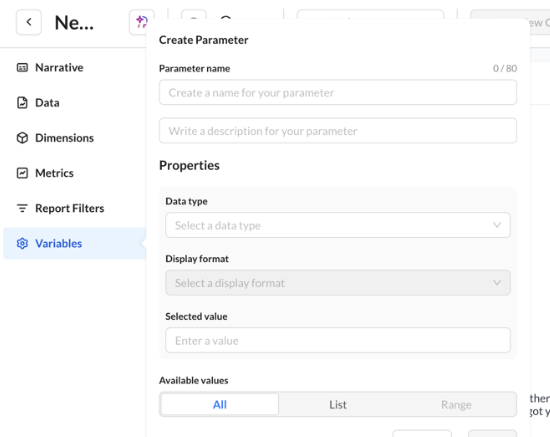
Field | Purpose | Required |
|---|---|---|
Name | Shown in Calculated Field Case pickers & Parameters tab (variables parameters) | Yes |
Description | Help text | No |
Data type | Feeds validation + allowable operators downstream | Yes |
Display format | Opens after picking type | No |
Selected value | Applied default/backing runtime | Yes post-type |
Available values | All / List / Range | No |
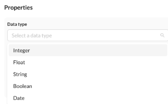
Data Type | Guidance |
|---|---|
Integer | Counts/thresholds |
Float | Rates |
String | Category switches |
Boolean | Binary |
Date | Temporal branching |
Available Mode | Notes |
|---|---|
All | Manual entry |
List | Enumerated picks align with If literals |
Range | Guardrails for numeric/date sliders |
Creating Calculated Fields
Calculated Fields use parameter-driven logic to dynamically determine which dimensions or metrics are displayed in a chart.
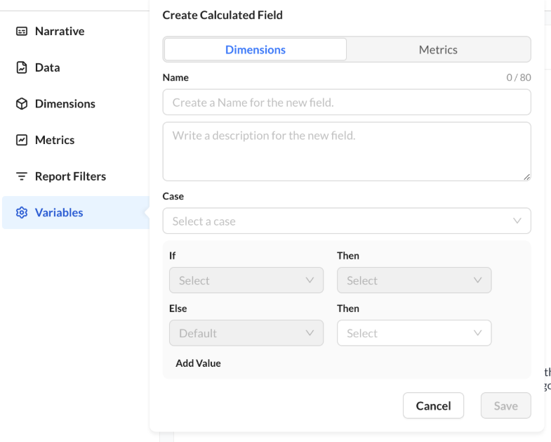
Case binds to a Variables → Parameters entry; Else is mandatory.
Control | Meaning |
|---|---|
Dimensions / Metrics | Insertion bucket for selectors |
Case | Variables → Parameter id/name |
If / Then | Per-branch literals → schema column |
Else | Fallback |
Add Value | Branches; blanks after row 0 may silently drop |
Operators vs parameter type | |
Parameter type | Operators |
Integer / Float / Date | =, <, ≤, >, ≥ |
String / Boolean | = only |